FabCon is coming to Atlanta
Join us at FabCon Atlanta from March 16 - 20, 2026, for the ultimate Fabric, Power BI, AI and SQL community-led event. Save $200 with code FABCOMM.
Register now!- Power BI forums
- Get Help with Power BI
- Desktop
- Service
- Report Server
- Power Query
- Mobile Apps
- Developer
- DAX Commands and Tips
- Custom Visuals Development Discussion
- Health and Life Sciences
- Power BI Spanish forums
- Translated Spanish Desktop
- Training and Consulting
- Instructor Led Training
- Dashboard in a Day for Women, by Women
- Galleries
- Data Stories Gallery
- Themes Gallery
- Contests Gallery
- QuickViz Gallery
- Quick Measures Gallery
- Visual Calculations Gallery
- Notebook Gallery
- Translytical Task Flow Gallery
- TMDL Gallery
- R Script Showcase
- Webinars and Video Gallery
- Ideas
- Custom Visuals Ideas (read-only)
- Issues
- Issues
- Events
- Upcoming Events
The Power BI Data Visualization World Championships is back! Get ahead of the game and start preparing now! Learn more
- Power BI forums
- Forums
- Get Help with Power BI
- Desktop
- 100% clustered chart
- Subscribe to RSS Feed
- Mark Topic as New
- Mark Topic as Read
- Float this Topic for Current User
- Bookmark
- Subscribe
- Printer Friendly Page
- Mark as New
- Bookmark
- Subscribe
- Mute
- Subscribe to RSS Feed
- Permalink
- Report Inappropriate Content
100% clustered chart
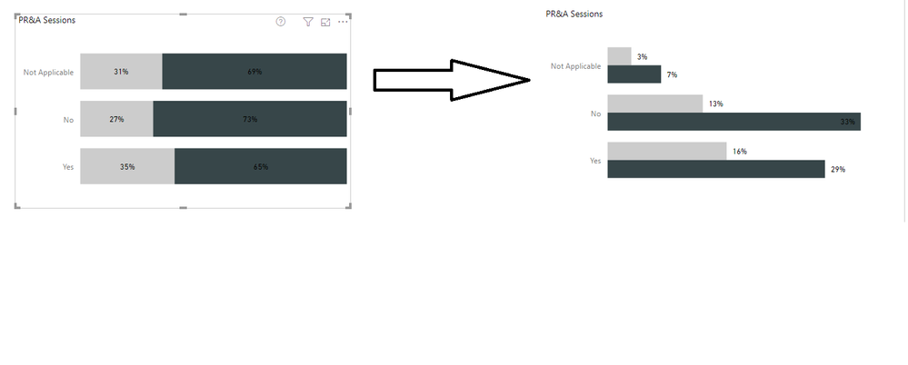
How can I get a 100% clusterd chart. I'd like the same data on the left to be look like on the right. However, I'd like for it not to be % of grand total, should be numbers of what we see on left (essentially each cluster should equal 100%).
Solved! Go to Solution.
- Mark as New
- Bookmark
- Subscribe
- Mute
- Subscribe to RSS Feed
- Permalink
- Report Inappropriate Content
Hi @jcastr02 ,
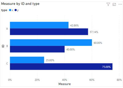
If i understand you correctly, you can use COUNT() function. Please refer to the below measure.
Measure 3 = CALCULATE(COUNT('Table'[Column2]),ALLEXCEPT('Table','Table'[Column1],'Table'[Column2]))/CALCULATE(COUNT('Table'[Column2]),ALLEXCEPT('Table','Table'[Column2]))Result would be shown as below.
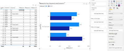
Best Regards,
Jay
Community Support Team _ Jay Wang
If this post helps, then please consider Accept it as the solution to help the other members find it more quickly.
- Mark as New
- Bookmark
- Subscribe
- Mute
- Subscribe to RSS Feed
- Permalink
- Report Inappropriate Content
@Anonymous Hi Jay, this is how I have it currently. I'd like it to be in your sample where both Bars for A - total 100%, both bars for B total 100%, and both bars for C total 100%..... VS. All bars totalling 100%
- Mark as New
- Bookmark
- Subscribe
- Mute
- Subscribe to RSS Feed
- Permalink
- Report Inappropriate Content
Hi @jcastr02 ,
Modify the measure as below.
Measure = CALCULATE(SUM('Table'[value]),ALLEXCEPT('Table','Table'[ID],'Table'[type]))/CALCULATE(SUM('Table'[value]),ALLEXCEPT('Table','Table'[ID]))If i misunderstood your meaning, please show your expected out put to us.
Best Regards,
Jay
Community Support Team _ Jay Wang
If this post helps, then please consider Accept it as the solution to help the other members find it more quickly.
- Mark as New
- Bookmark
- Subscribe
- Mute
- Subscribe to RSS Feed
- Permalink
- Report Inappropriate Content
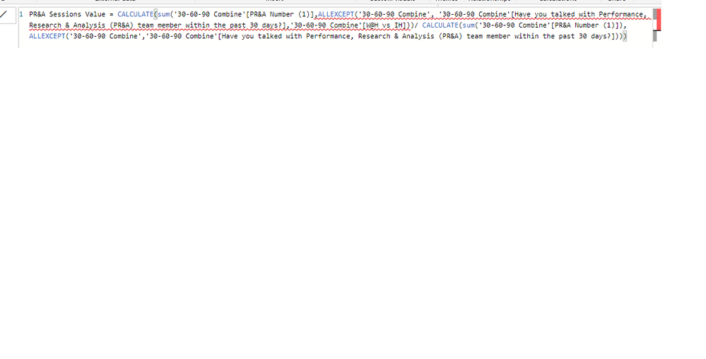
@Anonymous I don't necessarily have a "value" column, I just have a column with responses Yes, No, Not applicable. I tried to create a custom column with the value of "1" for each of the responses. I did this measure, but continues to have errors, any help is appreciated.
- Mark as New
- Bookmark
- Subscribe
- Mute
- Subscribe to RSS Feed
- Permalink
- Report Inappropriate Content
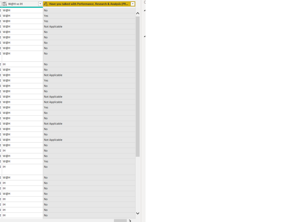
@Anonymous here is a sample of my data
- Mark as New
- Bookmark
- Subscribe
- Mute
- Subscribe to RSS Feed
- Permalink
- Report Inappropriate Content
Hi @jcastr02 ,
If i understand you correctly, you can use COUNT() function. Please refer to the below measure.
Measure 3 = CALCULATE(COUNT('Table'[Column2]),ALLEXCEPT('Table','Table'[Column1],'Table'[Column2]))/CALCULATE(COUNT('Table'[Column2]),ALLEXCEPT('Table','Table'[Column2]))Result would be shown as below.

Best Regards,
Jay
Community Support Team _ Jay Wang
If this post helps, then please consider Accept it as the solution to help the other members find it more quickly.
- Mark as New
- Bookmark
- Subscribe
- Mute
- Subscribe to RSS Feed
- Permalink
- Report Inappropriate Content
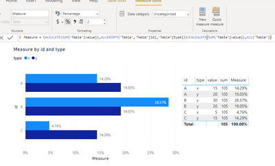
Hi @jcastr02 ,
You might need a Clustered bar chart instead.
And please check the formula below.
Measure = CALCULATE(SUM('Table'[value]),ALLEXCEPT('Table','Table'[id],'Table'[type]))/CALCULATE(SUM('Table'[value]),ALL('Table'))Here's my sample data and out put.
If i misunderstand you meaning, please share some sample data and expected result to us.
Best Regards,
Jay
Community Support Team _ Jay Wang
If this post helps, then please consider Accept it as the solution to help the other members find it more quickly.
- Mark as New
- Bookmark
- Subscribe
- Mute
- Subscribe to RSS Feed
- Permalink
- Report Inappropriate Content
Sample data would be great. Please see this post regarding How to Get Your Question Answered Quickly: https://community.powerbi.com/t5/Community-Blog/How-to-Get-Your-Question-Answered-Quickly/ba-p/38490
Follow on LinkedIn
@ me in replies or I'll lose your thread!!!
Instead of a Kudo, please vote for this idea
Become an expert!: Enterprise DNA
External Tools: MSHGQM
YouTube Channel!: Microsoft Hates Greg
Latest book!: DAX For Humans
DAX is easy, CALCULATE makes DAX hard...
- Mark as New
- Bookmark
- Subscribe
- Mute
- Subscribe to RSS Feed
- Permalink
- Report Inappropriate Content
One thought, you might try clicking the drop down on a column in the Values area and choose Show as | Percent of Total or Percent of Grand Total. I know you can do that in Tables and Matrices.
Follow on LinkedIn
@ me in replies or I'll lose your thread!!!
Instead of a Kudo, please vote for this idea
Become an expert!: Enterprise DNA
External Tools: MSHGQM
YouTube Channel!: Microsoft Hates Greg
Latest book!: DAX For Humans
DAX is easy, CALCULATE makes DAX hard...
- Mark as New
- Bookmark
- Subscribe
- Mute
- Subscribe to RSS Feed
- Permalink
- Report Inappropriate Content
@Greg_Deckler Hi there, this is how I have it currently. What I'm trying to do is.. I'd like both bars for "yes" to equal 100%, both bars for "no" equal 100%, and both bars for not applicable to equal 100%
Helpful resources

Power BI Dataviz World Championships
The Power BI Data Visualization World Championships is back! Get ahead of the game and start preparing now!

| User | Count |
|---|---|
| 41 | |
| 38 | |
| 36 | |
| 30 | |
| 28 |
| User | Count |
|---|---|
| 129 | |
| 88 | |
| 79 | |
| 68 | |
| 63 |
