FabCon is coming to Atlanta
Join us at FabCon Atlanta from March 16 - 20, 2026, for the ultimate Fabric, Power BI, AI and SQL community-led event. Save $200 with code FABCOMM.
Register now!- Power BI forums
- Get Help with Power BI
- Desktop
- Service
- Report Server
- Power Query
- Mobile Apps
- Developer
- DAX Commands and Tips
- Custom Visuals Development Discussion
- Health and Life Sciences
- Power BI Spanish forums
- Translated Spanish Desktop
- Training and Consulting
- Instructor Led Training
- Dashboard in a Day for Women, by Women
- Galleries
- Data Stories Gallery
- Themes Gallery
- Contests Gallery
- Quick Measures Gallery
- Notebook Gallery
- Translytical Task Flow Gallery
- TMDL Gallery
- R Script Showcase
- Webinars and Video Gallery
- Ideas
- Custom Visuals Ideas (read-only)
- Issues
- Issues
- Events
- Upcoming Events
Calling all Data Engineers! Fabric Data Engineer (Exam DP-700) live sessions are back! Starting October 16th. Sign up.
- Power BI forums
- Forums
- Get Help with Power BI
- Desktop
- 100% Stacked Column Chart with numbers in bars
- Subscribe to RSS Feed
- Mark Topic as New
- Mark Topic as Read
- Float this Topic for Current User
- Bookmark
- Subscribe
- Printer Friendly Page
- Mark as New
- Bookmark
- Subscribe
- Mute
- Subscribe to RSS Feed
- Permalink
- Report Inappropriate Content
100% Stacked Column Chart with numbers in bars
I have a requirement to create 100% Stacked Column Chart with numbers in the bars (not %).
Could somebody point me to App Store or any where else I can download the visual.
Kind Regards,
James
Solved! Go to Solution.
- Mark as New
- Bookmark
- Subscribe
- Mute
- Subscribe to RSS Feed
- Permalink
- Report Inappropriate Content
Hi,
I tried to create a sample pbix file like below.
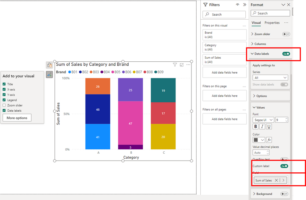
One of ways to solve this is using Custom Label feature that is built-in feature and you can use it with the exiting visualization in the pbix.
Please check the below picture and the attached pbix file.
If this post helps, then please consider accepting it as the solution to help other members find it faster, and give a big thumbs up.
Click here to visit my LinkedIn page
Click here to schedule a short Teams meeting to discuss your question.
- Mark as New
- Bookmark
- Subscribe
- Mute
- Subscribe to RSS Feed
- Permalink
- Report Inappropriate Content
Amazing! Thank you so much for this. Regards, James
- Mark as New
- Bookmark
- Subscribe
- Mute
- Subscribe to RSS Feed
- Permalink
- Report Inappropriate Content
Hi,
I tried to create a sample pbix file like below.
One of ways to solve this is using Custom Label feature that is built-in feature and you can use it with the exiting visualization in the pbix.
Please check the below picture and the attached pbix file.
If this post helps, then please consider accepting it as the solution to help other members find it faster, and give a big thumbs up.
Click here to visit my LinkedIn page
Click here to schedule a short Teams meeting to discuss your question.


