FabCon is coming to Atlanta
Join us at FabCon Atlanta from March 16 - 20, 2026, for the ultimate Fabric, Power BI, AI and SQL community-led event. Save $200 with code FABCOMM.
Register now!- Power BI forums
- Get Help with Power BI
- Desktop
- Service
- Report Server
- Power Query
- Mobile Apps
- Developer
- DAX Commands and Tips
- Custom Visuals Development Discussion
- Health and Life Sciences
- Power BI Spanish forums
- Translated Spanish Desktop
- Training and Consulting
- Instructor Led Training
- Dashboard in a Day for Women, by Women
- Galleries
- Data Stories Gallery
- Themes Gallery
- Contests Gallery
- QuickViz Gallery
- Quick Measures Gallery
- Visual Calculations Gallery
- Notebook Gallery
- Translytical Task Flow Gallery
- TMDL Gallery
- R Script Showcase
- Webinars and Video Gallery
- Ideas
- Custom Visuals Ideas (read-only)
- Issues
- Issues
- Events
- Upcoming Events
The Power BI Data Visualization World Championships is back! Get ahead of the game and start preparing now! Learn more
- Power BI forums
- Forums
- Get Help with Power BI
- Desktop
- Re: 1 line in a graph : actual and forecast
- Subscribe to RSS Feed
- Mark Topic as New
- Mark Topic as Read
- Float this Topic for Current User
- Bookmark
- Subscribe
- Printer Friendly Page
- Mark as New
- Bookmark
- Subscribe
- Mute
- Subscribe to RSS Feed
- Permalink
- Report Inappropriate Content
1 line in a graph : actual and forecast
Hi everyone!
I'm a beginner in PowerBI and after all my research, impossible for me to solve my problem.
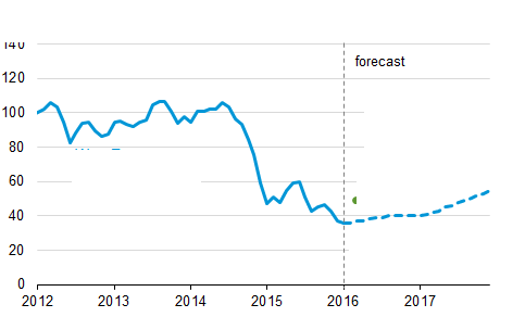
I want to do a simple thing : having a line which show my actual sales and my futur forecasted sales (already calculated). Same as the picture below.
MAXDATESALES = last date of sales recorded in DB
I used an if ([MAXDATESALES] > today(), [FORECASTCALCULATION] ; 0)
But powerbi only show me historical sales. I don't know what to do ![]()
Solved! Go to Solution.
- Mark as New
- Bookmark
- Subscribe
- Mute
- Subscribe to RSS Feed
- Permalink
- Report Inappropriate Content
Hello,
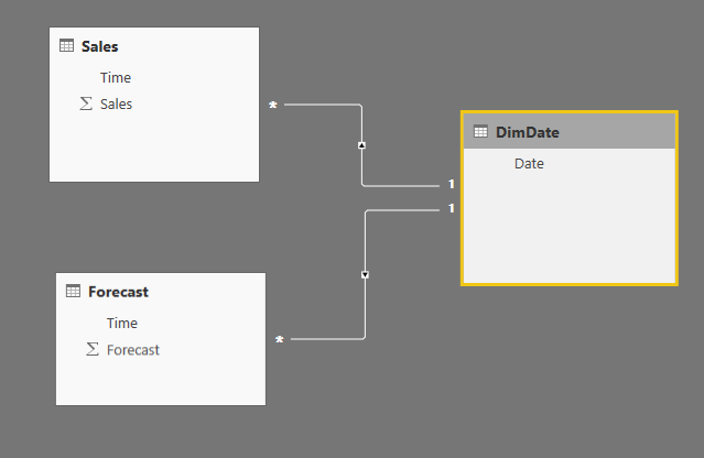
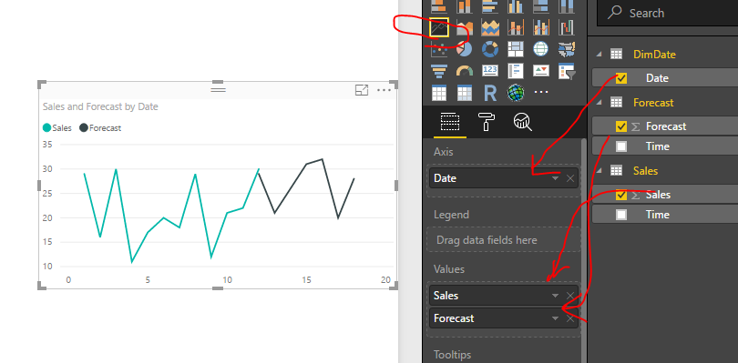
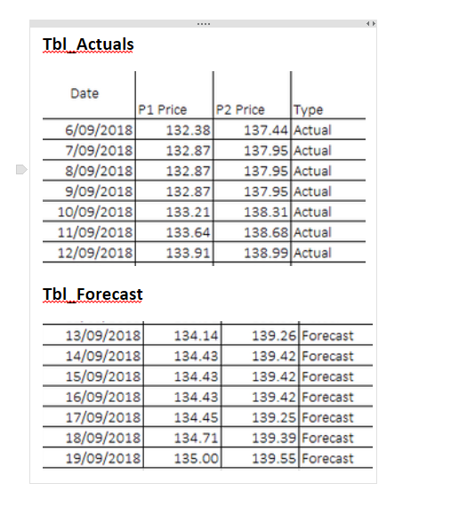
Most of the time forecast reports are coming in as separate files (usually as spreadsheets) which is a live document and can be subject to different changes. Best practices here are to include forecast as a separate table and join it to the Date dimension.
*** To my knowledge dotted lines are not yet supported despite numerous requests on ideas.powerbi.com
Thanks, Nick -
- Mark as New
- Bookmark
- Subscribe
- Mute
- Subscribe to RSS Feed
- Permalink
- Report Inappropriate Content
Hey..
I tried plotting the same but i am getting discontinuity at the date where actuals end and and forecasted starts. I have tried almost everything. what do you think can be the reason behind this and how to solve it. Thank you
- Mark as New
- Bookmark
- Subscribe
- Mute
- Subscribe to RSS Feed
- Permalink
- Report Inappropriate Content
fhill wrote:
#Interested #Following!
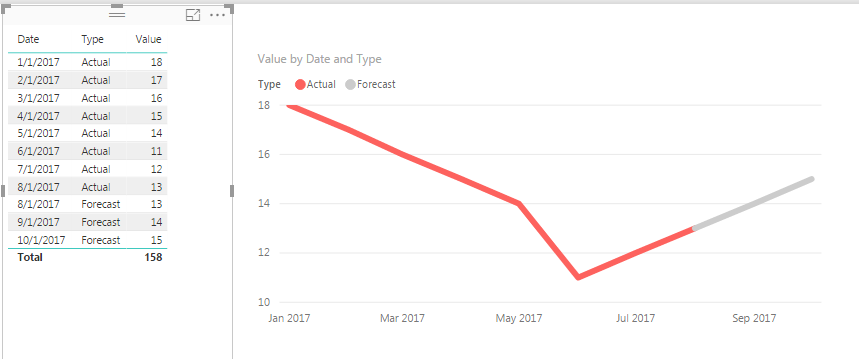
This is the only way we've been able to 'simulate' this functionality. We make sure the end of Actual always matched the start of Forecast, and then color code to seperate... We would love to be able to do the dotted lines and a Vertical marker that moves with a slicer. FOrrest
Yea ! But i tried Nickchobotar idea and it actually works perfectly !!!
Thanks guys for your help i'm happy now ![]()
![]()
- Mark as New
- Bookmark
- Subscribe
- Mute
- Subscribe to RSS Feed
- Permalink
- Report Inappropriate Content
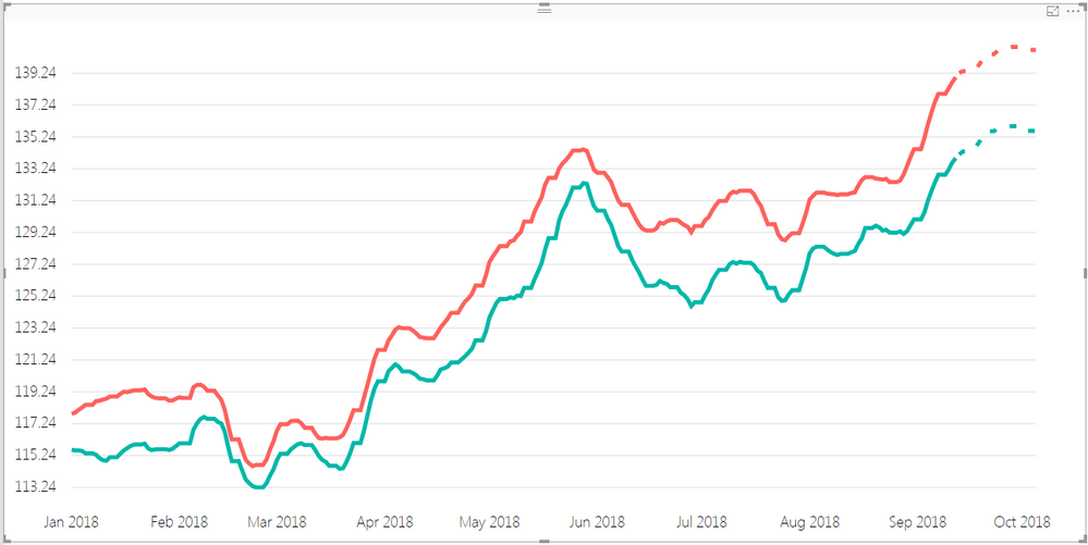
Good news. August Power BI Desktop release has dotted lines. Now, you can show your forecast as a dotted line.
https://powerbi.microsoft.com/en-us/blog/power-bi-desktop-august-2017-feature-summary/
Nick -
- Mark as New
- Bookmark
- Subscribe
- Mute
- Subscribe to RSS Feed
- Permalink
- Report Inappropriate Content
#Interested #Following!
This is the only way we've been able to 'simulate' this functionality. We make sure the end of Actual always matched the start of Forecast, and then color code to seperate... We would love to be able to do the dotted lines and a Vertical marker that moves with a slicer. FOrrest
Please give Kudos or Mark as a Solution!
https://www.linkedin.com/in/forrest-hill-04480730/
Proud to give back to the community!
Thank You!
- Mark as New
- Bookmark
- Subscribe
- Mute
- Subscribe to RSS Feed
- Permalink
- Report Inappropriate Content
Hi fhill,
What if I have two lines (two categories) that want to show Actual and Forecast?
In your suggested solution, if I drag the 'Type' to legend, then I cannot have two categories in 'Values'.
Any thought?
Thanks,
CindyD
- Mark as New
- Bookmark
- Subscribe
- Mute
- Subscribe to RSS Feed
- Permalink
- Report Inappropriate Content
Cindy,
In this case I would use a hybrid solution between my suggestion Nick's solution. Instead of using Type as a Legend, leave Legend blank and create Multiple Measures containing FILTER code (One for each Type) and then drag all of these new Measures onto the Values Field. The end results will be lines that only show up for each Type based on teh FILTERed measure.
If you post some sample data, I can help you with the Measure FILTER commands if needed.
Forrest
Please give Kudos or Mark as a Solution!
https://www.linkedin.com/in/forrest-hill-04480730/
Proud to give back to the community!
Thank You!
- Mark as New
- Bookmark
- Subscribe
- Mute
- Subscribe to RSS Feed
- Permalink
- Report Inappropriate Content
Thanks Forrest! I found a way to cheat it.
Thanks again!
Regards,
Cindy
- Mark as New
- Bookmark
- Subscribe
- Mute
- Subscribe to RSS Feed
- Permalink
- Report Inappropriate Content
Great that you got it to work but you got us all intrigued ![]() . Do you mind sharing your solution with the community.
. Do you mind sharing your solution with the community.
Thanks, Nick -
- Mark as New
- Bookmark
- Subscribe
- Mute
- Subscribe to RSS Feed
- Permalink
- Report Inappropriate Content
Sure!
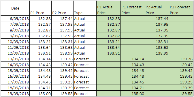
I have actual and forecast data all in one file, then I added four more columns to separate the actual and forecast data.
In this way I can drag my added four columns all to the Value field, and just change the forecast lines to a dash format. That gives me what I am after.
Hope that explains!
Cheers ~~ Cindy
- Mark as New
- Bookmark
- Subscribe
- Mute
- Subscribe to RSS Feed
- Permalink
- Report Inappropriate Content
@CindyD Excellent!
Please remember that you have an option to break your Actuals and Forecast data into separate excel work sheets or even excel files and make a data model.
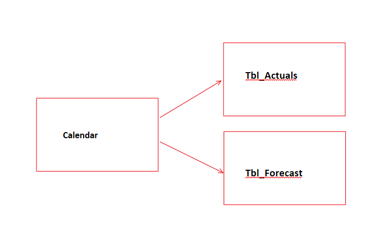
Also you could add a Calendar table to your model
You can create this table by going to Data View -> Calculated Table and write the following code Calendar = CALENDARAUTO() this will create a separate table with one Date field (consecutive dates which Power BI will automatically populates for you)
All that's left to do after that is to join your Calendar table to Actual and Forecast tables. (join in the Date field)
In the report you you will need to use field from Calendar table on the axis.
- Mark as New
- Bookmark
- Subscribe
- Mute
- Subscribe to RSS Feed
- Permalink
- Report Inappropriate Content
Hi Nick,
Thanks for the showing the details! I learnt something new about calendar table!
But in my specific case, I can't split the data in different files or tabs, as actual and forecast all automatically updated/calculated in one tab. Split them out will create more admin work.
Thanks for sharing your thought!
Cheers ~~ Cindy
Helpful resources

Power BI Dataviz World Championships
The Power BI Data Visualization World Championships is back! Get ahead of the game and start preparing now!

| User | Count |
|---|---|
| 40 | |
| 38 | |
| 36 | |
| 29 | |
| 28 |
| User | Count |
|---|---|
| 127 | |
| 88 | |
| 78 | |
| 66 | |
| 65 |
