Join us at FabCon Vienna from September 15-18, 2025
The ultimate Fabric, Power BI, SQL, and AI community-led learning event. Save €200 with code FABCOMM.
Get registered- Power BI forums
- Get Help with Power BI
- Desktop
- Service
- Report Server
- Power Query
- Mobile Apps
- Developer
- DAX Commands and Tips
- Custom Visuals Development Discussion
- Health and Life Sciences
- Power BI Spanish forums
- Translated Spanish Desktop
- Training and Consulting
- Instructor Led Training
- Dashboard in a Day for Women, by Women
- Galleries
- Data Stories Gallery
- Themes Gallery
- Contests Gallery
- Quick Measures Gallery
- Notebook Gallery
- Translytical Task Flow Gallery
- TMDL Gallery
- R Script Showcase
- Webinars and Video Gallery
- Ideas
- Custom Visuals Ideas (read-only)
- Issues
- Issues
- Events
- Upcoming Events
Enhance your career with this limited time 50% discount on Fabric and Power BI exams. Ends August 31st. Request your voucher.
- Power BI forums
- Galleries
- Data Stories Gallery
- Visualization Soccer match, 2019 FIFA U-20 WC, Ukr...
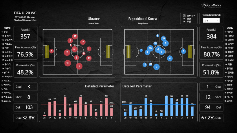
Visualization Soccer match, 2019 FIFA U-20 WC, Ukraine VS. Republic of Korea
10-23-2019 00:12 AM


- Mark as New
- Bookmark
- Subscribe
- Mute
- Subscribe to RSS Feed
- Permalink
- Report Inappropriate Content
Visualization Soccer match, 2019 FIFA U-20 WC, Ukraine VS. Republic of Korea
I had made the sample of sports data visualization which is Soccer match.
The raw data was collected by my coperation(about 17columns, 3,000 rows).
I used Scatter diagram, bar chart, card and multi card, filter etc.
Map : Average formation into six steps ans two steps
bar chart : detailed all action
and general datas.
It's divided into six steps(15 minutes interval) and two steps(first, second). Divided 1,2,3 are first half time and divided 4,5,6 are second half time.
This is not perfect as test and sample :D.
Thanks
eyJrIjoiNTI4NDhhZjktMWUzMi00Y2ZmLTlmMjUtMTdlYzQ1MmFmZGQ3IiwidCI6ImE4MTU5YWY3LWExNDUtNDA2Yi1iM2Y3LWRkZjk1Y2ZhZmZkNiJ9