Become a Certified Power BI Data Analyst!
Join us for an expert-led overview of the tools and concepts you'll need to pass exam PL-300. The first session starts on June 11th. See you there!
Get registered- Power BI forums
- Get Help with Power BI
- Desktop
- Service
- Report Server
- Power Query
- Mobile Apps
- Developer
- DAX Commands and Tips
- Custom Visuals Development Discussion
- Health and Life Sciences
- Power BI Spanish forums
- Translated Spanish Desktop
- Training and Consulting
- Instructor Led Training
- Dashboard in a Day for Women, by Women
- Galleries
- Webinars and Video Gallery
- Data Stories Gallery
- Themes Gallery
- Contests Gallery
- Quick Measures Gallery
- Notebook Gallery
- Translytical Task Flow Gallery
- R Script Showcase
- Ideas
- Custom Visuals Ideas (read-only)
- Issues
- Issues
- Events
- Upcoming Events
Power BI is turning 10! Let’s celebrate together with dataviz contests, interactive sessions, and giveaways. Register now.
- Power BI forums
- Galleries
- Data Stories Gallery
- Re: Retail Data Stories
- Mark as New
- Bookmark
- Subscribe
- Mute
- Subscribe to RSS Feed
- Permalink
- Report Inappropriate Content
Retail Data Stories
Here is a new take on delivering insights related to the Retail Industry, the base data taken for this dashboard is Obvience’s retail data (I have included the call out on the front page of the dashboard and on all the relevant pages). However, I have also included a lot of dummy variables to make this dashboard even more interesting.
Key tabs of this dashboard:
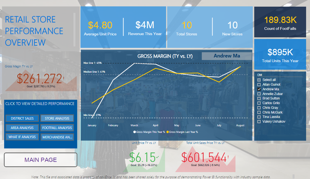
- The Overview tab showcase key performance indicators and related comparisons
- The District sales tabs shows the unit sold overall and relative to the selling are and sales per sq. ft. and product categories allows to select specific category related performance. I have also included a dummy sentiment bar graph which acts as a filter for this page
- Selling area analysis tab shows gross margins and units sold by area size and by chain. Key highlights of this tab is a simple synoptic panel that allows the users to gauge performance by specific section of the store. This tab also includes bookmarks to look at the store performance by selling area and make statistical inferences using the correlation plot to see what metric or data element is driving sales
- New store analysis tab shows the key influencer relative to DMs and Category to better understand which DM and which category is driving Gross Margin. This tab also includes store open by specific chain by month which acts as a filter along with the category interactive chart
- Footfall analysis tab is based on customer visit dummy data which can be used to make inference relative to increases in sales and can be further filtered by specific district manager. This tab also includes an interactive call out at the bottom which changes per the selection made by the user, showing gross margin amount by a particular district manager
- What if analysis tab is based on the scenario logic, where I have tried to focus purely on the grocery as a category given the fac that it is the most least performing of all the other categories. Hence, the thought is to see how a price increase will affect the total revenue of the store. This tab also includes an interactive narrative that has been created using various DAX measures and knitting them into one interesting group for insights.
- Merchandise analysis is a cool synoptic panel-based layout which promotes and boasts the Power BI capabilities
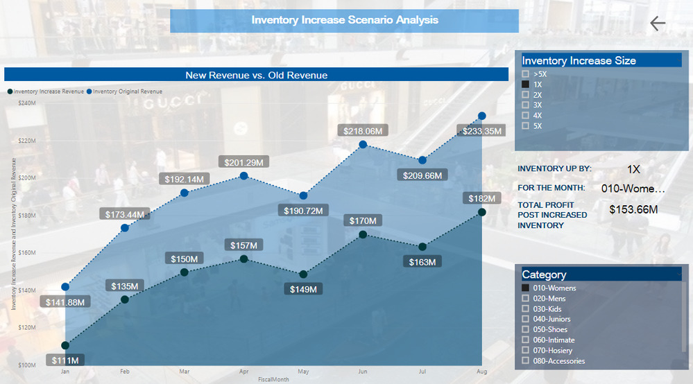
- Inventory analysis tab us another scenario-based tab which shows the revenue increase relative to the size of the inventory. For example how much extra revenue will be generated if we increase the size of the inventory by x times for a particular category. Once again, I have used some interactive and simple DAX measures to make this tab interesting and full of insights
- Conclusion tab boasts of Arria NLG add-in which provides ready to use insights based on the entire dataset to make some quick and cool inference
All ‘n All this dashboard is a perfect mix of what Power BI’s capabilities and an analyst’s intuitiveness to make data comprehensible and interesting. This dashboard can be treated as a start to end analysis of a retail giant providing granular as well as high level information to its users.
Overview Canvas
Inventory Scenario Analysis Canvas
Note:
The Correlation plot will be a little slow in showing the correlation % so please give it some time, to see the interactivity and results.
ESRI Maps may not showup in the Web version due to permissions issue. Hence, apologies for the inconvenience, however, they should work absolutley fine once you have downloaded the pbix desktop file.
Please do give it a thumbs up if you like it!
Enjoy the data story!
eyJrIjoiNTUxNGYyMzktNDk1MC00MmYyLWE2NWEtMGMxZDMwMjUxODdkIiwidCI6ImJiNDY2Y2JiLTYyMWMtNDkzYi04Mzc0LTZjOGYyNmRjNmExOCIsImMiOjEwfQ%3D%3D
- Mark as New
- Bookmark
- Subscribe
- Mute
- Subscribe to RSS Feed
- Permalink
- Report Inappropriate Content
Very nice work 🙂


