- Mark as New
- Bookmark
- Subscribe
- Mute
- Subscribe to RSS Feed
- Permalink
- Report Inappropriate Content
RFM-analysis
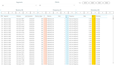
An RFM analysis was built, where data about our clients are arranged in the form of one summary table, where are indicated: RFM client segment, date of his last purchase, number of purchases, and amount spent by this client. To facilitate the work with the report, we can consider this table in the context of the RFM invoice or date we need.
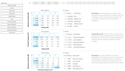
The RF/RM/FM Analysis report was built, in which the number of customers is presented as three matrices RF, RM and FM. So the RM matrix shows customers who bring in the most revenue and vice versa. The RF matrix shows how often customers make purchases in order to identify the most loyal customers. As well as the FM matrix, which allows you to reveal the dependence of the frequency of purchases on the amount spent and vice versa. This report can also be viewed in terms of dates or customer segments.
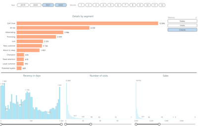
The report contains generalized metrics about the company's customers, characteristics of RFM segments in terms of the number of customers and turnover in the form of histograms. As well as the distribution of customers by the date of the last purchase in the form of a bar chart. This report can be viewed by date and segments.
The last report related to RFM analysis - "Description of segments", shows information with details about the segments accepted in this RFM analysis in the form of columnar histograms with distribution by different parameters. As well as recommendations for working with these segments.
The dashboard was compiled by Dmitry Budko, a student of St. Petersburg State Technological University, Faculty of Economics and Management, Business Informatics.
As a result of the study of this analysis, you can study the purchasing activity of customers in your database, as well as develop separate communications with each group of contacts, for example:
- customers with declining activity can be encouraged to return by offering them a discount;
- You can send announcements of new products to loyal customers to make them even more interested in your services;
- newcomers can be involved in interaction with your brand;
- customers who have lost interest in your brand can be tried to return by reactivation.
____________
⭐️ Fabric Group Channel
⭐️ Microsoft Fabric Community
Please join the Power BI UX/UI User Group if you need help with dashboard design and usability
Join to Data Governance User Group
Join to DENEB and Power BI Enthusiasts User Group
Join to Data Fabric Best Practices User Group
Subscribe to my medium blog
- Mark as New
- Bookmark
- Subscribe
- Mute
- Subscribe to RSS Feed
- Permalink
- Report Inappropriate Content
Hello!! Nice a good report!
Please, can you help me with the next question.
I'd like to know how can I make this pagination for report.
Use arrows and select page to navigate, also.
Thanks a lot.
Best regards.
Jhonatan Ora Badillo
- Mark as New
- Bookmark
- Subscribe
- Mute
- Subscribe to RSS Feed
- Permalink
- Report Inappropriate Content
Hi @JhonatanOB1993 !
I don't do something special for this. It's just working like this.
____________
⭐️ Fabric Group Channel
⭐️ Microsoft Fabric Community
Please join the Power BI UX/UI User Group if you need help with dashboard design and usability
Join to Data Governance User Group
Join to DENEB and Power BI Enthusiasts User Group
Join to Data Fabric Best Practices User Group
Subscribe to my medium blog
- Mark as New
- Bookmark
- Subscribe
- Mute
- Subscribe to RSS Feed
- Permalink
- Report Inappropriate Content
Hello,
I'm practicing RFM analysis on my dataset with 18K customers. I got the performance issue as my segment calculation using DAX has exceeded the available resource of Power BI.
So I'm curious about how you calculate RFM score. Could you please share me what you did on the calculation? For example, how does RFM score link to the Year filter at the top of dashboard? What happens if I select year 2022? Is it like the dashboard will filter to get all customers that have last transaction in 2022, and only calculate and visualise data from those customers?
One more question, for R, F and M score, do you use calculated column to calculate?
Thank you in advance!
- Mark as New
- Bookmark
- Subscribe
- Mute
- Subscribe to RSS Feed
- Permalink
- Report Inappropriate Content
Hi @thule0901 ! You can find source file at WoW wednesday Power BI initiative!
____________
⭐️ Fabric Group Channel
⭐️ Microsoft Fabric Community
Please join the Power BI UX/UI User Group if you need help with dashboard design and usability
Join to Data Governance User Group
Join to DENEB and Power BI Enthusiasts User Group
Join to Data Fabric Best Practices User Group
Subscribe to my medium blog
- Mark as New
- Bookmark
- Subscribe
- Mute
- Subscribe to RSS Feed
- Permalink
- Report Inappropriate Content
How much does your RFM model sell me? my email is daniel.jaramillo.montoya@gmail.com
- Mark as New
- Bookmark
- Subscribe
- Mute
- Subscribe to RSS Feed
- Permalink
- Report Inappropriate Content
@daniel3089 you can find this model at WOW Workout Wednesday 😎
____________
⭐️ Fabric Group Channel
⭐️ Microsoft Fabric Community
Please join the Power BI UX/UI User Group if you need help with dashboard design and usability
Join to Data Governance User Group
Join to DENEB and Power BI Enthusiasts User Group
Join to Data Fabric Best Practices User Group
Subscribe to my medium blog
- Mark as New
- Bookmark
- Subscribe
- Mute
- Subscribe to RSS Feed
- Permalink
- Report Inappropriate Content
Can you point me to the page on WoW on how to find the .pbix file for this? I searched RFM analysis but didn't get this version from 2022. This is excellent!
- Mark as New
- Bookmark
- Subscribe
- Mute
- Subscribe to RSS Feed
- Permalink
- Report Inappropriate Content
sure @data_analyst_bi
with pleasure!😊
https://workout-wednesday.com/pbi-2023-w46/
____________
⭐️ Fabric Group Channel
⭐️ Microsoft Fabric Community
Please join the Power BI UX/UI User Group if you need help with dashboard design and usability
Join to Data Governance User Group
Join to DENEB and Power BI Enthusiasts User Group
Join to Data Fabric Best Practices User Group
Subscribe to my medium blog
- Mark as New
- Bookmark
- Subscribe
- Mute
- Subscribe to RSS Feed
- Permalink
- Report Inappropriate Content
Can you send me this PBI file? Thank you
- Mark as New
- Bookmark
- Subscribe
- Mute
- Subscribe to RSS Feed
- Permalink
- Report Inappropriate Content
I like the variability in the dashboard! The colors on the first page are a little pale, but the palette is good
- Mark as New
- Bookmark
- Subscribe
- Mute
- Subscribe to RSS Feed
- Permalink
- Report Inappropriate Content
Thanks for the informative dashboard.
- Mark as New
- Bookmark
- Subscribe
- Mute
- Subscribe to RSS Feed
- Permalink
- Report Inappropriate Content
A good topic for analysis in power BI
- Mark as New
- Bookmark
- Subscribe
- Mute
- Subscribe to RSS Feed
- Permalink
- Report Inappropriate Content
a very informative dashboard, but I would like to see more saturated colors on the first screen
- Mark as New
- Bookmark
- Subscribe
- Mute
- Subscribe to RSS Feed
- Permalink
- Report Inappropriate Content
Good pallette, but I'd like saturated colors on 1 slide
- Mark as New
- Bookmark
- Subscribe
- Mute
- Subscribe to RSS Feed
- Permalink
- Report Inappropriate Content
Good visualization and informative


