FabCon is coming to Atlanta
Join us at FabCon Atlanta from March 16 - 20, 2026, for the ultimate Fabric, Power BI, AI and SQL community-led event. Save $200 with code FABCOMM.
Register now!- Power BI forums
- Get Help with Power BI
- Desktop
- Service
- Report Server
- Power Query
- Mobile Apps
- Developer
- DAX Commands and Tips
- Custom Visuals Development Discussion
- Health and Life Sciences
- Power BI Spanish forums
- Translated Spanish Desktop
- Training and Consulting
- Instructor Led Training
- Dashboard in a Day for Women, by Women
- Galleries
- Data Stories Gallery
- Themes Gallery
- Contests Gallery
- QuickViz Gallery
- Quick Measures Gallery
- Visual Calculations Gallery
- Notebook Gallery
- Translytical Task Flow Gallery
- TMDL Gallery
- R Script Showcase
- Webinars and Video Gallery
- Ideas
- Custom Visuals Ideas (read-only)
- Issues
- Issues
- Events
- Upcoming Events
The Power BI Data Visualization World Championships is back! Get ahead of the game and start preparing now! Learn more
- Power BI forums
- Galleries
- Data Stories Gallery
- Power BI September Microsoft Blog Layout
Power BI September Microsoft Blog Layout
09-28-2018 13:06 PM - last edited 03-27-2020 09:58 AM


- Mark as New
- Bookmark
- Subscribe
- Mute
- Subscribe to RSS Feed
- Permalink
- Report Inappropriate Content
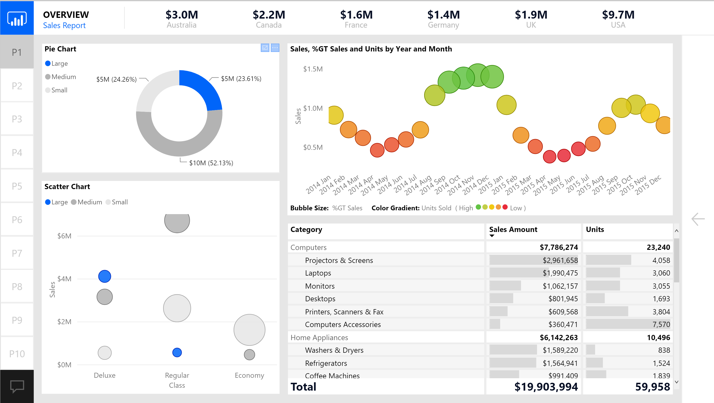
Power BI September Microsoft Blog Layout
An impressive layout was produced by the Microsoft team in September of 2018. While the layout was awesome, it was merely only one page. Not quite up to the PowerBI.Tips standards. We really love this layout, but it just needed some love to finish it up for the community. We hope you enjoy this new layout in the style of the Power BI Blog Sept 2018 release.
Feel free to download your free copy here: https://powerbi.tips/product/layouts-microsoft-sept-2018/
eyJrIjoiOWU0ZThiMGQtMzcwOC00MmQ4LWJhZjItZDk0Y2QyODMzODA5IiwidCI6IjcyNDQ1YmFhLTMxNGYtNGM5Mi05MzY0LTFjYjJjNDkyNGJmNiIsImMiOjN9
- Mark as New
- Bookmark
- Subscribe
- Mute
- Subscribe to RSS Feed
- Permalink
- Report Inappropriate Content
Hi
For the bubble chart did you use conditional formatting?
Thanks
- Mark as New
- Bookmark
- Subscribe
- Mute
- Subscribe to RSS Feed
- Permalink
- Report Inappropriate Content
that is correct, the bubble chart is suing conditional formatting to adjust the colors of the bubbles.