FabCon is coming to Atlanta
Join us at FabCon Atlanta from March 16 - 20, 2026, for the ultimate Fabric, Power BI, AI and SQL community-led event. Save $200 with code FABCOMM.
Register now!- Power BI forums
- Get Help with Power BI
- Desktop
- Service
- Report Server
- Power Query
- Mobile Apps
- Developer
- DAX Commands and Tips
- Custom Visuals Development Discussion
- Health and Life Sciences
- Power BI Spanish forums
- Translated Spanish Desktop
- Training and Consulting
- Instructor Led Training
- Dashboard in a Day for Women, by Women
- Galleries
- Data Stories Gallery
- Themes Gallery
- Contests Gallery
- QuickViz Gallery
- Quick Measures Gallery
- Visual Calculations Gallery
- Notebook Gallery
- Translytical Task Flow Gallery
- TMDL Gallery
- R Script Showcase
- Webinars and Video Gallery
- Ideas
- Custom Visuals Ideas (read-only)
- Issues
- Issues
- Events
- Upcoming Events
Get Fabric Certified for FREE during Fabric Data Days. Don't miss your chance! Request now
- Power BI forums
- Galleries
- Data Stories Gallery
- Re: Icon Map Capabilities and Guide
- Mark as New
- Bookmark
- Subscribe
- Mute
- Subscribe to RSS Feed
- Permalink
- Report Inappropriate Content
Icon Map Capabilities and Guide
Icon Map is a custom visual providing a flexible set of mapping capabilities for Power BI.
Background layers:
- A choice of raster background layers including custom URLs that can be configured using Power BI measures
- Overlay additional transparent layers onto your map, including support for WMS layers
- Support for vector tiles
Map Objects:
- Circles
- Lines
- Images
- Well Known Text (WKT) shapes including line strings, points and polygons held in your Power BI dataset
Vector layers:
- GeoJSON layers hosted on an external server
- Vector tiles
With support for text labels, drill down, drill through, report page tooltips and extensive customization using expression based formatting
More details for Icon Map can be found at www.icon-map.com.
eyJrIjoiMzY1NDNkYzgtZWY2Yy00MmJiLTg3OGEtYTRiZmQzNGQ2NzZjIiwidCI6ImQ4OGFkNjZmLTUzNzUtNGIyYS05NzBkLTU0ZTY4NDIxMzJmZiIsImMiOjh9&pageName=ReportSection6f641bf1a4d4eea09674
- Mark as New
- Bookmark
- Subscribe
- Mute
- Subscribe to RSS Feed
- Permalink
- Report Inappropriate Content
I've got an interesting issue I'm dealing with that I know I've accomplished before. I'm trying to map both lat/lon and WKT polygons at the same time. I have both fields in my fact table and I created an index column in my fact table to use as the bottom most granularity. When I add in the index to the Category well and add in Count of Index as the Size well, I am able to add my polygons into the WKT feature and they map as expected. However, when I then add in my lat and lon into their respective wells, the lat/lons plot on the map but the polygons disappear.
Like I mentioned, I know I've done this before, but I can't figure out what I'm doing wrong. Anyone else ever come across this issue?
- Mark as New
- Bookmark
- Subscribe
- Mute
- Subscribe to RSS Feed
- Permalink
- Report Inappropriate Content
For mine to work you have to transform the lat/long into a WKT point, this then enabled me to either use multi-ploygons, ploygons, linestring or point.
- Mark as New
- Bookmark
- Subscribe
- Mute
- Subscribe to RSS Feed
- Permalink
- Report Inappropriate Content
Hello,
could you please help with the following case:
i'm using icon map to draw a list of polygons based on x,y,seq for each polygon.
I need to add center point for each polygon based on x,y for each.
here's my query:
- Mark as New
- Bookmark
- Subscribe
- Mute
- Subscribe to RSS Feed
- Permalink
- Report Inappropriate Content
Hi @jamesdales,
I'm trying to add a WMS layer to icon map, but for some reason it won't show. In order to avoid confusion between if the problem is with icon map functionality or with the hosting website, I'm using the url mentioned in one of the icon-map blogs.
WMS URL: https://magosm.magellium.com/geoserver/ows?SERVICE=WMS&
Layer Name: magosm:france_bus_routes_line
Any ideas why this is an issue?
- Mark as New
- Bookmark
- Subscribe
- Mute
- Subscribe to RSS Feed
- Permalink
- Report Inappropriate Content
Hi, thanks for creating the icon map. It's been really helpful.
One question - I created a DAX to change some of the circles to icons. Now I would like to make all the icons the same size, while the other circles remain relative to each other in size. When I used the explicit size behaviour, circles become very large. How can I bring the circle back to normal size?
- Mark as New
- Bookmark
- Subscribe
- Mute
- Subscribe to RSS Feed
- Permalink
- Report Inappropriate Content
Hi I am trying to figure out how to commit Geojson information to the dataset as noted in the update,
- Added ability to display GeoJSON shapes stored within the Power BI dataset. These are added in the same way as WKT content. The visual now supports a mixture of GeoJSON, WKT and images stored in the dataset.
I understand how the formatting of the data for WKT works within the dataset but unsure of how to implement my geojson file.
Any examples would be greatly appreciated.
Thanks
- Mark as New
- Bookmark
- Subscribe
- Mute
- Subscribe to RSS Feed
- Permalink
- Report Inappropriate Content
Using some of the examples from https://docs.snowflake.com/en/sql-reference/data-types-geospatial
If you have two rows of data, a point and a linestring, the WKT would look like:
POINT(-122.35 37.55)
LINESTRING(-124.2 42,-120.01 41.99)
The equivalent 2 rows of geojson would look like:
{ "coordinates": [-122.35, 37.55], "type": "Point" }
{ "coordinates": [[-124.2, 42], [-120.01, 41.99]], "type": "LineString" }
Given PowerQuery has a max character limit of just over 30000 characters, I'd recommend using WKT over GeoJSON if you can as it's more compact.
- Mark as New
- Bookmark
- Subscribe
- Mute
- Subscribe to RSS Feed
- Permalink
- Report Inappropriate Content
Hi James,
Thank you so much for your help. Your Icon Map visual is legendary.
- Mark as New
- Bookmark
- Subscribe
- Mute
- Subscribe to RSS Feed
- Permalink
- Report Inappropriate Content
Hi everyone,
I'm struggling to get a black and white map in Icon Map. The B&W option from Open Street Map is not working and I cannot use Mapbox. Any suggestion would be appreciated.
Many thanks,
R
- Mark as New
- Bookmark
- Subscribe
- Mute
- Subscribe to RSS Feed
- Permalink
- Report Inappropriate Content
Hi @RoSch
My suggestion would be to download the latest version of Icon Map from https://icon-map.com/downloads.html
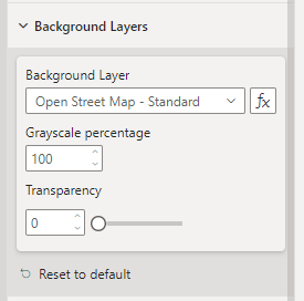
In the more recent versions, you can make any of the background layers greyscale :
You can also set the transparency of the background, which can make it lighter.
Hope this helps
James
- Mark as New
- Bookmark
- Subscribe
- Mute
- Subscribe to RSS Feed
- Permalink
- Report Inappropriate Content
Hi James,
I think I have found a strange interaction with the PlayAxis custom visual. Icon maps seems to use the current value of the PlayAxis visual as a selection instead of a filter. As a result, all data points for all time values are loaded in the visual which may be problematic with small time intervals. Even though I can set the transparency to 0, I encounter performance issues as there are a lot of data points.
Would it be possible to add an option to "clean" the map at each update ? Or am I doing something wrong ?
Thanks in advance !
- Mark as New
- Bookmark
- Subscribe
- Mute
- Subscribe to RSS Feed
- Permalink
- Report Inappropriate Content
To solve this you need to change the visual interactions to be filter, not highlight.
Turn on visual interactions in Power BI: With the Play Axis visual selected, select Format from the toolbar and then toggle "Edit interactions" to be on:
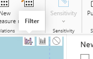
Then with the play Axis still selected, the interaction options should now be shown in the corner of Icon Map. Change from highlight to filter:
- Mark as New
- Bookmark
- Subscribe
- Mute
- Subscribe to RSS Feed
- Permalink
- Report Inappropriate Content
Thank you so much ! Have a nice rest of your day.
- Mark as New
- Bookmark
- Subscribe
- Mute
- Subscribe to RSS Feed
- Permalink
- Report Inappropriate Content
I have an Icon Map visual that shows many customer polygons (farm fields). A requirement that I've been given is that when the map is zoomed out to a certain distance, the polygons disappear and they are simply replaced with "pins" that show where the fields are. Then when the map is zoomed back in, the "pins" disapear and the polygons reappear.
Is this possible?
- Mark as New
- Bookmark
- Subscribe
- Mute
- Subscribe to RSS Feed
- Permalink
- Report Inappropriate Content
Is it possible to bring in a custom background layer from ArcGIS Online? I would do Mapbox but I'd like to avoid exceeding the monthly quota of free tile loads.
Has anyone done so? I've brought in GeoJSON layers from ArcGIS Online, but haven't beena able to work out the steps required to load an AGOL map as a background layer. Thanks!
- Mark as New
- Bookmark
- Subscribe
- Mute
- Subscribe to RSS Feed
- Permalink
- Report Inappropriate Content
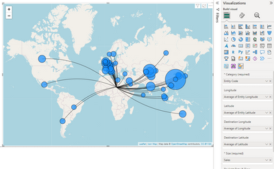
Hi - really keen this visual and I'd like to use it to show where sales are made from (our offices/factories etc) and where they go to (by country). I have a data set that gives my origin Entity by code, to destination country by name, and a couple of reference tables with longitude and latitude values, one for origin and one for destination. These are linked in my model. However when I put the data into the map I get all my origins pointing to the centre of Africa and I can figure out what I'm doing wrong, can anyone help? I'd like to be able to use a slicer to choose origin and show where they sell to and the value of those sales (and maybe have the circle size at destination relative to sales size)
Thanks for any help!!
- Mark as New
- Bookmark
- Subscribe
- Mute
- Subscribe to RSS Feed
- Permalink
- Report Inappropriate Content
I am trying to use the Iconmaps to visualize where people sit in my plant. I used maptiler to convert a High Res PNG to a folder of tiles. I have them locally but cant get it to show the map. Do you have a demonstration on how to get this working?
- Mark as New
- Bookmark
- Subscribe
- Mute
- Subscribe to RSS Feed
- Permalink
- Report Inappropriate Content
Has anyone else used the Auto Zoom to item feature? The description reads like it should zoom to a polygon if I click on it, but I haven't been able to get it to work that way, unfortunately.
- Mark as New
- Bookmark
- Subscribe
- Mute
- Subscribe to RSS Feed
- Permalink
- Report Inappropriate Content
I just exported my report to pdf and the icon map piece says that it doesn't support exporting. Is there any workaround for this or if exporting is a requirement, will I need to use another map visual. If that's the case, are you aware of any other maps that support WKT? From what I've read, the native map visuals that support exporting do not support WKT.
- Mark as New
- Bookmark
- Subscribe
- Mute
- Subscribe to RSS Feed
- Permalink
- Report Inappropriate Content
I am also trying to get this working with a WKT linestring and it appears to ignore the Zoom settings I have applied.
I can select features in the map and cross filter the matching table which is nice but it would be even better if users could work from the table to the map


