Become a Certified Power BI Data Analyst!
Join us for an expert-led overview of the tools and concepts you'll need to pass exam PL-300. The first session starts on June 11th. See you there!
Get registered- Power BI forums
- Get Help with Power BI
- Desktop
- Service
- Report Server
- Power Query
- Mobile Apps
- Developer
- DAX Commands and Tips
- Custom Visuals Development Discussion
- Health and Life Sciences
- Power BI Spanish forums
- Translated Spanish Desktop
- Training and Consulting
- Instructor Led Training
- Dashboard in a Day for Women, by Women
- Galleries
- Webinars and Video Gallery
- Data Stories Gallery
- Themes Gallery
- Contests Gallery
- Quick Measures Gallery
- Notebook Gallery
- Translytical Task Flow Gallery
- R Script Showcase
- Ideas
- Custom Visuals Ideas (read-only)
- Issues
- Issues
- Events
- Upcoming Events
Power BI is turning 10! Let’s celebrate together with dataviz contests, interactive sessions, and giveaways. Register now.
- Power BI forums
- Galleries
- Data Stories Gallery
- Re: HR Dashboard - Exit Survey


- Mark as New
- Bookmark
- Subscribe
- Mute
- Subscribe to RSS Feed
- Permalink
- Report Inappropriate Content
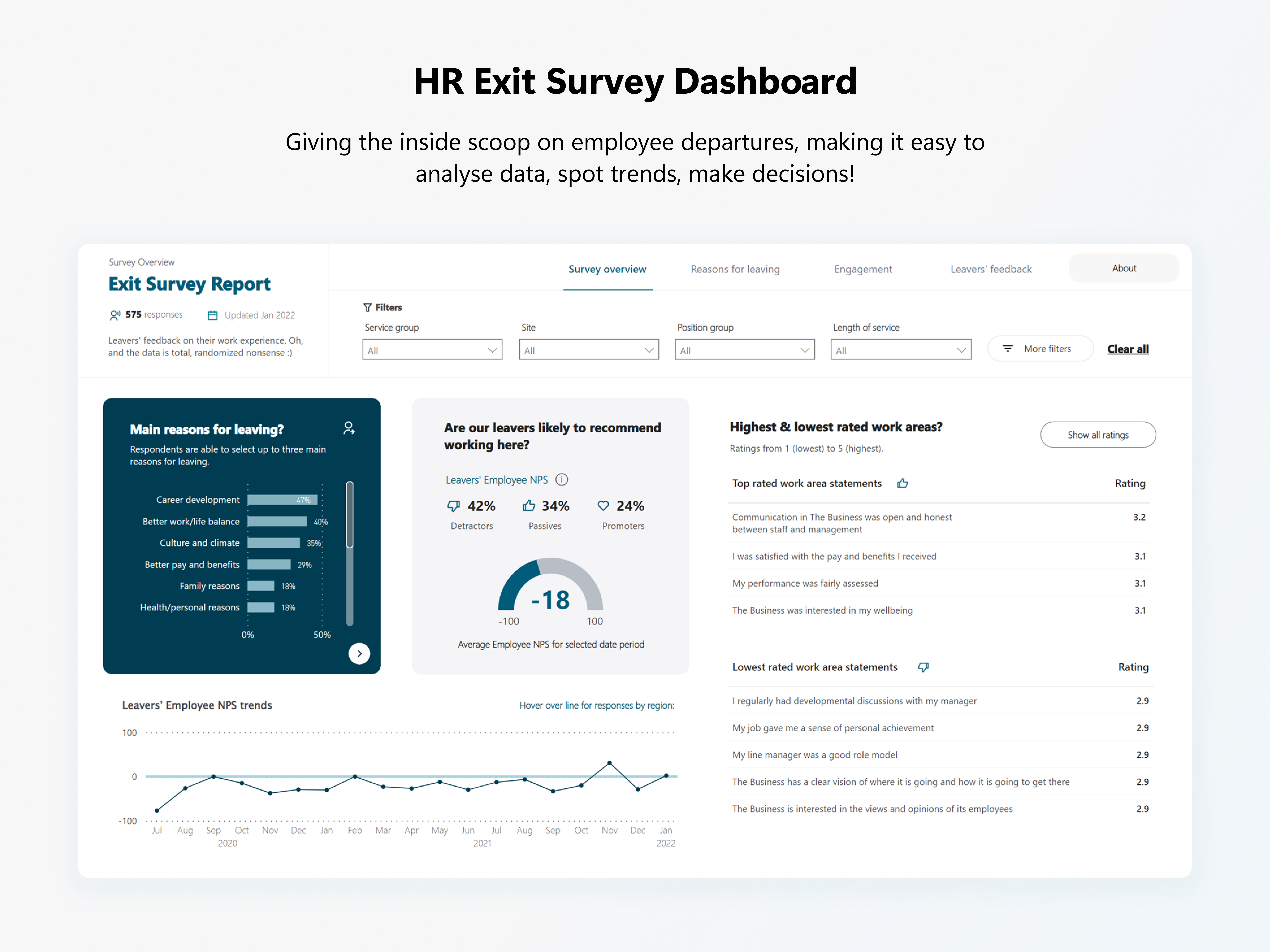
HR Dashboard - Exit Survey
Highlighting Exit Survey Results
Exit survey dashboard built to give managers and HR the inside scoop on employee departures. Making it easy to analyse data, spot trends, and make informed decisions with clear, beautiful visuals.
- Understand key reasons people leave. Explore free text reasons for leaving to inform retention strategies.
- Employee NPS: we ask one last time whether they'd recommend working here. A great source of honest feedback!
- Dig into the work areas people loved, and the areas that could use some love. Use of bookmarks makes it easy to get a different view of the data to uncover insight.
Want to work together or interested in talking Power BI?
I'd love to hear from you!
eyJrIjoiNWY3YTdiMDQtYjYwNS00N2NmLWExOTMtZDAwODcxNWViZGM1IiwidCI6ImIyNjk0YTIyLWJkNGQtNDFhMS05YTY5LWJkYTI1YjlmNWZiNyJ9
- Mark as New
- Bookmark
- Subscribe
- Mute
- Subscribe to RSS Feed
- Permalink
- Report Inappropriate Content
- Mark as New
- Bookmark
- Subscribe
- Mute
- Subscribe to RSS Feed
- Permalink
- Report Inappropriate Content
- Mark as New
- Bookmark
- Subscribe
- Mute
- Subscribe to RSS Feed
- Permalink
- Report Inappropriate Content
Hi,
Really good visuals.
Can you please share the pbix file.
Thanks
- Mark as New
- Bookmark
- Subscribe
- Mute
- Subscribe to RSS Feed
- Permalink
- Report Inappropriate Content
Hi, were you able to receive a pbix file of this dashboard?
- Mark as New
- Bookmark
- Subscribe
- Mute
- Subscribe to RSS Feed
- Permalink
- Report Inappropriate Content
Hi Conor, No unfortunately I haven't had any response at all. If these messages nudge the owner and I get something I'll let you know
- Mark as New
- Bookmark
- Subscribe
- Mute
- Subscribe to RSS Feed
- Permalink
- Report Inappropriate Content
Good Morning Scooner,
I just came across your HR Dashboard - Exit Survey which looks so amazing. Any chance I could get a copy of the PBIX file so I can use your visuals?
Cheers
- Mark as New
- Bookmark
- Subscribe
- Mute
- Subscribe to RSS Feed
- Permalink
- Report Inappropriate Content
Hi @Scooner like others commenting, well thought out dashboard with many helpful features. Do you have plans to share a PBIX file? Congrats on a great product!
Sloan
- Mark as New
- Bookmark
- Subscribe
- Mute
- Subscribe to RSS Feed
- Permalink
- Report Inappropriate Content
Hi, I like the heat-map slide, Great Work
- Mark as New
- Bookmark
- Subscribe
- Mute
- Subscribe to RSS Feed
- Permalink
- Report Inappropriate Content
Hi @Scooner , This is a great looking template. I'm new to both HR & PBI, would it be possible to share the pbix or give an insight into where the survey data has come from so I can try and learn, any advice, pointers would be great, thanks in advance
- Mark as New
- Bookmark
- Subscribe
- Mute
- Subscribe to RSS Feed
- Permalink
- Report Inappropriate Content
Hi I would love to see how these metrics were created. Could you upload the PBIX file for this?
- Mark as New
- Bookmark
- Subscribe
- Mute
- Subscribe to RSS Feed
- Permalink
- Report Inappropriate Content
Can you upload a pbix to download? I would love to be able to build this as a template. Thanks!
- Mark as New
- Bookmark
- Subscribe
- Mute
- Subscribe to RSS Feed
- Permalink
- Report Inappropriate Content
This is great looking!
I'm curious, under the Engagement Section for "Empowerment" & "Just Culture" questions, is your survey a 1-10 ranking?
I know it's not BI specific, but just looking for the best way to present this data.
Thank you
- Mark as New
- Bookmark
- Subscribe
- Mute
- Subscribe to RSS Feed
- Permalink
- Report Inappropriate Content
Thanks heaps @Anonymous!
That's right - the first two questions use an 'NPS' calculation so scores range from -100 to 100. The Empowerment and Culture questions just take the average of 0 to 10. It's a fair point, users need to catch on to the different labels to spot that. Otherwise they'd think those latter question results are hugely better than the first two!
On the actual dashboard I have little text boxes pointing that out (I'll copy it over here soon). Wasn't too sure how else to visualise the difference in scale!
Cheers!
- Mark as New
- Bookmark
- Subscribe
- Mute
- Subscribe to RSS Feed
- Permalink
- Report Inappropriate Content
- Mark as New
- Bookmark
- Subscribe
- Mute
- Subscribe to RSS Feed
- Permalink
- Report Inappropriate Content
Great...thank you!
It's a great looking dashboard...is it available for download, would love to use it.
Thanks again!