Join us at FabCon Vienna from September 15-18, 2025
The ultimate Fabric, Power BI, SQL, and AI community-led learning event. Save €200 with code FABCOMM.
Get registered- Power BI forums
- Get Help with Power BI
- Desktop
- Service
- Report Server
- Power Query
- Mobile Apps
- Developer
- DAX Commands and Tips
- Custom Visuals Development Discussion
- Health and Life Sciences
- Power BI Spanish forums
- Translated Spanish Desktop
- Training and Consulting
- Instructor Led Training
- Dashboard in a Day for Women, by Women
- Galleries
- Data Stories Gallery
- Themes Gallery
- Contests Gallery
- Quick Measures Gallery
- Notebook Gallery
- Translytical Task Flow Gallery
- TMDL Gallery
- R Script Showcase
- Webinars and Video Gallery
- Ideas
- Custom Visuals Ideas (read-only)
- Issues
- Issues
- Events
- Upcoming Events
Enhance your career with this limited time 50% discount on Fabric and Power BI exams. Ends August 31st. Request your voucher.
- Power BI forums
- Galleries
- Data Stories Gallery
- Re: Global CO2 Emissions Analysis (Power BI for En...
Re: Global CO2 Emissions Analysis (Power BI for Environment)
01-01-2023 05:24 AM


- Mark as New
- Bookmark
- Subscribe
- Mute
- Subscribe to RSS Feed
- Permalink
- Report Inappropriate Content
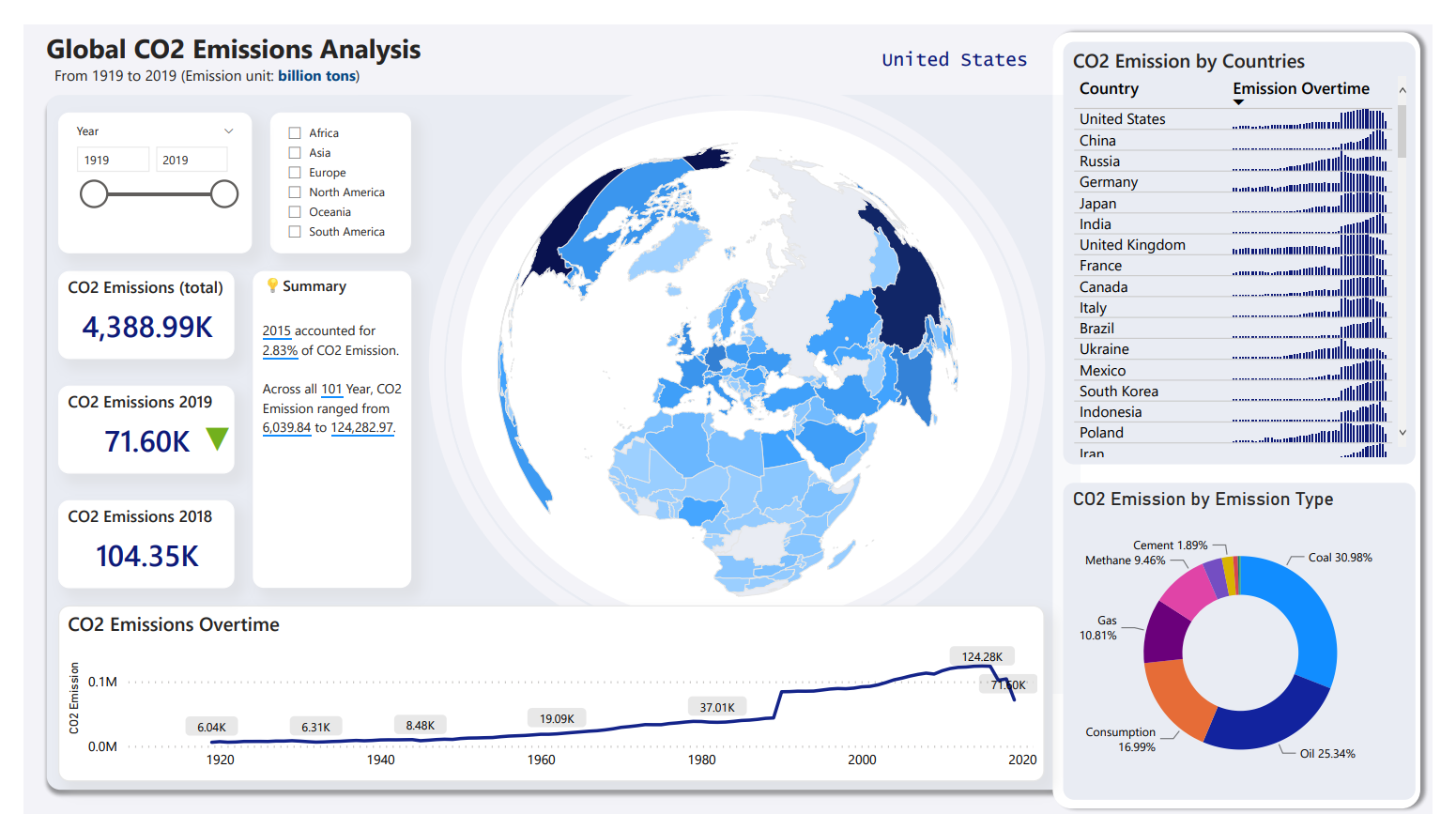
Global CO2 Emissions Analysis (Power BI for Environment)
Build an interactive dashboard for Global CO2 Emissions Analysis.
CO2 Emissions globally impacting the world in different ways. i have tried to create some CO2 Emissions analysis at region level and country level to see how CO2 Emission impacting globally over time
Some insights from analysis :-
1- Trend of CO2 Emissions over time at region/country level. At what intensity the CO2 Emission is increasing
2- Which Country have improved overtime.
3 -Which Country have gone worse overtime.
4- CO2 Emission types.
eyJrIjoiYmVkMWExZjItZWJkOC00YTc5LWFkMzEtNGQyNDAwMTE5YWMyIiwidCI6ImQ4ZTFiMDVlLTcwYWEtNGVmNy1iODc4LTQ2NmI2ODhmOTUyZiJ9
- Mark as New
- Bookmark
- Subscribe
- Mute
- Subscribe to RSS Feed
- Permalink
- Report Inappropriate Content
¿Dónde tomas los datos?
- Mark as New
- Bookmark
- Subscribe
- Mute
- Subscribe to RSS Feed
- Permalink
- Report Inappropriate Content
Estoy aprendiendo Power BI, consulta de dónde tomas los datos
- Mark as New
- Bookmark
- Subscribe
- Mute
- Subscribe to RSS Feed
- Permalink
- Report Inappropriate Content
can you please share pbix file?
- Mark as New
- Bookmark
- Subscribe
- Mute
- Subscribe to RSS Feed
- Permalink
- Report Inappropriate Content
can you please share pbix file
- Mark as New
- Bookmark
- Subscribe
- Mute
- Subscribe to RSS Feed
- Permalink
- Report Inappropriate Content
would I know what is the earth visual name ?
or send .pbix file
- Mark as New
- Bookmark
- Subscribe
- Mute
- Subscribe to RSS Feed
- Permalink
- Report Inappropriate Content
you can dirctly download this visual from Github
- Mark as New
- Bookmark
- Subscribe
- Mute
- Subscribe to RSS Feed
- Permalink
- Report Inappropriate Content
can you send the link of Github
- Mark as New
- Bookmark
- Subscribe
- Mute
- Subscribe to RSS Feed
- Permalink
- Report Inappropriate Content
Hi,
you can try this for world map visual
https://github.com/deldersveld/topojson/blob/master/world-countries.json
- Mark as New
- Bookmark
- Subscribe
- Mute
- Subscribe to RSS Feed
- Permalink
- Report Inappropriate Content
Thanks
I have download the globe from Github
- Mark as New
- Bookmark
- Subscribe
- Mute
- Subscribe to RSS Feed
- Permalink
- Report Inappropriate Content
Where i can downlad ,i am new to Github ,can anyone guide
- Mark as New
- Bookmark
- Subscribe
- Mute
- Subscribe to RSS Feed
- Permalink
- Report Inappropriate Content
Can you share the link, please?
- Mark as New
- Bookmark
- Subscribe
- Mute
- Subscribe to RSS Feed
- Permalink
- Report Inappropriate Content
Beautiful. Where did you get the globle visual?