Fabric Data Days starts November 4th!
Advance your Data & AI career with 50 days of live learning, dataviz contests, hands-on challenges, study groups & certifications and more!
Get registered- Power BI forums
- Get Help with Power BI
- Desktop
- Service
- Report Server
- Power Query
- Mobile Apps
- Developer
- DAX Commands and Tips
- Custom Visuals Development Discussion
- Health and Life Sciences
- Power BI Spanish forums
- Translated Spanish Desktop
- Training and Consulting
- Instructor Led Training
- Dashboard in a Day for Women, by Women
- Galleries
- Data Stories Gallery
- Themes Gallery
- Contests Gallery
- QuickViz Gallery
- Quick Measures Gallery
- Visual Calculations Gallery
- Notebook Gallery
- Translytical Task Flow Gallery
- TMDL Gallery
- R Script Showcase
- Webinars and Video Gallery
- Ideas
- Custom Visuals Ideas (read-only)
- Issues
- Issues
- Events
- Upcoming Events
Get Fabric Certified for FREE during Fabric Data Days. Don't miss your chance! Request now
- Power BI forums
- Galleries
- Data Stories Gallery
- Re: Example of Integrating Visio with Power BI
Re: Example of Integrating Visio with Power BI
04-18-2020 18:26 PM


- Mark as New
- Bookmark
- Subscribe
- Mute
- Subscribe to RSS Feed
- Permalink
- Report Inappropriate Content
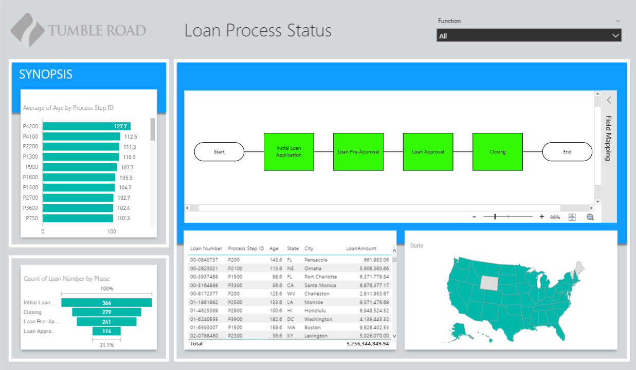
Example of Integrating Visio with Power BI
This data story illustrates how an existing Visio diagram can be inserted into a Power BI report and used as a heat map. The details on how this was done are posted here.
Visio can be used to add items such as floor plans, organizational charts and process maps to your report. Since the diagram becomes clickable, it can act as a visual slicer, where clicking a specific person in an org chart filters the entire report for that person.
Also, the integration is easy to do. If you have access to a Visio diagram, even if you don't have edit rights to it, you can incorporate it into your report.
eyJrIjoiMWQwYWU4MTgtYjZkMi00NDA5LWIyZWItMzYwMjA3NGQ5ZmZhIiwidCI6IjA5ODQ4YTQ5LTRiMDEtNGFkNS05YzIyLWFlNjdjOWRlODVjNCIsImMiOjZ9
- Mark as New
- Bookmark
- Subscribe
- Mute
- Subscribe to RSS Feed
- Permalink
- Report Inappropriate Content
Nice visual. Just curious as to why the link shows as expired? Thanks.