FabCon is coming to Atlanta
Join us at FabCon Atlanta from March 16 - 20, 2026, for the ultimate Fabric, Power BI, AI and SQL community-led event. Save $200 with code FABCOMM.
Register now!- Power BI forums
- Get Help with Power BI
- Desktop
- Service
- Report Server
- Power Query
- Mobile Apps
- Developer
- DAX Commands and Tips
- Custom Visuals Development Discussion
- Health and Life Sciences
- Power BI Spanish forums
- Translated Spanish Desktop
- Training and Consulting
- Instructor Led Training
- Dashboard in a Day for Women, by Women
- Galleries
- Data Stories Gallery
- Themes Gallery
- Contests Gallery
- Quick Measures Gallery
- Notebook Gallery
- Translytical Task Flow Gallery
- TMDL Gallery
- R Script Showcase
- Webinars and Video Gallery
- Ideas
- Custom Visuals Ideas (read-only)
- Issues
- Issues
- Events
- Upcoming Events
Calling all Data Engineers! Fabric Data Engineer (Exam DP-700) live sessions are back! Starting October 16th. Sign up.
- Power BI forums
- Forums
- Get Help with Power BI
- DAX Commands and Tips
- percentage along x-axis
- Subscribe to RSS Feed
- Mark Topic as New
- Mark Topic as Read
- Float this Topic for Current User
- Bookmark
- Subscribe
- Printer Friendly Page
- Mark as New
- Bookmark
- Subscribe
- Mute
- Subscribe to RSS Feed
- Permalink
- Report Inappropriate Content
percentage along x-axis
Hi everyone.
I have two columns:
I want a bar chart whit the percentage of notes related to the number of students. ej: "50% of the id_alumno have note =8"
If we see now , my bar chart is a count of id_alumno with a note:
What is the measure that i need?
Tanks!!
Solved! Go to Solution.
- Mark as New
- Bookmark
- Subscribe
- Mute
- Subscribe to RSS Feed
- Permalink
- Report Inappropriate Content
Hi,
there are several possibilities.
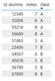
To illustrate them, I created some sample data (and added another column for a class or course).
Table "Notes":
I see three options:
1. Maybe another visual is already what you need
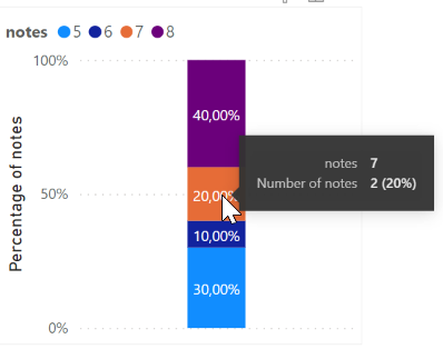
If you choose a stacked column chart (100%), it already shows you the percentages - but all in one column. (Put the "notes" in Legend and the Quick-Measure "number of notes" in Values).
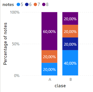
You could also put the column "clase" in the Axis, then you get one column per class.
2. Measure for percentage comparison with total number
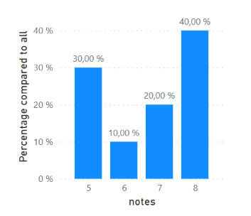
If you want to have columns next to each other, you can use the following measure:
Percentage of notes =
DIVIDE (
COUNTROWS(Notes),
CALCULATE(
COUNTROWS(Notes),
REMOVEFILTERS(Notes)
)
)
With this, the visualizations above but also the following visualization is possible:
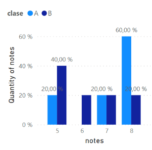
But if you add the classes (in the Legend), the result might not be what you want:
As you can see, the percentage is calculated to the total number of notes (rows), not to the total number of notes of the specific class.
Therefore, the third solution comes into play:
3. Measure for percentage comparison with subsets
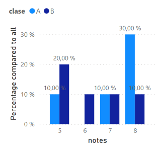
In the previous measure, the filtered number of rows is always compared with the total number. But sometimes you want to compare only with a subset, e.g. with the total number within the class:
In that case you would have to adjust the measure and remove only the filter on the "notes" column:
Percentage of notes compared to subsets =
DIVIDE (
COUNTROWS(Notes),
CALCULATE(
COUNTROWS(Notes),
REMOVEFILTERS(Notes[notes])
)
)
Now, you can show the following with percentages relative to each class:
I hope this helps.
- Mark as New
- Bookmark
- Subscribe
- Mute
- Subscribe to RSS Feed
- Permalink
- Report Inappropriate Content
Hi,
You did specify you wanted a bar chart, but typically when displaying this kind of data I would use a combo chart. So keep the bars as they are and use a line to display the percentages. This way you get the same information, but you don't have to deal with bucketing and overly complicated dax. For the line measure somethin like this ought to do: DIVIDE(COUNT(table[Notes]),CALCULATE(COUNT(Table[Notes]),ALL(Table))))
Did I answer your question? Mark my post as a solution!
Proud to be a Super User!
- Mark as New
- Bookmark
- Subscribe
- Mute
- Subscribe to RSS Feed
- Permalink
- Report Inappropriate Content
@Dgpte , Not very create. But you need to use binning or bucketing.
In your case, you might have to create a table with a range of each 1 %
Dynamic Segmentation Bucketing Binning
https://community.powerbi.com/t5/Quick-Measures-Gallery/Dynamic-Segmentation-Bucketing-Binning/m-p/1...
Dynamic Segmentation, Bucketing or Binning: https://youtu.be/CuczXPj0N-k
Helpful resources

FabCon Global Hackathon
Join the Fabric FabCon Global Hackathon—running virtually through Nov 3. Open to all skill levels. $10,000 in prizes!

Power BI Monthly Update - September 2025
Check out the September 2025 Power BI update to learn about new features.

| User | Count |
|---|---|
| 9 | |
| 8 | |
| 7 | |
| 4 | |
| 3 |


