Huge last-minute discounts for FabCon Vienna from September 15-18, 2025
Supplies are limited. Contact info@espc.tech right away to save your spot before the conference sells out.
Get your discount- Power BI forums
- Get Help with Power BI
- Desktop
- Service
- Report Server
- Power Query
- Mobile Apps
- Developer
- DAX Commands and Tips
- Custom Visuals Development Discussion
- Health and Life Sciences
- Power BI Spanish forums
- Translated Spanish Desktop
- Training and Consulting
- Instructor Led Training
- Dashboard in a Day for Women, by Women
- Galleries
- Data Stories Gallery
- Themes Gallery
- Contests Gallery
- Quick Measures Gallery
- Notebook Gallery
- Translytical Task Flow Gallery
- TMDL Gallery
- R Script Showcase
- Webinars and Video Gallery
- Ideas
- Custom Visuals Ideas (read-only)
- Issues
- Issues
- Events
- Upcoming Events
Score big with last-minute savings on the final tickets to FabCon Vienna. Secure your discount
- Power BI forums
- Forums
- Get Help with Power BI
- DAX Commands and Tips
- choose the right filter context in measure to comp...
- Subscribe to RSS Feed
- Mark Topic as New
- Mark Topic as Read
- Float this Topic for Current User
- Bookmark
- Subscribe
- Printer Friendly Page
- Mark as New
- Bookmark
- Subscribe
- Mute
- Subscribe to RSS Feed
- Permalink
- Report Inappropriate Content
choose the right filter context in measure to compare to wider category
Hi,
I have the following data:
| Sale ID | Sales Rep | Location | Success |
| 1 | Daniel | US | Yes |
| 2 | Michael | Canada | Yes |
| 3 | Yolanda | US | Yes |
| 4 | Yolanda | US | Yes |
| 5 | Lily | Europe | Yes |
| 6 | Lily | Europe | Yes |
| 7 | Michael | Canada | Yes |
| 8 | Michael | Canada | Yes |
| 9 | Michael | Canada | Yes |
| 10 | Lily | Europe | Yes |
| 11 | Daniel | US | Yes |
| 12 | Michael | Canada | No |
| 13 | Yolanda | US | No |
| 14 | Yolanda | US | No |
| 15 | Daniel | US | No |
| 16 | Lily | Europe | No |
| 17 | Lily | Europe | No |
| 18 | Daniel | US | No |
| 19 | Ann | Europe | No |
| 20 | Ann | Europe | No |
| 21 | Ann | Europe | Yes |
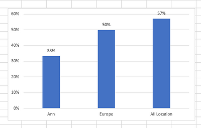
I want to show in one visualization the success rate of the rep compared to the success rate in the rep's location and separately compared to all.
The idea is that the user will filter a specific rep and will get the following chart:
I added the following calculated measures:
1.
Total sucess = CALCULATE(
COUNT(
Sales[Sale ID]),
Sales[Sucess] = "Yes")
2.
Total Sales = COUNTROWS(Sales)
3.
Success % =
DIVIDE(
[Total sucess],
[Total Sales ])
4. Success % (My Location) =
CALCULATE(
[Success %],
ALL(Sales[Sales Rep]))
I was expecting [Success % (My Location) ] (#4 above) to give me the the middle column of the chart above, but it actually gives me the right one (all locations).
So when I filter rep (Ann for example), the query shows that this rep location is Europe. I want to create a measure that when the user is filtered, the user location is also filterred without the need to actively filter the location.
Hope this is clear..
Thanks!
Solved! Go to Solution.
- Mark as New
- Bookmark
- Subscribe
- Mute
- Subscribe to RSS Feed
- Permalink
- Report Inappropriate Content
Having said that, this is the DAX forum so let's see if we can get your exact output...
The first issue is that values that appear in the x-axis of a chart need to all be in a single column. The desired chart has a mix of Sales Reps, Locations and an 'All Locations', so we'll need to create a table that has a column containing all these values. Here's some DAX to create that table:
Chart Levels =
UNION(
    ROW("Name", "All Locations", "Level", "All", "Order", 3),
    ADDCOLUMNS(
        VALUES(Sales[Sales Rep]),
        "Level", "Sales Rep",
        "Order", 1
    ),
    ADDCOLUMNS(
        VALUES(Sales[Location]),
        "Level", "Location",
        "Order", 2
    )
)
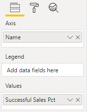
Now we can use Name column of this table in the Axis field well of the chart
The measure is:
Successful Sales Pct =
VAR _Name = SELECTEDVALUE('Chart Levels'[Name])
VAR _Rep = SELECTEDVALUE(Sales[Sales Rep])
VAR _Location = SELECTEDVALUE(Sales[Location])
VAR _Result =
SWITCH(
    SELECTEDVALUE('Chart Levels'[Level]),
    "All",
    DIVIDE(
        CALCULATE(COUNTROWS(Sales), REMOVEFILTERS(), Sales[Success] = "Yes"),
        CALCULATE(COUNTROWS(Sales), REMOVEFILTERS())
    ),
    "Location",
    DIVIDE(
        CALCULATE(COUNTROWS(Sales), REMOVEFILTERS(), Sales[Location] = _Name, Sales[Location] = COALESCE(_Location, _Name), Sales[Success] = "Yes"),
        CALCULATE(COUNTROWS(Sales), REMOVEFILTERS(), Sales[Location] = _Name, Sales[Location] = COALESCE(_Location, _Name))
    ),
    "Sales Rep",
    DIVIDE(
        CALCULATE(COUNTROWS(Sales), Sales[Sales Rep] = _Name, Sales[Sales Rep] = COALESCE(_Rep, _Name), Sales[Success] = "Yes"),
        CALCULATE(COUNTROWS(Sales), Sales[Sales Rep] = _Name, Sales[Sales Rep] = COALESCE(_Rep, _Name))
    )
)
RETURN
    _Result
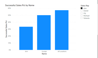
That'll allow us to use Sales[Sales Rep] as a slicer and get the following output when a rep is selected:
- Mark as New
- Bookmark
- Subscribe
- Mute
- Subscribe to RSS Feed
- Permalink
- Report Inappropriate Content
@PaulOlding thanks a lot. showing in different visualizations is possible, but becuase the user needs it for comparation of one rep to the wider population, I wanted to show in one.
Your solution worked for the sample I provided, for some reason it doesn't work on my actual data, (it only shows the bar of all locations). I will try to better understand the measure you wrote and what needs to be adjusted.
- Mark as New
- Bookmark
- Subscribe
- Mute
- Subscribe to RSS Feed
- Permalink
- Report Inappropriate Content
Hi @Anonymous
It's possible to create a report for this analysis without any complex DAX. Your Success % measure would do it.
You'd need 3 visuals, one for Sales Rep, one for Location and One for Overall. The Sales Rep visual and Location visual should have the edit interactions property set to 'no interaction' with the Overall visual:
The user would be able to click on a sales rep in the Sales Rep visual and, with cross-highlighting, show how that sales rep compares with their Location
- Mark as New
- Bookmark
- Subscribe
- Mute
- Subscribe to RSS Feed
- Permalink
- Report Inappropriate Content
Having said that, this is the DAX forum so let's see if we can get your exact output...
The first issue is that values that appear in the x-axis of a chart need to all be in a single column. The desired chart has a mix of Sales Reps, Locations and an 'All Locations', so we'll need to create a table that has a column containing all these values. Here's some DAX to create that table:
Chart Levels =
UNION(
    ROW("Name", "All Locations", "Level", "All", "Order", 3),
    ADDCOLUMNS(
        VALUES(Sales[Sales Rep]),
        "Level", "Sales Rep",
        "Order", 1
    ),
    ADDCOLUMNS(
        VALUES(Sales[Location]),
        "Level", "Location",
        "Order", 2
    )
)
Now we can use Name column of this table in the Axis field well of the chart
The measure is:
Successful Sales Pct =
VAR _Name = SELECTEDVALUE('Chart Levels'[Name])
VAR _Rep = SELECTEDVALUE(Sales[Sales Rep])
VAR _Location = SELECTEDVALUE(Sales[Location])
VAR _Result =
SWITCH(
    SELECTEDVALUE('Chart Levels'[Level]),
    "All",
    DIVIDE(
        CALCULATE(COUNTROWS(Sales), REMOVEFILTERS(), Sales[Success] = "Yes"),
        CALCULATE(COUNTROWS(Sales), REMOVEFILTERS())
    ),
    "Location",
    DIVIDE(
        CALCULATE(COUNTROWS(Sales), REMOVEFILTERS(), Sales[Location] = _Name, Sales[Location] = COALESCE(_Location, _Name), Sales[Success] = "Yes"),
        CALCULATE(COUNTROWS(Sales), REMOVEFILTERS(), Sales[Location] = _Name, Sales[Location] = COALESCE(_Location, _Name))
    ),
    "Sales Rep",
    DIVIDE(
        CALCULATE(COUNTROWS(Sales), Sales[Sales Rep] = _Name, Sales[Sales Rep] = COALESCE(_Rep, _Name), Sales[Success] = "Yes"),
        CALCULATE(COUNTROWS(Sales), Sales[Sales Rep] = _Name, Sales[Sales Rep] = COALESCE(_Rep, _Name))
    )
)
RETURN
    _Result
That'll allow us to use Sales[Sales Rep] as a slicer and get the following output when a rep is selected:
Helpful resources
| User | Count |
|---|---|
| 12 | |
| 11 | |
| 8 | |
| 7 | |
| 6 |
| User | Count |
|---|---|
| 25 | |
| 19 | |
| 14 | |
| 10 | |
| 7 |


