FabCon is coming to Atlanta
Join us at FabCon Atlanta from March 16 - 20, 2026, for the ultimate Fabric, Power BI, AI and SQL community-led event. Save $200 with code FABCOMM.
Register now!- Power BI forums
- Get Help with Power BI
- Desktop
- Service
- Report Server
- Power Query
- Mobile Apps
- Developer
- DAX Commands and Tips
- Custom Visuals Development Discussion
- Health and Life Sciences
- Power BI Spanish forums
- Translated Spanish Desktop
- Training and Consulting
- Instructor Led Training
- Dashboard in a Day for Women, by Women
- Galleries
- Data Stories Gallery
- Themes Gallery
- Contests Gallery
- QuickViz Gallery
- Quick Measures Gallery
- Visual Calculations Gallery
- Notebook Gallery
- Translytical Task Flow Gallery
- TMDL Gallery
- R Script Showcase
- Webinars and Video Gallery
- Ideas
- Custom Visuals Ideas (read-only)
- Issues
- Issues
- Events
- Upcoming Events
The Power BI Data Visualization World Championships is back! Get ahead of the game and start preparing now! Learn more
- Power BI forums
- Forums
- Get Help with Power BI
- DAX Commands and Tips
- Why does my Dax Measure not caclulate all values w...
- Subscribe to RSS Feed
- Mark Topic as New
- Mark Topic as Read
- Float this Topic for Current User
- Bookmark
- Subscribe
- Printer Friendly Page
- Mark as New
- Bookmark
- Subscribe
- Mute
- Subscribe to RSS Feed
- Permalink
- Report Inappropriate Content
Why does my Dax Measure not caclulate all values when I add a date from the Date_Table?
The task is to show two measures for Projects on a line graph, one being the actual hours worked each week, the other being a forecast of how many hours might be worked to fit the budget. I have a measure set that calulates this approximation.
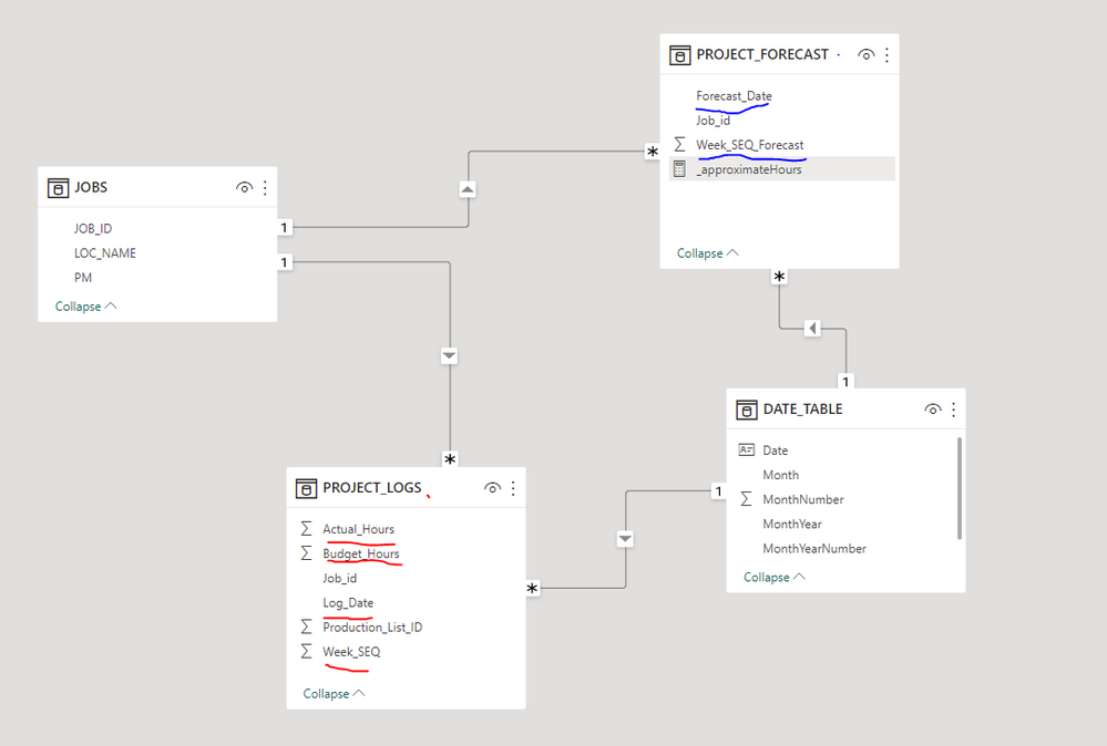
Photo's will be the easiest to explain, I have a sample set of the model here. There are two fact tables, one being Project_Forecast and
The Date_Table is so the values can share a common X-axis.
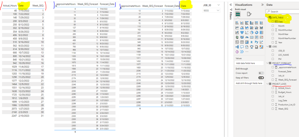
Here are some values for selected job 9555.
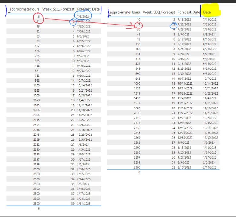
As you can see, the leftmost table for actual hours and the middle table for forecasted is correct, though when I add the Date column to the forecasted hours it cuts the dates to the actuals. Week_Seq# refers to what week of the project it is.
How can I join these two metrics together without truncating/shorting the forecasted hours?
Here is my measure for the Approximate_Hours.
Feel free to critique my data model if any changes should be made, or if you need the sample .pbix. Just trying to figure out why the forecast does not include the full range of weeks when the date_table is added.
Thank you!
Solved! Go to Solution.
- Mark as New
- Bookmark
- Subscribe
- Mute
- Subscribe to RSS Feed
- Permalink
- Report Inappropriate Content
Hi @CJBoelt ,
he calculaction seems to swith per one row:
6+11 = 17. Perhaps only a random event? First i would try to find out why 7/8/2022 is missing. Is this Date in the Date_table? Are you able to share the PBI without sensitve data via ondrive or dropbox?
Did I answer your question? Mark my post as a solution!
Proud to be a Super User!
Helpful resources

Power BI Dataviz World Championships
The Power BI Data Visualization World Championships is back! Get ahead of the game and start preparing now!

Power BI Monthly Update - November 2025
Check out the November 2025 Power BI update to learn about new features.

| User | Count |
|---|---|
| 19 | |
| 10 | |
| 9 | |
| 4 | |
| 4 |
| User | Count |
|---|---|
| 34 | |
| 32 | |
| 20 | |
| 12 | |
| 11 |


