FabCon is coming to Atlanta
Join us at FabCon Atlanta from March 16 - 20, 2026, for the ultimate Fabric, Power BI, AI and SQL community-led event. Save $200 with code FABCOMM.
Register now!- Power BI forums
- Get Help with Power BI
- Desktop
- Service
- Report Server
- Power Query
- Mobile Apps
- Developer
- DAX Commands and Tips
- Custom Visuals Development Discussion
- Health and Life Sciences
- Power BI Spanish forums
- Translated Spanish Desktop
- Training and Consulting
- Instructor Led Training
- Dashboard in a Day for Women, by Women
- Galleries
- Data Stories Gallery
- Themes Gallery
- Contests Gallery
- Quick Measures Gallery
- Visual Calculations Gallery
- Notebook Gallery
- Translytical Task Flow Gallery
- TMDL Gallery
- R Script Showcase
- Webinars and Video Gallery
- Ideas
- Custom Visuals Ideas (read-only)
- Issues
- Issues
- Events
- Upcoming Events
Calling all Data Engineers! Fabric Data Engineer (Exam DP-700) live sessions are back! Starting October 16th. Sign up.
- Power BI forums
- Forums
- Get Help with Power BI
- DAX Commands and Tips
- Re: Weekly data and slicer
- Subscribe to RSS Feed
- Mark Topic as New
- Mark Topic as Read
- Float this Topic for Current User
- Bookmark
- Subscribe
- Printer Friendly Page
- Mark as New
- Bookmark
- Subscribe
- Mute
- Subscribe to RSS Feed
- Permalink
- Report Inappropriate Content
Weekly data and slicer
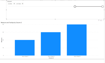
Have a graph that uses a Slicer (using between) and a measure to get each week per a column of the dates we reference.

If you move the slider to another month the weeks become out of order, even if you resort the axis it may not correct the issue.

- Mark as New
- Bookmark
- Subscribe
- Mute
- Subscribe to RSS Feed
- Permalink
- Report Inappropriate Content
MonthWeek column does not appear in Transform Data, unfortunately cannot share my pbix file as it is proprietary as it is FED data. Is there a way to rewrite my current column
- Mark as New
- Bookmark
- Subscribe
- Mute
- Subscribe to RSS Feed
- Permalink
- Report Inappropriate Content
@BratKat, changing your analysis to the week of the year would give you better results as week of month analysis is fundamentally flawed for comparable analysis.
If you are slicing by month & week, you will get strange and incomparable results in your visualizations. I would suggest not going about it this way. For example, if the first or last week of the month had anything other than 7 days in them (which they always do), then they would not be comparable to anything and would give misleading results.
- Mark as New
- Bookmark
- Subscribe
- Mute
- Subscribe to RSS Feed
- Permalink
- Report Inappropriate Content
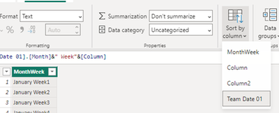
Tried the first method (Click the MonthWeek column, then select sort by [Team Date 01] column) and recieved this message
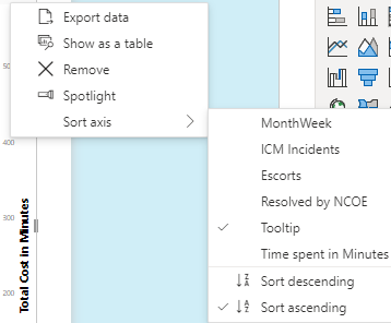
Yes I added the measure to the tooltip for the graph
- Mark as New
- Bookmark
- Subscribe
- Mute
- Subscribe to RSS Feed
- Permalink
- Report Inappropriate Content
Hi @BratKat
Can you show me some sample data of the [Team Date 01] column? Because the two ways can work on my pbix file.
Best Regards!
Yolo Zhu
- Mark as New
- Bookmark
- Subscribe
- Mute
- Subscribe to RSS Feed
- Permalink
- Report Inappropriate Content
Example of column
- Mark as New
- Bookmark
- Subscribe
- Mute
- Subscribe to RSS Feed
- Permalink
- Report Inappropriate Content
Hi @BratKat
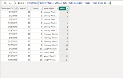
Please try to keep the ascending ranking of the [Team Date 01], then create a calculated column
e.g
Index = COUNTROWS(FILTER('Table',[Team Date 01]<=EARLIER('Table'[Team Date 01])))Then modify the Tooltip measure.
Best Regards!
Yolo Zhu
If this post helps, then please consider Accept it as the solution to help the other members find it more quickly.
- Mark as New
- Bookmark
- Subscribe
- Mute
- Subscribe to RSS Feed
- Permalink
- Report Inappropriate Content
The MonthWeek item is a measure in my data so does not appear in looking at the data in Transform, tried you method but made it worse. Is there a way I can format the date to appear instead of for example. January Week 1 to appear as 1 Week January so I can sort numerically ? Thank you
- Mark as New
- Bookmark
- Subscribe
- Mute
- Subscribe to RSS Feed
- Permalink
- Report Inappropriate Content
Hi @BratKat
Modify the Tooltip measure.
Best Regards!
Yolo Zhu
If this post helps, then please consider Accept it as the solution to help the other members find it more quickly.
- Mark as New
- Bookmark
- Subscribe
- Mute
- Subscribe to RSS Feed
- Permalink
- Report Inappropriate Content
Its possible may be creating the graph wrong. Am using my MonthWeek measure in the Slicer but using the Team Date in the X-Axis. Could that be an issue ? I did try using the Team Date in the Slicer however then I did not have the option of using "between" in the Slicer.
- Mark as New
- Bookmark
- Subscribe
- Mute
- Subscribe to RSS Feed
- Permalink
- Report Inappropriate Content
Hi @BratKat
1.Click the MonthWeek column, then select sort by [Team Date 01] column
Then put the MonthWeek column to the visual
Output
2.You can create a measure
e.g
Tooltip=SUM('Work Items'[Team Date 01])
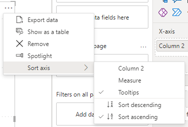
Then put it to the tooltips, and select "..." of the visual and select sort by "Tooltips" and "ascending"
Then, no matter how you filter the slicer, it can appear in increasing order.
Output
Best Regards!
Yolo Zhu
If this post helps, then please consider Accept it as the solution to help the other members find it more quickly.
- Mark as New
- Bookmark
- Subscribe
- Mute
- Subscribe to RSS Feed
- Permalink
- Report Inappropriate Content
Additional information:
The Team Date is from AzDo Work Items as the date of the task per item.
- Mark as New
- Bookmark
- Subscribe
- Mute
- Subscribe to RSS Feed
- Permalink
- Report Inappropriate Content
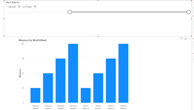
Thank you, I tried this however it didn't resolve -
Even if I change the sort method, still off.
Measure created =
- Mark as New
- Bookmark
- Subscribe
- Mute
- Subscribe to RSS Feed
- Permalink
- Report Inappropriate Content
Hi @BratKat
Did you put the measure to the tooltip, and you can try the first method I have offered, after testing, it can be work.
Best Regards!
Yolo Zhu
Helpful resources

FabCon Global Hackathon
Join the Fabric FabCon Global Hackathon—running virtually through Nov 3. Open to all skill levels. $10,000 in prizes!

Power BI Monthly Update - October 2025
Check out the October 2025 Power BI update to learn about new features.

| User | Count |
|---|---|
| 9 | |
| 6 | |
| 3 | |
| 3 | |
| 3 |
| User | Count |
|---|---|
| 13 | |
| 11 | |
| 9 | |
| 8 | |
| 8 |


