FabCon is coming to Atlanta
Join us at FabCon Atlanta from March 16 - 20, 2026, for the ultimate Fabric, Power BI, AI and SQL community-led event. Save $200 with code FABCOMM.
Register now!- Power BI forums
- Get Help with Power BI
- Desktop
- Service
- Report Server
- Power Query
- Mobile Apps
- Developer
- DAX Commands and Tips
- Custom Visuals Development Discussion
- Health and Life Sciences
- Power BI Spanish forums
- Translated Spanish Desktop
- Training and Consulting
- Instructor Led Training
- Dashboard in a Day for Women, by Women
- Galleries
- Data Stories Gallery
- Themes Gallery
- Contests Gallery
- Quick Measures Gallery
- Visual Calculations Gallery
- Notebook Gallery
- Translytical Task Flow Gallery
- TMDL Gallery
- R Script Showcase
- Webinars and Video Gallery
- Ideas
- Custom Visuals Ideas (read-only)
- Issues
- Issues
- Events
- Upcoming Events
Calling all Data Engineers! Fabric Data Engineer (Exam DP-700) live sessions are back! Starting October 16th. Sign up.
- Power BI forums
- Forums
- Get Help with Power BI
- DAX Commands and Tips
- Vizualization of calculated value distribution
- Subscribe to RSS Feed
- Mark Topic as New
- Mark Topic as Read
- Float this Topic for Current User
- Bookmark
- Subscribe
- Printer Friendly Page
- Mark as New
- Bookmark
- Subscribe
- Mute
- Subscribe to RSS Feed
- Permalink
- Report Inappropriate Content
Vizualization of calculated value distribution
Hi all,
I am looking for a count of bins made of a measuer.
What I have is a huge table with diffrent inforamtion, made by measurement equipment wich logs a dataset each second.
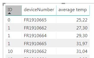
The information are identified by ID and deviceNumber. I calculated an avarage value for each process, so I get following structure - wherby "average temp" is a measure.
What I try to realise is a graph were average temperature will be the Axis ( bins of 2 - 5 °C) and the count of average values from the data will be value. So a sort of average value distribution will be showd
Anyway, do anyone know how to get a calculated value (measure) into a context that it can be displayed?
Best regards,
Dominik
Solved! Go to Solution.
- Mark as New
- Bookmark
- Subscribe
- Mute
- Subscribe to RSS Feed
- Permalink
- Report Inappropriate Content
You are going to need to use some variation of the Disconnected Table Trick as this article demonstrates: https://community.powerbi.com/t5/Community-Blog/Solving-Attendance-with-the-Disconnected-Table-Trick...
You will want to create a table of your bins. Then, you will need a measure that essentially is a SWITCH statement to determine which bin is in context and then calculate the result accordingly for each bin.
So, for example, you are in bin 25-30 degrees Celcius. You would recognize that in your SWITCH statement and then probably use SUMMARIZE or GROUPBY along with maybe ADDCOLUMNS to get a variable that is a table of your values and has your average temp measure in it (probably where the ADDCOLUMNS) comes in. Then you would filter that to the range for the bin and return the COUNTX of it.
Something like that.
Follow on LinkedIn
@ me in replies or I'll lose your thread!!!
Instead of a Kudo, please vote for this idea
Become an expert!: Enterprise DNA
External Tools: MSHGQM
YouTube Channel!: Microsoft Hates Greg
Latest book!: DAX For Humans
DAX is easy, CALCULATE makes DAX hard...
Helpful resources

FabCon Global Hackathon
Join the Fabric FabCon Global Hackathon—running virtually through Nov 3. Open to all skill levels. $10,000 in prizes!

Power BI Monthly Update - October 2025
Check out the October 2025 Power BI update to learn about new features.

| User | Count |
|---|---|
| 10 | |
| 7 | |
| 5 | |
| 4 | |
| 3 |
| User | Count |
|---|---|
| 12 | |
| 11 | |
| 10 | |
| 9 | |
| 8 |

