FabCon is coming to Atlanta
Join us at FabCon Atlanta from March 16 - 20, 2026, for the ultimate Fabric, Power BI, AI and SQL community-led event. Save $200 with code FABCOMM.
Register now!- Power BI forums
- Get Help with Power BI
- Desktop
- Service
- Report Server
- Power Query
- Mobile Apps
- Developer
- DAX Commands and Tips
- Custom Visuals Development Discussion
- Health and Life Sciences
- Power BI Spanish forums
- Translated Spanish Desktop
- Training and Consulting
- Instructor Led Training
- Dashboard in a Day for Women, by Women
- Galleries
- Data Stories Gallery
- Themes Gallery
- Contests Gallery
- Quick Measures Gallery
- Notebook Gallery
- Translytical Task Flow Gallery
- TMDL Gallery
- R Script Showcase
- Webinars and Video Gallery
- Ideas
- Custom Visuals Ideas (read-only)
- Issues
- Issues
- Events
- Upcoming Events
Calling all Data Engineers! Fabric Data Engineer (Exam DP-700) live sessions are back! Starting October 16th. Sign up.
- Power BI forums
- Forums
- Get Help with Power BI
- DAX Commands and Tips
- Re: Turnover Groups
- Subscribe to RSS Feed
- Mark Topic as New
- Mark Topic as Read
- Float this Topic for Current User
- Bookmark
- Subscribe
- Printer Friendly Page
- Mark as New
- Bookmark
- Subscribe
- Mute
- Subscribe to RSS Feed
- Permalink
- Report Inappropriate Content
Turnover Groups
Good afternoon Community,
I have a connundrum that I wanted some help with 🙂
I have a simple list of turnover by account 2022. What I would like to do is create a measure that sums the total turnover by account and give them a category based on total turnover as follows:
Group 1 'Std' - <£5k
Group 2 'Progressive' - >£5k <£25k
Group 3 'Target' - >£25k <£50k
Group 4 'Allaince' - >£50k <£150k
Group 5 'Prime' - >£150k
My aim is to then put this data in a map using the above data as the legend:
Any ideas here wouyld be greatly appriciated 🙂
- Mark as New
- Bookmark
- Subscribe
- Mute
- Subscribe to RSS Feed
- Permalink
- Report Inappropriate Content
Hi,
Its straight forward.
First create buckets in calculated column to capture category by using nested if. There you get group 1,2,3, etc according to your needs.
Now drag and drop turnover in values and maps with location and legends as this calculated column.
Hope its clear and kindly mark it as solution
- Mark as New
- Bookmark
- Subscribe
- Mute
- Subscribe to RSS Feed
- Permalink
- Report Inappropriate Content
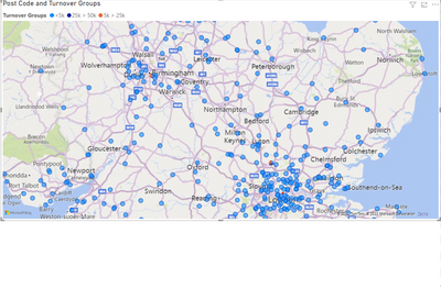
Thank you for the response, please correct me where I am wrong, I'm new to this functionality, your help is greatly appriciated 🙂 from the below I am not getting the desired result!
I should be seeing more colours on the map?
I've also tried this but same results:
- Mark as New
- Bookmark
- Subscribe
- Mute
- Subscribe to RSS Feed
- Permalink
- Report Inappropriate Content
Hi,
Thats perfect. And your results are correct. I see different color in maps. Check deeply, you see legends with different colors, but data is more for blue. You can obserev 1 or 2 orange color spots too. So its working.
Kindly mark as solution , as this would support our community.
- Mark as New
- Bookmark
- Subscribe
- Mute
- Subscribe to RSS Feed
- Permalink
- Report Inappropriate Content
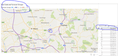
The issue I can see is that I have accounts with large turnovers but this group is no where to be seen, for example the biggest account is >750,000 but this isnt reflected in the map, ideally I would want only one colour to represent the final figure?
I created a group >150k and this should be visible on the above account
- Mark as New
- Bookmark
- Subscribe
- Mute
- Subscribe to RSS Feed
- Permalink
- Report Inappropriate Content
Dear I believe for the same location , there may be different account codes having more categories.
Thats the reason you see 3 color for same location.
Can you bring location in table along with account code and turnover, this would conclude and solve your use case
- Mark as New
- Bookmark
- Subscribe
- Mute
- Subscribe to RSS Feed
- Permalink
- Report Inappropriate Content
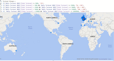
Here is a measure I have been working on:
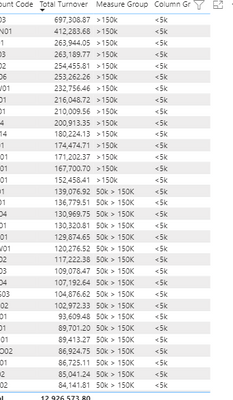
When I create a table view, my measure is accurate but my calclulated column is incorrect:
I cannot insert my measure into the legend but when I insert the same calculated column I get the adverse results.
Here is my full table:
I've tried many many combinations but the legend remains incorrect and I cannot present the data as it not accurate enough.
Lets strip this all back and focus in on the data set, it has multiple invoice sku lines, line value represents SKU QTY x UNIT PRICE and this is done at source.
I then created a column TOTAL TURNOVER which is SUM(
- Mark as New
- Bookmark
- Subscribe
- Mute
- Subscribe to RSS Feed
- Permalink
- Report Inappropriate Content
Remove calculate and sum from your code which is used to create calculated column. It should work
- Mark as New
- Bookmark
- Subscribe
- Mute
- Subscribe to RSS Feed
- Permalink
- Report Inappropriate Content
@saravanan_p Eagle eyes. Nice observation. Good work!!.
@ajaydavidluke Hope its clear, kindly mark this as a solution
- Mark as New
- Bookmark
- Subscribe
- Mute
- Subscribe to RSS Feed
- Permalink
- Report Inappropriate Content
That awesome. So speedy. I was about to type the same. Congratz.
@ajaydavidluke Kindly mark it as solution , keeps the community healthy
Helpful resources
| User | Count |
|---|---|
| 10 | |
| 9 | |
| 7 | |
| 4 | |
| 4 |


