Join us at FabCon Vienna from September 15-18, 2025
The ultimate Fabric, Power BI, SQL, and AI community-led learning event. Save €200 with code FABCOMM.
Get registered- Power BI forums
- Get Help with Power BI
- Desktop
- Service
- Report Server
- Power Query
- Mobile Apps
- Developer
- DAX Commands and Tips
- Custom Visuals Development Discussion
- Health and Life Sciences
- Power BI Spanish forums
- Translated Spanish Desktop
- Training and Consulting
- Instructor Led Training
- Dashboard in a Day for Women, by Women
- Galleries
- Data Stories Gallery
- Themes Gallery
- Contests Gallery
- Quick Measures Gallery
- Notebook Gallery
- Translytical Task Flow Gallery
- TMDL Gallery
- R Script Showcase
- Webinars and Video Gallery
- Ideas
- Custom Visuals Ideas (read-only)
- Issues
- Issues
- Events
- Upcoming Events
Enhance your career with this limited time 50% discount on Fabric and Power BI exams. Ends August 31st. Request your voucher.
- Power BI forums
- Forums
- Get Help with Power BI
- DAX Commands and Tips
- Trendlines on clustered column chart
- Subscribe to RSS Feed
- Mark Topic as New
- Mark Topic as Read
- Float this Topic for Current User
- Bookmark
- Subscribe
- Printer Friendly Page
- Mark as New
- Bookmark
- Subscribe
- Mute
- Subscribe to RSS Feed
- Permalink
- Report Inappropriate Content
Trendlines on clustered column chart
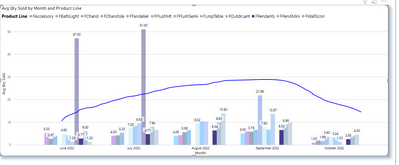
Is there a way to add a trendline on this type of chart? I cant seem to find it anywhere.
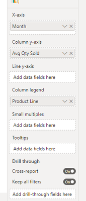
I would like to see the trendline move with whichever product line is selected. For instance, if we are looking at bath lights, we would see the trendline based on the Avg Qty Sold . Example below along with the Visualization pane. Thank you!!
Solved! Go to Solution.
- Mark as New
- Bookmark
- Subscribe
- Mute
- Subscribe to RSS Feed
- Permalink
- Report Inappropriate Content
HI @ashleyb2022,
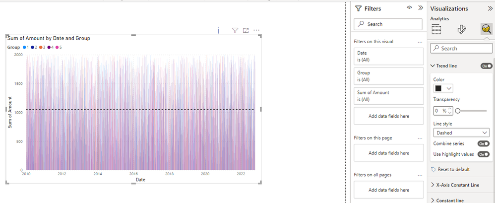
The trendlines line is hosted on the analytics panel, please double-check to confirm you are using the general date values instead of the date values with the hierarchy model on the x-axis:
Use the Analytics pane in Power BI Desktop - Power BI | Microsoft Learn
Regards,
Xiaoxin Sheng
- Mark as New
- Bookmark
- Subscribe
- Mute
- Subscribe to RSS Feed
- Permalink
- Report Inappropriate Content
You may want to do that in a separate line chart visual. Showing the trend line inside the column chart is inconsistent and likely confusing to your users (how do they know that it is related to a filtered value?
- Mark as New
- Bookmark
- Subscribe
- Mute
- Subscribe to RSS Feed
- Permalink
- Report Inappropriate Content
Thank You!
Helpful resources
| User | Count |
|---|---|
| 11 | |
| 9 | |
| 6 | |
| 6 | |
| 5 |
| User | Count |
|---|---|
| 24 | |
| 14 | |
| 14 | |
| 9 | |
| 7 |


