Join us at FabCon Vienna from September 15-18, 2025
The ultimate Fabric, Power BI, SQL, and AI community-led learning event. Save €200 with code FABCOMM.
Get registered- Power BI forums
- Get Help with Power BI
- Desktop
- Service
- Report Server
- Power Query
- Mobile Apps
- Developer
- DAX Commands and Tips
- Custom Visuals Development Discussion
- Health and Life Sciences
- Power BI Spanish forums
- Translated Spanish Desktop
- Training and Consulting
- Instructor Led Training
- Dashboard in a Day for Women, by Women
- Galleries
- Data Stories Gallery
- Themes Gallery
- Contests Gallery
- Quick Measures Gallery
- Notebook Gallery
- Translytical Task Flow Gallery
- TMDL Gallery
- R Script Showcase
- Webinars and Video Gallery
- Ideas
- Custom Visuals Ideas (read-only)
- Issues
- Issues
- Events
- Upcoming Events
Compete to become Power BI Data Viz World Champion! First round ends August 18th. Get started.
- Power BI forums
- Forums
- Get Help with Power BI
- DAX Commands and Tips
- Re: TOPN with parameters & slicers
- Subscribe to RSS Feed
- Mark Topic as New
- Mark Topic as Read
- Float this Topic for Current User
- Bookmark
- Subscribe
- Printer Friendly Page
- Mark as New
- Bookmark
- Subscribe
- Mute
- Subscribe to RSS Feed
- Permalink
- Report Inappropriate Content
TOPN with parameters & slicers
Hello all,
I have a table with weather details.
Every day, for 50 years, details like max. temp & mm. rain are updated.
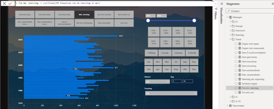
Below you see a screenshot of an overview page, with on top the parameter (12 items) and on the right slicers for year / decade / month / date etc.
I would like only the bars for the top10 results to be shown. For example the top 10 days/weeks/months/years based on total mm. rain for the past 50 years ... or the top 10 days/weeks/months/years based on the average max. temp in the past 50 years ... and so on.
Besides that would it be nice of the bar of this year would have an slighty different color.
Would appereciate your help / tips very much.
Thkx in advance, Rud.
Solved! Go to Solution.
- Mark as New
- Bookmark
- Subscribe
- Mute
- Subscribe to RSS Feed
- Permalink
- Report Inappropriate Content
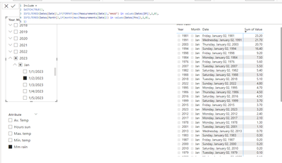
see attached for an approximation. Your "TOP 10" request is very complex, and may not be needed.
I am not aware of an automatic indentation option - you will need to traverse the matrix hierarchy yourself after you selected the filter granularity.
- Mark as New
- Bookmark
- Subscribe
- Mute
- Subscribe to RSS Feed
- Permalink
- Report Inappropriate Content
Please provide sample data that covers your issue or question completely, in a usable format (not as a screenshot).
Do not include sensitive information or anything not related to the issue or question.
If you are unsure how to upload data please refer to https://community.fabric.microsoft.com/t5/Community-Blog/How-to-provide-sample-data-in-the-Power-BI-...
Please show the expected outcome based on the sample data you provided.
Want faster answers? https://community.fabric.microsoft.com/t5/Desktop/How-to-Get-Your-Question-Answered-Quickly/m-p/1447...
- Mark as New
- Bookmark
- Subscribe
- Mute
- Subscribe to RSS Feed
- Permalink
- Report Inappropriate Content
Thank you very much for your reply !
I hope this will make things clear.
Below you'll find a link to the source data.
This is weather data since 1951.
Data2 source
I would like to visualize the following in a bar chart:
Top10 for all the items for all the periods (by slicer).
For example:
TOP10 years (desc) for the month jan. with the most monthly rain in mm.
TOP10 years (desc) for the years mith the most anual rain in mm.
TOP10 years (desc) for the days 01-march with the most daily rain on that day.
And so on, depending on slicer settings (see attachment).
Same for the average max. temp / min. temp.
If the current year is in the TOP10, the bar of the current year should be in a different colour.
Hope this gives a better understanding.
Thankx in advance and all the best for 2024 for you (all).
Best regards, Rud.
- Mark as New
- Bookmark
- Subscribe
- Mute
- Subscribe to RSS Feed
- Permalink
- Report Inappropriate Content
Please confirm that you need bar charts for all of these - that would mean you couldn't use a proper calendar table.
Alternatively you could use table visuals.
- Mark as New
- Bookmark
- Subscribe
- Mute
- Subscribe to RSS Feed
- Permalink
- Report Inappropriate Content
Thank you very much again!
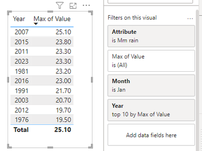
It must be due to my bad English, but this is not what i'm looking for. Your table shows the max. value of rain for 1 day in jan.
What i'm looking for is:
How is a specific period (could be a single day, week, month, quarter or year) be compared to the top 10 of the same period in previous years.
Example:
The amount of rain on 15-01-23, how does it compare to the amount of rain on the same day (15-01) in the previous years. And show it in a bar chart with the top 10 results (years) desc.
Or,
The total amount of rain for december 2023, how does it compare to the total amount of rain in the same month (december) in the previous years. And show it in a bar chart with the top 10 results (years) desc.
Or,
The average max. temp for the month of june 2023, how does it compare to the the average max. temp. in the same month (june) in the previous years. And show it in a bar chart with the top 10 results (years) desc.
The period (date/week/month/quarter...) must be dynamic, so handled by slicer (not by filter).
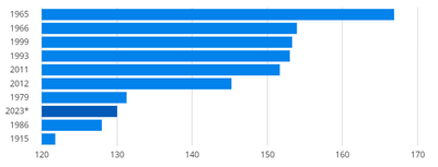
Below a sample of how it should look like, beware this is NOT based on my data. Just to give you an idea.
Again many thanks for trying to help me out with this!!
Best regards, Rud.
- Mark as New
- Bookmark
- Subscribe
- Mute
- Subscribe to RSS Feed
- Permalink
- Report Inappropriate Content
- Mark as New
- Bookmark
- Subscribe
- Mute
- Subscribe to RSS Feed
- Permalink
- Report Inappropriate Content
Many thanks for the response, and first of all I would like to wish you a good and prosperous 2024 and let you know that your words "it is very complex" makes me feel less stupid 🙂
I wasn't familiar with the 'include' yet, so I'm going to look into that further. Looks promising. Perhaps I can use it by creating a separate measurement for each item (mm. rain - avg.temp etc.) and combining that with a parameter and topN.
By the way, at the av. temp. the intention was not to add these up (sum) but to calculate the average (average), but that is a small matter.
Many thanks again!!
Best regards, Rud.
Helpful resources
| User | Count |
|---|---|
| 25 | |
| 10 | |
| 8 | |
| 7 | |
| 6 |
| User | Count |
|---|---|
| 32 | |
| 12 | |
| 10 | |
| 10 | |
| 9 |


