Join us at FabCon Vienna from September 15-18, 2025
The ultimate Fabric, Power BI, SQL, and AI community-led learning event. Save €200 with code FABCOMM.
Get registered- Power BI forums
- Get Help with Power BI
- Desktop
- Service
- Report Server
- Power Query
- Mobile Apps
- Developer
- DAX Commands and Tips
- Custom Visuals Development Discussion
- Health and Life Sciences
- Power BI Spanish forums
- Translated Spanish Desktop
- Training and Consulting
- Instructor Led Training
- Dashboard in a Day for Women, by Women
- Galleries
- Data Stories Gallery
- Themes Gallery
- Contests Gallery
- Quick Measures Gallery
- Notebook Gallery
- Translytical Task Flow Gallery
- TMDL Gallery
- R Script Showcase
- Webinars and Video Gallery
- Ideas
- Custom Visuals Ideas (read-only)
- Issues
- Issues
- Events
- Upcoming Events
Compete to become Power BI Data Viz World Champion! First round ends August 18th. Get started.
- Power BI forums
- Forums
- Get Help with Power BI
- DAX Commands and Tips
- Re: Summary table?
- Subscribe to RSS Feed
- Mark Topic as New
- Mark Topic as Read
- Float this Topic for Current User
- Bookmark
- Subscribe
- Printer Friendly Page
- Mark as New
- Bookmark
- Subscribe
- Mute
- Subscribe to RSS Feed
- Permalink
- Report Inappropriate Content
Summary table?
Hello
I have a data table that contains
Date (MMDDYY), Work Order#, Product, Qty of Parts Placed, Defects Qty, and a calculated colum titled PPM which is ((Defect Qty / Placed Qty)*1000000)
However, when I create a bar chart to visual show the PPM value for each Product and Work order, I cannot display the PPM value as Product, it wants to show it as an aggregate...
I like to use slicers in the visual to select a specific product and/or date range and then see the corresponding PPM performance by Work Order#s.
I'm failry new to Power BI and any help/guidence would be greatly appreciated!
Thanks
Rick
Solved! Go to Solution.
- Mark as New
- Bookmark
- Subscribe
- Mute
- Subscribe to RSS Feed
- Permalink
- Report Inappropriate Content
Hi @RickB72 ,
According to your description, here are my steps you can follow as a solution.
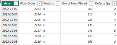
(1) This is my test data.
(2) Select the Stacked column chart visual and place the fields as shown in the following image, then create two slicers.
If the above one can't help you get the desired result, please provide some sample data in your tables (exclude sensitive data) with Text format and your expected result with backend logic and special examples. It is better if you can share a simplified pbix file. Thank you.
Best Regards,
Neeko Tang
If this post helps, then please consider Accept it as the solution to help the other members find it more quickly.
- Mark as New
- Bookmark
- Subscribe
- Mute
- Subscribe to RSS Feed
- Permalink
- Report Inappropriate Content
Is there a way to wrap content of URL which is added as icon for the table being added. Also can we customise the width of column of every table
- Mark as New
- Bookmark
- Subscribe
- Mute
- Subscribe to RSS Feed
- Permalink
- Report Inappropriate Content
Hi @RickB72 ,
According to your description, here are my steps you can follow as a solution.
(1) This is my test data.
(2) Select the Stacked column chart visual and place the fields as shown in the following image, then create two slicers.
If the above one can't help you get the desired result, please provide some sample data in your tables (exclude sensitive data) with Text format and your expected result with backend logic and special examples. It is better if you can share a simplified pbix file. Thank you.
Best Regards,
Neeko Tang
If this post helps, then please consider Accept it as the solution to help the other members find it more quickly.
Helpful resources
| User | Count |
|---|---|
| 25 | |
| 10 | |
| 8 | |
| 6 | |
| 6 |
| User | Count |
|---|---|
| 31 | |
| 12 | |
| 10 | |
| 10 | |
| 9 |


