Fabric Data Days starts November 4th!
Advance your Data & AI career with 50 days of live learning, dataviz contests, hands-on challenges, study groups & certifications and more!
Get registered- Power BI forums
- Get Help with Power BI
- Desktop
- Service
- Report Server
- Power Query
- Mobile Apps
- Developer
- DAX Commands and Tips
- Custom Visuals Development Discussion
- Health and Life Sciences
- Power BI Spanish forums
- Translated Spanish Desktop
- Training and Consulting
- Instructor Led Training
- Dashboard in a Day for Women, by Women
- Galleries
- Data Stories Gallery
- Themes Gallery
- Contests Gallery
- QuickViz Gallery
- Quick Measures Gallery
- Visual Calculations Gallery
- Notebook Gallery
- Translytical Task Flow Gallery
- TMDL Gallery
- R Script Showcase
- Webinars and Video Gallery
- Ideas
- Custom Visuals Ideas (read-only)
- Issues
- Issues
- Events
- Upcoming Events
Get Fabric Certified for FREE during Fabric Data Days. Don't miss your chance! Request now
- Power BI forums
- Forums
- Get Help with Power BI
- DAX Commands and Tips
- Stock Variation in a time line
- Subscribe to RSS Feed
- Mark Topic as New
- Mark Topic as Read
- Float this Topic for Current User
- Bookmark
- Subscribe
- Printer Friendly Page
- Mark as New
- Bookmark
- Subscribe
- Mute
- Subscribe to RSS Feed
- Permalink
- Report Inappropriate Content
Stock Variation in a time line
Hello,
I have a table that controls my stock, what goes in and what goes out, day by day. I need to create a graphic that shows me this variation in a waterfall chart, but I am not getting the right result. How can I do the formula to shows the accumulated variation on a period of time?
In my table I have the columns: Product, Data, Stock in, Stock Out.
Best Regards.
Solved! Go to Solution.
- Mark as New
- Bookmark
- Subscribe
- Mute
- Subscribe to RSS Feed
- Permalink
- Report Inappropriate Content
@VitorXavierCell , You might need a measure like
CALCULATE(SUM(Table[Stock in]),filter(date,date[date] <=maxx(date,date[date]))) - CALCULATE(SUM(Table[Stok Out]),filter(date,date[date] <=maxx(date,date[date])))
- Mark as New
- Bookmark
- Subscribe
- Mute
- Subscribe to RSS Feed
- Permalink
- Report Inappropriate Content
Hello @amitchandak , thank you for answer my question!
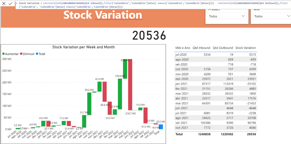
I tried to use your sugestion, but it results the same as I did before, because the measure don't accumulate the balance between it on the time line.
I attached a image that shows the month, The quantity In, quantity out and the measure "Stock Variation".
Thanks a lot
- Mark as New
- Bookmark
- Subscribe
- Mute
- Subscribe to RSS Feed
- Permalink
- Report Inappropriate Content
@amitchandak Actually I was using the filter with a different table, that's why I not got it, but now I change the source of the filter and it worked.
Thanks a lot for the help!
Helpful resources

Fabric Data Days
Advance your Data & AI career with 50 days of live learning, contests, hands-on challenges, study groups & certifications and more!

Power BI Monthly Update - October 2025
Check out the October 2025 Power BI update to learn about new features.

| User | Count |
|---|---|
| 8 | |
| 6 | |
| 5 | |
| 5 | |
| 4 |
| User | Count |
|---|---|
| 25 | |
| 16 | |
| 8 | |
| 7 | |
| 7 |

