Fabric Data Days starts November 4th!
Advance your Data & AI career with 50 days of live learning, dataviz contests, hands-on challenges, study groups & certifications and more!
Get registered- Power BI forums
- Get Help with Power BI
- Desktop
- Service
- Report Server
- Power Query
- Mobile Apps
- Developer
- DAX Commands and Tips
- Custom Visuals Development Discussion
- Health and Life Sciences
- Power BI Spanish forums
- Translated Spanish Desktop
- Training and Consulting
- Instructor Led Training
- Dashboard in a Day for Women, by Women
- Galleries
- Data Stories Gallery
- Themes Gallery
- Contests Gallery
- Quick Measures Gallery
- Visual Calculations Gallery
- Notebook Gallery
- Translytical Task Flow Gallery
- TMDL Gallery
- R Script Showcase
- Webinars and Video Gallery
- Ideas
- Custom Visuals Ideas (read-only)
- Issues
- Issues
- Events
- Upcoming Events
Join us at FabCon Atlanta from March 16 - 20, 2026, for the ultimate Fabric, Power BI, AI and SQL community-led event. Save $200 with code FABCOMM. Register now.
- Power BI forums
- Forums
- Get Help with Power BI
- DAX Commands and Tips
- Slicer to filter chart using DAX
- Subscribe to RSS Feed
- Mark Topic as New
- Mark Topic as Read
- Float this Topic for Current User
- Bookmark
- Subscribe
- Printer Friendly Page
- Mark as New
- Bookmark
- Subscribe
- Mute
- Subscribe to RSS Feed
- Permalink
- Report Inappropriate Content
Slicer to filter chart using DAX
Hi all,
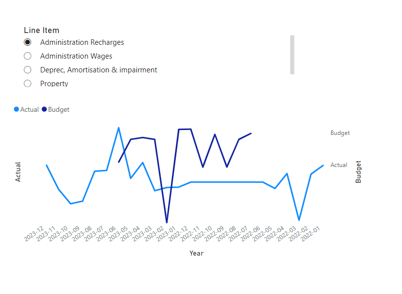
I'm trying to create a chart to return net actual vs budget chart using fields in multiple tables.
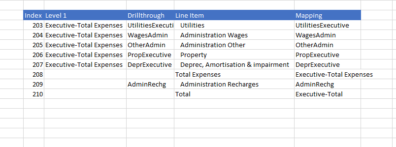
Table 1:
Table 2:
Table 3:
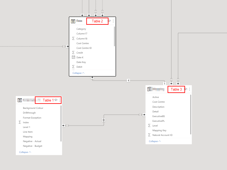
Relationship:
Table1(Mapping) - Table 3(ExecutivePL)
Table 3(Mapping Key) - Table2(Mapping Key)
Question
I have created a DAX measure to returns net actual:
- Mark as New
- Bookmark
- Subscribe
- Mute
- Subscribe to RSS Feed
- Permalink
- Report Inappropriate Content
Hi @beeEc009
Please provide a screenshot of the relational data model view to understand there lationships between the tables.
- Mark as New
- Bookmark
- Subscribe
- Mute
- Subscribe to RSS Feed
- Permalink
- Report Inappropriate Content
Hi,
- Mark as New
- Bookmark
- Subscribe
- Mute
- Subscribe to RSS Feed
- Permalink
- Report Inappropriate Content
- Mark as New
- Bookmark
- Subscribe
- Mute
- Subscribe to RSS Feed
- Permalink
- Report Inappropriate Content
Thank you for the prompt response. I assumed that the chart should filter if slicer is added but that hasn't been the case.
there is no direct relationshipship between table 1 and table 3. It is worth mentioning that carries data labels, table 2 is a mapping table and table 3 holds all the data (fact table)- this is a new project and I just recently took over.
To simplify my request, i will attach a screenshot of how i will like my output to look.
- Mark as New
- Bookmark
- Subscribe
- Mute
- Subscribe to RSS Feed
- Permalink
- Report Inappropriate Content
@beeEc009 , If table 1 is on the one side of the join, you should be simply able display this measure and column from table 1
In case of other join is should also work
If this does not help
Can you share sample data and sample output in table format? Or a sample pbix after removing sensitive data.
Helpful resources

FabCon Global Hackathon
Join the Fabric FabCon Global Hackathon—running virtually through Nov 3. Open to all skill levels. $10,000 in prizes!

Power BI Monthly Update - October 2025
Check out the October 2025 Power BI update to learn about new features.

| User | Count |
|---|---|
| 8 | |
| 6 | |
| 3 | |
| 3 | |
| 3 |
| User | Count |
|---|---|
| 11 | |
| 9 | |
| 8 | |
| 7 | |
| 6 |


