FabCon is coming to Atlanta
Join us at FabCon Atlanta from March 16 - 20, 2026, for the ultimate Fabric, Power BI, AI and SQL community-led event. Save $200 with code FABCOMM.
Register now!- Power BI forums
- Get Help with Power BI
- Desktop
- Service
- Report Server
- Power Query
- Mobile Apps
- Developer
- DAX Commands and Tips
- Custom Visuals Development Discussion
- Health and Life Sciences
- Power BI Spanish forums
- Translated Spanish Desktop
- Training and Consulting
- Instructor Led Training
- Dashboard in a Day for Women, by Women
- Galleries
- Data Stories Gallery
- Themes Gallery
- Contests Gallery
- QuickViz Gallery
- Quick Measures Gallery
- Visual Calculations Gallery
- Notebook Gallery
- Translytical Task Flow Gallery
- TMDL Gallery
- R Script Showcase
- Webinars and Video Gallery
- Ideas
- Custom Visuals Ideas (read-only)
- Issues
- Issues
- Events
- Upcoming Events
The Power BI Data Visualization World Championships is back! Get ahead of the game and start preparing now! Learn more
- Power BI forums
- Forums
- Get Help with Power BI
- DAX Commands and Tips
- Re: Slicer to filter chart using DAX
- Subscribe to RSS Feed
- Mark Topic as New
- Mark Topic as Read
- Float this Topic for Current User
- Bookmark
- Subscribe
- Printer Friendly Page
- Mark as New
- Bookmark
- Subscribe
- Mute
- Subscribe to RSS Feed
- Permalink
- Report Inappropriate Content
Slicer to filter chart using DAX
Hi all,
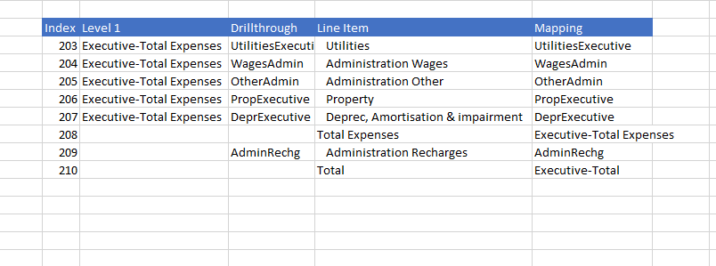
I'm trying to create a chart to return net actual vs budget chart using fields in multiple tables.
Table 1:
Table 2:
Table 3:
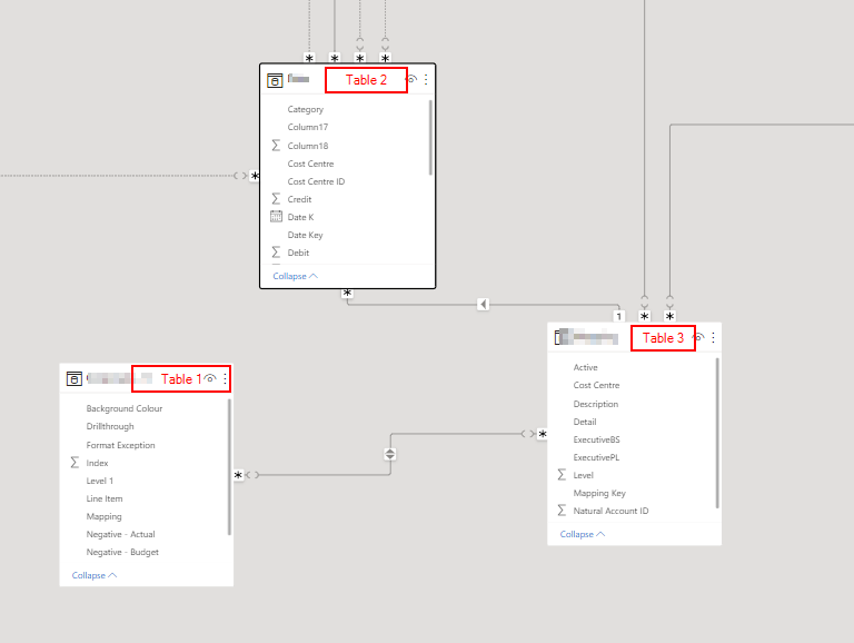
Relationship:
Table1(Mapping) - Table 3(ExecutivePL)
Table 3(Mapping Key) - Table2(Mapping Key)
Question
I have created a DAX measure to returns net actual:
- Mark as New
- Bookmark
- Subscribe
- Mute
- Subscribe to RSS Feed
- Permalink
- Report Inappropriate Content
Hi @beeEc009
Please provide a screenshot of the relational data model view to understand there lationships between the tables.
- Mark as New
- Bookmark
- Subscribe
- Mute
- Subscribe to RSS Feed
- Permalink
- Report Inappropriate Content
Hi,
- Mark as New
- Bookmark
- Subscribe
- Mute
- Subscribe to RSS Feed
- Permalink
- Report Inappropriate Content
- Mark as New
- Bookmark
- Subscribe
- Mute
- Subscribe to RSS Feed
- Permalink
- Report Inappropriate Content
Thank you for the prompt response. I assumed that the chart should filter if slicer is added but that hasn't been the case.
there is no direct relationshipship between table 1 and table 3. It is worth mentioning that carries data labels, table 2 is a mapping table and table 3 holds all the data (fact table)- this is a new project and I just recently took over.
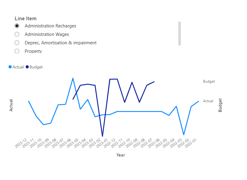
To simplify my request, i will attach a screenshot of how i will like my output to look.
- Mark as New
- Bookmark
- Subscribe
- Mute
- Subscribe to RSS Feed
- Permalink
- Report Inappropriate Content
@beeEc009 , If table 1 is on the one side of the join, you should be simply able display this measure and column from table 1
In case of other join is should also work
If this does not help
Can you share sample data and sample output in table format? Or a sample pbix after removing sensitive data.
Helpful resources

Power BI Dataviz World Championships
The Power BI Data Visualization World Championships is back! Get ahead of the game and start preparing now!

| User | Count |
|---|---|
| 19 | |
| 13 | |
| 9 | |
| 4 | |
| 4 |
| User | Count |
|---|---|
| 29 | |
| 26 | |
| 16 | |
| 11 | |
| 10 |


