- Power BI forums
- Get Help with Power BI
- Desktop
- Service
- Report Server
- Power Query
- Mobile Apps
- Developer
- DAX Commands and Tips
- Custom Visuals Development Discussion
- Health and Life Sciences
- Power BI Spanish forums
- Translated Spanish Desktop
- Training and Consulting
- Instructor Led Training
- Dashboard in a Day for Women, by Women
- Galleries
- Data Stories Gallery
- Themes Gallery
- Contests Gallery
- Quick Measures Gallery
- Notebook Gallery
- Translytical Task Flow Gallery
- TMDL Gallery
- R Script Showcase
- Webinars and Video Gallery
- Ideas
- Custom Visuals Ideas (read-only)
- Issues
- Issues
- Events
- Upcoming Events
To celebrate FabCon Vienna, we are offering 50% off select exams. Ends October 3rd. Request your discount now.
- Power BI forums
- Forums
- Get Help with Power BI
- DAX Commands and Tips
- Re: Showing Different Categories in a column chart
- Subscribe to RSS Feed
- Mark Topic as New
- Mark Topic as Read
- Float this Topic for Current User
- Bookmark
- Subscribe
- Printer Friendly Page
- Mark as New
- Bookmark
- Subscribe
- Mute
- Subscribe to RSS Feed
- Permalink
- Report Inappropriate Content
Showing Different Categories in a column chart
Hello guys,
I have the data file as below :
| CSP | CSL | Co-CSL | Q1 | Q2 | Q3 |
| ABC | CDA | DAB | 8 | 7 | 5 |
| HJK | LKJ | GHJ | 7 | 9 | 3 |
| ASD | DSA | CDA | 8 | 9 | 9 |
So i have Scores for different questions in the data and the Scores basically are calculated as average.
But the challenge is that client has asked for slicers of CSP,Co-CSL and CSL where are names.So for instance if i select "CDA" in CSL it should show the score of "CDA" where he or she is mapped as CSL.
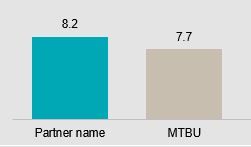
And they want to compare it with his or her BU too just like in the pic below
Please help me acheive this guys
- Mark as New
- Bookmark
- Subscribe
- Mute
- Subscribe to RSS Feed
- Permalink
- Report Inappropriate Content
You should unpivot at least the last 3 columns (with the questions). It is not clear what the first 3 columns are, but may potentially want to unpivot those too, to get what you are looking for. Can you say more what is in those first 3 columns?
Regards,
Pat
Did I answer your question? Mark my post as a solution! Kudos are also appreciated!
To learn more about Power BI, follow me on Twitter or subscribe on YouTube.
@mahoneypa HoosierBI on YouTube
Helpful resources
| User | Count |
|---|---|
| 14 | |
| 11 | |
| 6 | |
| 6 | |
| 5 |
| User | Count |
|---|---|
| 29 | |
| 17 | |
| 11 | |
| 7 | |
| 5 |

