FabCon is coming to Atlanta
Join us at FabCon Atlanta from March 16 - 20, 2026, for the ultimate Fabric, Power BI, AI and SQL community-led event. Save $200 with code FABCOMM.
Register now!- Power BI forums
- Get Help with Power BI
- Desktop
- Service
- Report Server
- Power Query
- Mobile Apps
- Developer
- DAX Commands and Tips
- Custom Visuals Development Discussion
- Health and Life Sciences
- Power BI Spanish forums
- Translated Spanish Desktop
- Training and Consulting
- Instructor Led Training
- Dashboard in a Day for Women, by Women
- Galleries
- Data Stories Gallery
- Themes Gallery
- Contests Gallery
- QuickViz Gallery
- Quick Measures Gallery
- Visual Calculations Gallery
- Notebook Gallery
- Translytical Task Flow Gallery
- TMDL Gallery
- R Script Showcase
- Webinars and Video Gallery
- Ideas
- Custom Visuals Ideas (read-only)
- Issues
- Issues
- Events
- Upcoming Events
The Power BI Data Visualization World Championships is back! Get ahead of the game and start preparing now! Learn more
- Power BI forums
- Forums
- Get Help with Power BI
- DAX Commands and Tips
- Re: Show whole year in line graph while slicing on...
- Subscribe to RSS Feed
- Mark Topic as New
- Mark Topic as Read
- Float this Topic for Current User
- Bookmark
- Subscribe
- Printer Friendly Page
- Mark as New
- Bookmark
- Subscribe
- Mute
- Subscribe to RSS Feed
- Permalink
- Report Inappropriate Content
Show whole year in line graph while slicing on Month in a Year/Month Slicer
Hi members,
I have a line graph which is supposed to show Net Order Value development over the whole year, even when in my Year/Month Slicer only one Month is selected from a specific year.
E.g. Select Jan & Feb from 2021 => only 2021 Net Order Value Data (the whole year) should be displayed in the Line Graph.
The Year/Month slicer contains a Year column and Month (Jan, Feb ...) column.
Is there a way to create a Dax Measure which can calculate Net Order Value
so that it calculates the value for the whole year based on the month selection in the Year/Month slicer?
Regards,
Mirza
- Mark as New
- Bookmark
- Subscribe
- Mute
- Subscribe to RSS Feed
- Permalink
- Report Inappropriate Content
@jaweher899 thank you for your quick reply.
How do you go about creating the filter? That part, honestly I did not understand. If I use Month Column and Year Column in one slicer in the report canvas, there is no way that the SUM of Sales = SUM(Sales [SalesAmount]) shows the selected month and the whole FY based on the month selection.
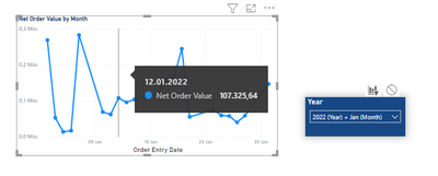
Here is what I get:
I can only achive that when I create two separate filters, one month and the other year, and disable the interaction of the month filter with my line graph. In that way I can filter my line graph with the year filter and al other visuals with the month filter and year filter simultaniously.
- Mark as New
- Bookmark
- Subscribe
- Mute
- Subscribe to RSS Feed
- Permalink
- Report Inappropriate Content
To achieve this, the user can create a measure that calculates the sum of a certain column for a selected month and year, and use this measure in the line graph. Additionally, the user can create a filter that allows them to select a specific month and year to slice on.
Here's how:
- Create a measure: In the Fields Pane, select the column that you want to sum for a selected month and year, and create a measure using the SUM function. For example:
SUM of Sales = SUM(Sales[SalesAmount])
Create a filter: In the Fields Pane, select the date column, and add a filter to the report canvas. In the filter, select the desired month and year to slice on.
Use the measure in the line graph: In the Fields Pane, select the measure created in step 1, and add a line graph to the report canvas. In the line graph, use the date column as the X-axis, and the measure as the Y-axis.
By using this approach, the line graph will show the sum of the selected column for a selected month and year, allowing the user to view the data for a specific time frame while still seeing the overall trend for the whole year.
Helpful resources

Power BI Dataviz World Championships
The Power BI Data Visualization World Championships is back! Get ahead of the game and start preparing now!

| User | Count |
|---|---|
| 18 | |
| 14 | |
| 7 | |
| 5 | |
| 5 |
| User | Count |
|---|---|
| 29 | |
| 18 | |
| 17 | |
| 11 | |
| 10 |


