Join us at FabCon Vienna from September 15-18, 2025
The ultimate Fabric, Power BI, SQL, and AI community-led learning event. Save €200 with code FABCOMM.
Get registered- Power BI forums
- Get Help with Power BI
- Desktop
- Service
- Report Server
- Power Query
- Mobile Apps
- Developer
- DAX Commands and Tips
- Custom Visuals Development Discussion
- Health and Life Sciences
- Power BI Spanish forums
- Translated Spanish Desktop
- Training and Consulting
- Instructor Led Training
- Dashboard in a Day for Women, by Women
- Galleries
- Data Stories Gallery
- Themes Gallery
- Contests Gallery
- Quick Measures Gallery
- Notebook Gallery
- Translytical Task Flow Gallery
- TMDL Gallery
- R Script Showcase
- Webinars and Video Gallery
- Ideas
- Custom Visuals Ideas (read-only)
- Issues
- Issues
- Events
- Upcoming Events
Enhance your career with this limited time 50% discount on Fabric and Power BI exams. Ends September 15. Request your voucher.
- Power BI forums
- Forums
- Get Help with Power BI
- DAX Commands and Tips
- Re: Scaling time series data based on starting dat...
- Subscribe to RSS Feed
- Mark Topic as New
- Mark Topic as Read
- Float this Topic for Current User
- Bookmark
- Subscribe
- Printer Friendly Page
- Mark as New
- Bookmark
- Subscribe
- Mute
- Subscribe to RSS Feed
- Permalink
- Report Inappropriate Content
Scaling time series data based on starting date value
Hi all,
I'm struggling with a probably relatively easy problem:
I have time series data (e.g. stock prices) with 3 variables: date, stock name (Aktie) and value.
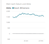
In this example I have just 2 categories, which have very different values (first one around 1500 and the 2nd one around 10). So if I plot them on a simple line chart, it looks quite ugly as you don't see any movement.
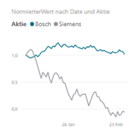
So the idea is to scale both values so that they start at the same value (say 1,0) and then indicate the trend compared to that value. This scaled time series can't be saved as a calculated column, because the plotted date period should be dynamic (set by a slicer).
The result should look like this.
I was able to achieve this plot by using the following measures:
FirstValue = CALCULATE(SUM(Tabelle1[Wert]);FILTER(ALL(Datumstabelle);Datumstabelle[Date]=DATE(2020;1;1)))
ScaledValue = DIVIDE(SUM(Tabelle1[Wert]);[FirstValue];0)a
Unfortunately I wasn't able to set the DATE(2020;1;1) to the minimum value in the current filter context. Whatever I tried, PowerBI set the filter context to the date on the x-axis in the line chart, resulting in the scaledValue being 1 every day for both stocks.
Any ideas?
Solved! Go to Solution.
- Mark as New
- Bookmark
- Subscribe
- Mute
- Subscribe to RSS Feed
- Permalink
- Report Inappropriate Content
- Mark as New
- Bookmark
- Subscribe
- Mute
- Subscribe to RSS Feed
- Permalink
- Report Inappropriate Content
- Mark as New
- Bookmark
- Subscribe
- Mute
- Subscribe to RSS Feed
- Permalink
- Report Inappropriate Content
Perfect, thanks a lot!
I have one more question about the same use case:
We also want to display the difference (absolute or in percent) between the value on the current date and the value on the previous available date.
I tried to work with the EARLIER function, but it seems to require an ordered column and I don't know how to create one if there are several stocks in the dataset.
- Mark as New
- Bookmark
- Subscribe
- Mute
- Subscribe to RSS Feed
- Permalink
- Report Inappropriate Content
Best
D
- Mark as New
- Bookmark
- Subscribe
- Mute
- Subscribe to RSS Feed
- Permalink
- Report Inappropriate Content
Best
D
- Mark as New
- Bookmark
- Subscribe
- Mute
- Subscribe to RSS Feed
- Permalink
- Report Inappropriate Content
Best
D
- Mark as New
- Bookmark
- Subscribe
- Mute
- Subscribe to RSS Feed
- Permalink
- Report Inappropriate Content
Sorry but it's the admin of this site that's to blame.
Best
D
Helpful resources
| User | Count |
|---|---|
| 15 | |
| 13 | |
| 9 | |
| 6 | |
| 6 |
| User | Count |
|---|---|
| 27 | |
| 19 | |
| 13 | |
| 9 | |
| 5 |


