FabCon is coming to Atlanta
Join us at FabCon Atlanta from March 16 - 20, 2026, for the ultimate Fabric, Power BI, AI and SQL community-led event. Save $200 with code FABCOMM.
Register now!- Power BI forums
- Get Help with Power BI
- Desktop
- Service
- Report Server
- Power Query
- Mobile Apps
- Developer
- DAX Commands and Tips
- Custom Visuals Development Discussion
- Health and Life Sciences
- Power BI Spanish forums
- Translated Spanish Desktop
- Training and Consulting
- Instructor Led Training
- Dashboard in a Day for Women, by Women
- Galleries
- Data Stories Gallery
- Themes Gallery
- Contests Gallery
- QuickViz Gallery
- Quick Measures Gallery
- Visual Calculations Gallery
- Notebook Gallery
- Translytical Task Flow Gallery
- TMDL Gallery
- R Script Showcase
- Webinars and Video Gallery
- Ideas
- Custom Visuals Ideas (read-only)
- Issues
- Issues
- Events
- Upcoming Events
The Power BI Data Visualization World Championships is back! Get ahead of the game and start preparing now! Learn more
- Power BI forums
- Forums
- Get Help with Power BI
- DAX Commands and Tips
- Re: Row by row Conditional Formatting on a Matrix
- Subscribe to RSS Feed
- Mark Topic as New
- Mark Topic as Read
- Float this Topic for Current User
- Bookmark
- Subscribe
- Printer Friendly Page
- Mark as New
- Bookmark
- Subscribe
- Mute
- Subscribe to RSS Feed
- Permalink
- Report Inappropriate Content
Row by row Conditional Formatting on a Matrix
Dear all,
I have a matrix formating issue.
I want to conditionally format my matirx row by row to show the monthly highest and smallest values for the years and months selected.
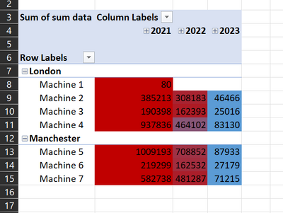
The result should look like this:
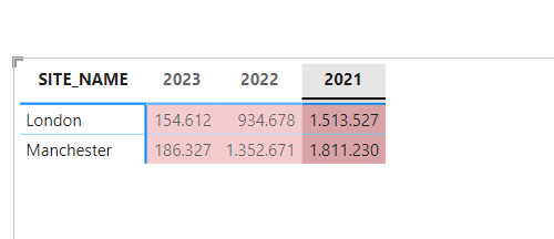
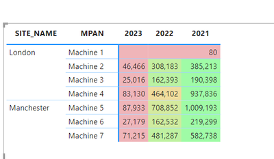
I can get the correct formating (below) for the individual dates but not for the Month, by using this DAX expression.
Please can you help me rank the data so that I can see the ranking what the data is aggregated on a monthly basis rather than the granular daily values?
Let me know if you require more information. Many thanks in advance.
tagging a few people to help. @tamerj1, @FreemanZ , @amitchandak
- Mark as New
- Bookmark
- Subscribe
- Mute
- Subscribe to RSS Feed
- Permalink
- Report Inappropriate Content
Hi,
Thank you for your reply and apologies for my delay in responding.
Please find a pbix file here with a sample data set: pbix file
Here is also an Excel file showing the row by row conditional formating that I want.
Ideally each row of data is conditionally formated based on the highest and lowest value in that row. This formatting should be maintained when I drill down to the day granualrity or drill up to month.
Many thanks in advance!
- Mark as New
- Bookmark
- Subscribe
- Mute
- Subscribe to RSS Feed
- Permalink
- Report Inappropriate Content
For each Machine and Year you want to find the highest and lowest monthly values? Or for each Machine you want to find the highest and lowest values regardless of the year? You would need to use ISINSCOPE() to figure out where in the date hierarchy you are.
- Mark as New
- Bookmark
- Subscribe
- Mute
- Subscribe to RSS Feed
- Permalink
- Report Inappropriate Content
For each machine and year, I want to format the matrix so that the value in each row is formated according to how big it is from smallest to largests, ignoring other rows of data. as in the image below: For example for machine 2, 2023 46,466 data is the smallest and 2021 385,213 is the biggest.
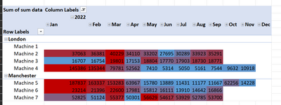
I also what this for each month in a year - the value in each row should be formated from smallest to largest, ignoring other rows of data. Please see below example, for Machine two we get more detail than in the before image, we see that for 2022, June had the smallest data and March the largest.
If I drill down then the values in each row again should be formated to show the smallest to biggest, ignoring other rows of data. In the below eaxmple, the daily granulariy show that for Machine 2, in March 2022, March 20 had the smallest data whilst March 14 had the largest data.
Thank for for your reply. I will check out ISINSCOPE() function.
- Mark as New
- Bookmark
- Subscribe
- Mute
- Subscribe to RSS Feed
- Permalink
- Report Inappropriate Content
See attached.
color =
SWITCH(
TRUE(),
ISINSCOPE( 'Date Table'[Day Number] ),
VAR a =
CALCULATETABLE(
SUMMARIZE(
'Date Table',
'Date Table'[Year],
'Date Table'[Month],
'Date Table'[Day Number],
"sd", [sum data]
),
REMOVEFILTERS(
'Date Table'[Year],
'Date Table'[Month],
'Date Table'[Day Number]
)
)
RETURN
DIVIDE( [sum data] - MINX( a, [sd] ), MAXX( a, [sd] ) - MINX( a, [sd] ) ),
ISINSCOPE( 'Date Table'[Month] ),
VAR a =
CALCULATETABLE(
SUMMARIZE(
'Date Table',
'Date Table'[Year],
'Date Table'[Month],
"sd", [sum data]
),
REMOVEFILTERS( 'Date Table'[Year], 'Date Table'[Month] )
)
RETURN
DIVIDE( [sum data] - MINX( a, [sd] ), MAXX( a, [sd] ) - MINX( a, [sd] ) ),
ISINSCOPE( 'Date Table'[Year] ),
VAR a =
CALCULATETABLE(
SUMMARIZE( 'Date Table', 'Date Table'[Year], "sd", [sum data] ),
REMOVEFILTERS( 'Date Table'[Year] )
)
RETURN
DIVIDE( [sum data] - MINX( a, [sd] ), MAXX( a, [sd] ) - MINX( a, [sd] ) )
)
- Mark as New
- Bookmark
- Subscribe
- Mute
- Subscribe to RSS Feed
- Permalink
- Report Inappropriate Content
- Mark as New
- Bookmark
- Subscribe
- Mute
- Subscribe to RSS Feed
- Permalink
- Report Inappropriate Content
I refactored the code. Seems to work better now.
color =
SWITCH (
    TRUE (),
    ISINSCOPE ( 'Date Table'[Day Number] ),
        VAR a =
            ADDCOLUMNS (
                CALCULATETABLE (
                    SUMMARIZECOLUMNS ( 'Date Table'[Day Number] ),
                    REMOVEFILTERS ( 'Date Table'[Day Number] )
                ),
                "sd", [sum data]
            )
        RETURN
            DIVIDE ( [sum data] - MINX ( a, [sd] ), MAXX ( a, [sd] ) - MINX ( a, [sd] ) ),
    ISINSCOPE ( 'Date Table'[Month] ),
        VAR a =
            ADDCOLUMNS (
                CALCULATETABLE (
                    SUMMARIZECOLUMNS ( 'Date Table'[Month], 'Date Table'[Month Number] ),
                    REMOVEFILTERS ( 'Date Table'[Month], 'Date Table'[Month Number] )
                ),
                "sd", [sum data]
            )
        RETURN
            DIVIDE ( [sum data] - MINX ( a, [sd] ), MAXX ( a, [sd] ) - MINX ( a, [sd] ) ),
    ISINSCOPE ( 'Date Table'[Year] ),
        VAR a =
            ADDCOLUMNS (
                CALCULATETABLE (
                    SUMMARIZECOLUMNS ( 'Date Table'[Year] ),
                    REMOVEFILTERS ( 'Date Table'[Year] )
                ),
                "sd", [sum data]
            )
        RETURN
            DIVIDE ( [sum data] - MINX ( a, [sd] ), MAXX ( a, [sd] ) - MINX ( a, [sd] ) )
)
- Mark as New
- Bookmark
- Subscribe
- Mute
- Subscribe to RSS Feed
- Permalink
- Report Inappropriate Content
Hi @lbendlin! I just realized if I sort year column by other one, the code doesn't work properly.
I want to sort years inversely as you can see in the next image:
How can I solve this? I doesn't understand why doesn't run. Thank you so much.
- Mark as New
- Bookmark
- Subscribe
- Mute
- Subscribe to RSS Feed
- Permalink
- Report Inappropriate Content
- Mark as New
- Bookmark
- Subscribe
- Mute
- Subscribe to RSS Feed
- Permalink
- Report Inappropriate Content
thank you so much!!!😁
- Mark as New
- Bookmark
- Subscribe
- Mute
- Subscribe to RSS Feed
- Permalink
- Report Inappropriate Content
That's perfect! Thank you so much for your time.
- Mark as New
- Bookmark
- Subscribe
- Mute
- Subscribe to RSS Feed
- Permalink
- Report Inappropriate Content
Hi Ibendlin,
Thank you so much for the time spent coming up with the above DAX. I appreciate your efort and time. Unfortunately, it doesn't work quite as I expect. In each row the data colouring doesn't flow from smallest to largest.
I created a work around with the below DAX. I essentially created two of the below DAX, one for formating the monthly view and another for formating the daily view and then added buttons for the use to move between the two matrices rather than drilling up or down. The below DAX is the monthly formating.
month Row by row CF =
VAR SummaryTable =
CALCULATETABLE(
ADDCOLUMNS (
Summarize(
'Data Table name',
'Data Table name'[row granularity column],
'Date Table'[Year],
'Date Table'[Month]
),
" SummaryTable column name", [sum measure of interest]
),
ALLSELECTED('Date Table') // column to remove filter so restart every row
)
VAR MaxValue =
MAXX (
SummaryTable,
[SummaryTable column name]
)
VAR MinValue =
MINX (
SummaryTable,
[SummaryTable column name]
)
VAR range = MaxValue - MinValue
VAR hue =
Round(
DIVIDE (
[sum measure of interest] - MinValue,
range
)*60, 0
) // + 240 // - to change the colour hue
VAR colour = "hsla(" & hue & ", " & "100%" & ", " & "70%" & ", " & 1 & ")"
Return
colour
This solution is from Bas, How to Power BI video titled Unleash the full Potential of Conditional Formating- row by row colour scale in a Matrix.
- Mark as New
- Bookmark
- Subscribe
- Mute
- Subscribe to RSS Feed
- Permalink
- Report Inappropriate Content
Please provide sample data that covers your issue or question completely, in a usable format (not as a screenshot).
https://community.powerbi.com/t5/Community-Blog/How-to-provide-sample-data-in-the-Power-BI-Forum/ba-...
Please show the expected outcome based on the sample data you provided.
https://community.powerbi.com/t5/Desktop/How-to-Get-Your-Question-Answered-Quickly/m-p/1447523
Helpful resources

Power BI Dataviz World Championships
The Power BI Data Visualization World Championships is back! Get ahead of the game and start preparing now!

| User | Count |
|---|---|
| 19 | |
| 13 | |
| 9 | |
| 4 | |
| 4 |
| User | Count |
|---|---|
| 30 | |
| 26 | |
| 17 | |
| 11 | |
| 10 |


