Fabric Data Days starts November 4th!
Advance your Data & AI career with 50 days of live learning, dataviz contests, hands-on challenges, study groups & certifications and more!
Get registered- Power BI forums
- Get Help with Power BI
- Desktop
- Service
- Report Server
- Power Query
- Mobile Apps
- Developer
- DAX Commands and Tips
- Custom Visuals Development Discussion
- Health and Life Sciences
- Power BI Spanish forums
- Translated Spanish Desktop
- Training and Consulting
- Instructor Led Training
- Dashboard in a Day for Women, by Women
- Galleries
- Data Stories Gallery
- Themes Gallery
- Contests Gallery
- QuickViz Gallery
- Quick Measures Gallery
- Visual Calculations Gallery
- Notebook Gallery
- Translytical Task Flow Gallery
- TMDL Gallery
- R Script Showcase
- Webinars and Video Gallery
- Ideas
- Custom Visuals Ideas (read-only)
- Issues
- Issues
- Events
- Upcoming Events
Get Fabric Certified for FREE during Fabric Data Days. Don't miss your chance! Request now
- Power BI forums
- Forums
- Get Help with Power BI
- DAX Commands and Tips
- Rank the sum of each column and visualize in a sor...
- Subscribe to RSS Feed
- Mark Topic as New
- Mark Topic as Read
- Float this Topic for Current User
- Bookmark
- Subscribe
- Printer Friendly Page
- Mark as New
- Bookmark
- Subscribe
- Mute
- Subscribe to RSS Feed
- Permalink
- Report Inappropriate Content
Rank the sum of each column and visualize in a sorted 'top N' horisontal bar chart
I'm banging my head against the wall on this one. I thought it would be easy, but for some reason I cannot get it to work.
Consider the following table
| timestamp | Instrument A | Instrument B | Instrument C | Instrument D |
| 10.01.2021 10:00:00 | 5 | 6 | 9 | 9 |
| 10.01.2021 11:00:00 | 6 | 2 | 3 | 9 |
| 11.01.2021 10:00:00 | 7 | 7 | 4 | 9 |
| 12.01.2021 10:00:00 | 5 | 3 | 3 | 4 |
| 13.01.2021 10:00:00 | 3 | 8 | 7 | 8 |
| 14.01.2021 10:00:00 | 9 | 6 | 3 | 4 |
| 14.01.2021 11:00:00 | 4 | 4 | 8 | 4 |
What I want to do is
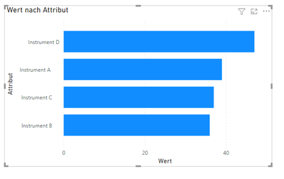
1. Sum the value of each colum (in this case that would be 39, 36, 37, 47 from left to right)
2. Show the sums in an 'Top N' chart sorted decending
In my real world case I have some 20 columns and 50000 rows, but the principle is the same.
Any tips ?
Solved! Go to Solution.
- Mark as New
- Bookmark
- Subscribe
- Mute
- Subscribe to RSS Feed
- Permalink
- Report Inappropriate Content
Hello,
i have tried out this topic and i think i have way you can do it.
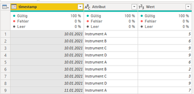
What i did is, i went into PowerQuery and unpivoted the table
First it looks like your table and afterwards like this screenshot:
And this would already work for getting the horizontal bar chart
Axis would be your Attribute (Instrument)
Value the Value
Now you can add a Top N Filter on the visualisation.
Does this help you?
Cheers
Tyree
- Mark as New
- Bookmark
- Subscribe
- Mute
- Subscribe to RSS Feed
- Permalink
- Report Inappropriate Content
Thanks for your feedback 🙂
Yeah, this would probably work. My current problem is that all the columns are calculated colums in DAX. The columns does not excist in the power query environment. So using your solution I would need to be able to make the calculated colums in power query. It can probably be done.
The "less work approach" would be to do this in DAX, if possible 🙂
- Mark as New
- Bookmark
- Subscribe
- Mute
- Subscribe to RSS Feed
- Permalink
- Report Inappropriate Content
Hello,
i have tried out this topic and i think i have way you can do it.
What i did is, i went into PowerQuery and unpivoted the table
First it looks like your table and afterwards like this screenshot:
And this would already work for getting the horizontal bar chart
Axis would be your Attribute (Instrument)
Value the Value
Now you can add a Top N Filter on the visualisation.
Does this help you?
Cheers
Tyree
Helpful resources

Fabric Data Days
Advance your Data & AI career with 50 days of live learning, contests, hands-on challenges, study groups & certifications and more!

Power BI Monthly Update - October 2025
Check out the October 2025 Power BI update to learn about new features.

| User | Count |
|---|---|
| 8 | |
| 7 | |
| 6 | |
| 5 | |
| 4 |
| User | Count |
|---|---|
| 25 | |
| 11 | |
| 8 | |
| 8 | |
| 8 |


