Join us at FabCon Vienna from September 15-18, 2025
The ultimate Fabric, Power BI, SQL, and AI community-led learning event. Save €200 with code FABCOMM.
Get registered- Power BI forums
- Get Help with Power BI
- Desktop
- Service
- Report Server
- Power Query
- Mobile Apps
- Developer
- DAX Commands and Tips
- Custom Visuals Development Discussion
- Health and Life Sciences
- Power BI Spanish forums
- Translated Spanish Desktop
- Training and Consulting
- Instructor Led Training
- Dashboard in a Day for Women, by Women
- Galleries
- Data Stories Gallery
- Themes Gallery
- Contests Gallery
- Quick Measures Gallery
- Notebook Gallery
- Translytical Task Flow Gallery
- TMDL Gallery
- R Script Showcase
- Webinars and Video Gallery
- Ideas
- Custom Visuals Ideas (read-only)
- Issues
- Issues
- Events
- Upcoming Events
Compete to become Power BI Data Viz World Champion! First round ends August 18th. Get started.
- Subscribe to RSS Feed
- Mark Topic as New
- Mark Topic as Read
- Float this Topic for Current User
- Bookmark
- Subscribe
- Printer Friendly Page
- Mark as New
- Bookmark
- Subscribe
- Mute
- Subscribe to RSS Feed
- Permalink
- Report Inappropriate Content
Percentages
Hello all,
I have a problem that I can not solve as a novice.
I have a table with trial subsciptionas from customers.
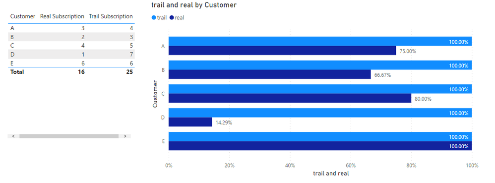
In parallel, I have joined the real subscriptions and shown in a table, how many of the trial subscriptions, also led to a real subscription.
Now I want to display the whole as a percentage, but in the stacked bar chart (100%) the trial subscriptions + correct subscriptions are displayed as 100%, although the trial subscriptions should be displayed as 100%.
So how do I get it to display the trial subscriptions as 100% each, and the correct subscriptions as a proportion of this 100%?
Thanks a lot!
Solved! Go to Solution.
- Mark as New
- Bookmark
- Subscribe
- Mute
- Subscribe to RSS Feed
- Permalink
- Report Inappropriate Content
Hi @_PBI_23455 ,
You can use the Clustered bar chart instead to achieve this goal.
1. Create two measure trail and real
trail = DIVIDE(SUM('Table'[Trail Subscription]),SUM('Table'[Trail Subscription]))

real = DIVIDE(SUM('Table'[Real Subscription]),SUM('Table'[Trail Subscription]))
2. Change the format of these measure to percentage.
3. Apply the two measure to the chart.
4. Open the data label.
Final output:
If the result you want is not this, please clarify in the next reply
Best Regards,
Jianbo Li
If this post helps, then please consider Accept it as the solution to help the other members find it more quickly.
- Mark as New
- Bookmark
- Subscribe
- Mute
- Subscribe to RSS Feed
- Permalink
- Report Inappropriate Content
would it be possible for you to provide some sample data of both tables? I would think that you could use an If (correct subscriptions >0 ,*then* trial subscriptions - correct subscriptions, *else* trial subscriptions then have the type as the legend
Helpful resources
| User | Count |
|---|---|
| 17 | |
| 8 | |
| 7 | |
| 6 | |
| 6 |
| User | Count |
|---|---|
| 26 | |
| 13 | |
| 12 | |
| 9 | |
| 8 |


