Join us at FabCon Vienna from September 15-18, 2025
The ultimate Fabric, Power BI, SQL, and AI community-led learning event. Save €200 with code FABCOMM.
Get registered- Power BI forums
- Get Help with Power BI
- Desktop
- Service
- Report Server
- Power Query
- Mobile Apps
- Developer
- DAX Commands and Tips
- Custom Visuals Development Discussion
- Health and Life Sciences
- Power BI Spanish forums
- Translated Spanish Desktop
- Training and Consulting
- Instructor Led Training
- Dashboard in a Day for Women, by Women
- Galleries
- Data Stories Gallery
- Themes Gallery
- Contests Gallery
- Quick Measures Gallery
- Notebook Gallery
- Translytical Task Flow Gallery
- TMDL Gallery
- R Script Showcase
- Webinars and Video Gallery
- Ideas
- Custom Visuals Ideas (read-only)
- Issues
- Issues
- Events
- Upcoming Events
Compete to become Power BI Data Viz World Champion! First round ends August 18th. Get started.
- Power BI forums
- Forums
- Get Help with Power BI
- DAX Commands and Tips
- Re: Percentages instead of Numbers in Stacked Colu...
- Subscribe to RSS Feed
- Mark Topic as New
- Mark Topic as Read
- Float this Topic for Current User
- Bookmark
- Subscribe
- Printer Friendly Page
- Mark as New
- Bookmark
- Subscribe
- Mute
- Subscribe to RSS Feed
- Permalink
- Report Inappropriate Content
Percentages instead of Numbers in Stacked Column chart
Hello All,
One query on Line & Stacked column chart implementation.
I need to show Percentages instead of Numbers in Power BI- Stacked column chart
The data set example is provided below.
| Country | Sales | Business/Customer |
| France | 2000 | B |
| France | 1000 | C |
| UK | 3000 | B |
| UK | 2000 | C |
| Germany | 4000 | B |
| Germany | 1000 | C |
| Spain | 2000 | B |
| Netherlands | 2000 | B |
| Netherlands | 500 | C |
| Italy | 1000 | B |
| Italy | 200 | C |
| Portugal | 1200 | B |
| Portugal | 300 | C |
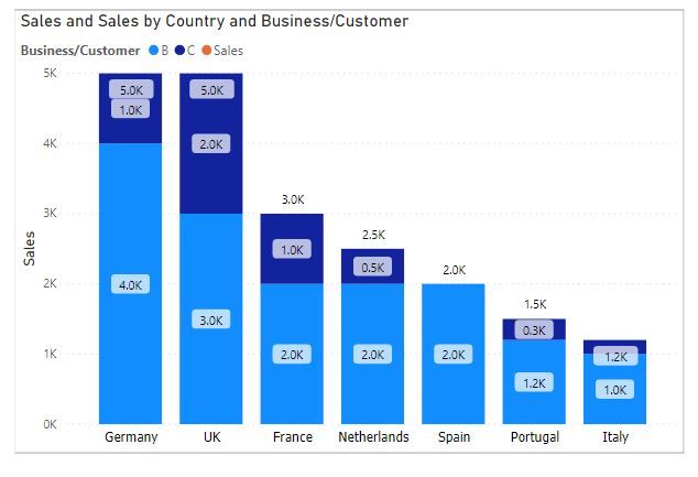
The visual I'm trying to generate is provided below.

Ex. For Germany, in Business it should be 4000/5000 = 80%, whereas for Customer it should be 1000/5000 = 20%
Also the column length is based on the total sales for each country.
Can you please help with what can be the possible tweak in Power BI which would help me get to this final state.
Thanks 🙂
Regards,
Varun
- Mark as New
- Bookmark
- Subscribe
- Mute
- Subscribe to RSS Feed
- Permalink
- Report Inappropriate Content
Hi @Anonymous
Use 100% stacked column chart.
Thanks & regards,
Pravin Wattamwar
www.linkedin.com/in/pravin-p-wattamwar
If I resolve your problem Mark it as a solution and give kudos.
- Mark as New
- Bookmark
- Subscribe
- Mute
- Subscribe to RSS Feed
- Permalink
- Report Inappropriate Content
@Anonymous
The idea is not to use 100% stacked column chart. As I want the 'Sales' for each country to determine the size of the columns (and not by 100% value).
- Mark as New
- Bookmark
- Subscribe
- Mute
- Subscribe to RSS Feed
- Permalink
- Report Inappropriate Content
Hi, I have not implemented this yet myself, but I came across this article a few weeks ago - I believe it's what you're looking to accomplish and seems fairly simple: https://bielite.com/blog/percent-data-labels/. Good luck!
Helpful resources
| User | Count |
|---|---|
| 16 | |
| 8 | |
| 7 | |
| 6 | |
| 5 |
| User | Count |
|---|---|
| 25 | |
| 13 | |
| 12 | |
| 8 | |
| 8 |


