FabCon is coming to Atlanta
Join us at FabCon Atlanta from March 16 - 20, 2026, for the ultimate Fabric, Power BI, AI and SQL community-led event. Save $200 with code FABCOMM.
Register now!- Power BI forums
- Get Help with Power BI
- Desktop
- Service
- Report Server
- Power Query
- Mobile Apps
- Developer
- DAX Commands and Tips
- Custom Visuals Development Discussion
- Health and Life Sciences
- Power BI Spanish forums
- Translated Spanish Desktop
- Training and Consulting
- Instructor Led Training
- Dashboard in a Day for Women, by Women
- Galleries
- Data Stories Gallery
- Themes Gallery
- Contests Gallery
- QuickViz Gallery
- Quick Measures Gallery
- Visual Calculations Gallery
- Notebook Gallery
- Translytical Task Flow Gallery
- TMDL Gallery
- R Script Showcase
- Webinars and Video Gallery
- Ideas
- Custom Visuals Ideas (read-only)
- Issues
- Issues
- Events
- Upcoming Events
The Power BI Data Visualization World Championships is back! Get ahead of the game and start preparing now! Learn more
- Power BI forums
- Forums
- Get Help with Power BI
- DAX Commands and Tips
- Not be grouped by
- Subscribe to RSS Feed
- Mark Topic as New
- Mark Topic as Read
- Float this Topic for Current User
- Bookmark
- Subscribe
- Printer Friendly Page
- Mark as New
- Bookmark
- Subscribe
- Mute
- Subscribe to RSS Feed
- Permalink
- Report Inappropriate Content
Not be grouped by
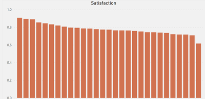
Hey! I got a bar chart, x-axis is list of brands, y-axis measure. Looks like this:
(can't show x-acis due to company agreement). I need a measure that will be an average value of y-axis measure by x-axis category. I can calculate this measure:
But when I put it as a line on barchart it don't shows me what I need, I need a straight line.
Solved! Go to Solution.
- Mark as New
- Bookmark
- Subscribe
- Mute
- Subscribe to RSS Feed
- Permalink
- Report Inappropriate Content
Hi:
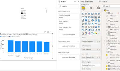
Can you try a Line & Clustered chart, using the overall measure as seconday Y? I'll paste image for more clarity. My example is on profit margin %, but can be done for your overall SAT measure. I hope this helps..
Measure for flat line:
- Mark as New
- Bookmark
- Subscribe
- Mute
- Subscribe to RSS Feed
- Permalink
- Report Inappropriate Content
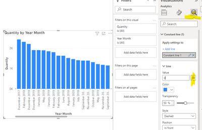
@Anonymous just add your measure as a constant line in the analytics tab of the visual formatting :
- Mark as New
- Bookmark
- Subscribe
- Mute
- Subscribe to RSS Feed
- Permalink
- Report Inappropriate Content
The answer is correct, very cool. But I should use not constant line, but average line, thanks, I didn't know about these feature.
- Mark as New
- Bookmark
- Subscribe
- Mute
- Subscribe to RSS Feed
- Permalink
- Report Inappropriate Content
Hi:
Can you try a Line & Clustered chart, using the overall measure as seconday Y? I'll paste image for more clarity. My example is on profit margin %, but can be done for your overall SAT measure. I hope this helps..
Measure for flat line:
- Mark as New
- Bookmark
- Subscribe
- Mute
- Subscribe to RSS Feed
- Permalink
- Report Inappropriate Content
I won't work because let's say your sales in my case is a measure, not a column
- Mark as New
- Bookmark
- Subscribe
- Mute
- Subscribe to RSS Feed
- Permalink
- Report Inappropriate Content
Hi:
Can you provide example data (and image of key tables in your data model)as it should be possible to create a measure showing the values you want as a straight line?
Thanks
- Mark as New
- Bookmark
- Subscribe
- Mute
- Subscribe to RSS Feed
- Permalink
- Report Inappropriate Content
Table: Both;
Columns: Brand, Person_ID, Question, Answer, answer_code, Type
Measure:
So, it just counts the % of positive answers, and I show it as % per brand in a bar chart(x-axis - brand, y-axis - satisfaction measure. How to show average satisfaction by brand on the same bar chart as line?
Helpful resources

Power BI Dataviz World Championships
The Power BI Data Visualization World Championships is back! Get ahead of the game and start preparing now!

| User | Count |
|---|---|
| 16 | |
| 8 | |
| 4 | |
| 4 | |
| 3 |
| User | Count |
|---|---|
| 25 | |
| 13 | |
| 12 | |
| 10 | |
| 6 |


