Fabric Data Days starts November 4th!
Advance your Data & AI career with 50 days of live learning, dataviz contests, hands-on challenges, study groups & certifications and more!
Get registered- Power BI forums
- Get Help with Power BI
- Desktop
- Service
- Report Server
- Power Query
- Mobile Apps
- Developer
- DAX Commands and Tips
- Custom Visuals Development Discussion
- Health and Life Sciences
- Power BI Spanish forums
- Translated Spanish Desktop
- Training and Consulting
- Instructor Led Training
- Dashboard in a Day for Women, by Women
- Galleries
- Data Stories Gallery
- Themes Gallery
- Contests Gallery
- Quick Measures Gallery
- Visual Calculations Gallery
- Notebook Gallery
- Translytical Task Flow Gallery
- TMDL Gallery
- R Script Showcase
- Webinars and Video Gallery
- Ideas
- Custom Visuals Ideas (read-only)
- Issues
- Issues
- Events
- Upcoming Events
Get Fabric Certified for FREE during Fabric Data Days. Don't miss your chance! Learn more
- Power BI forums
- Forums
- Get Help with Power BI
- DAX Commands and Tips
- Re: Not be grouped by
- Subscribe to RSS Feed
- Mark Topic as New
- Mark Topic as Read
- Float this Topic for Current User
- Bookmark
- Subscribe
- Printer Friendly Page
- Mark as New
- Bookmark
- Subscribe
- Mute
- Subscribe to RSS Feed
- Permalink
- Report Inappropriate Content
Not be grouped by
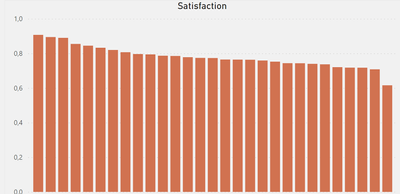
Hey! I got a bar chart, x-axis is list of brands, y-axis measure. Looks like this:
(can't show x-acis due to company agreement). I need a measure that will be an average value of y-axis measure by x-axis category. I can calculate this measure:
But when I put it as a line on barchart it don't shows me what I need, I need a straight line.
Solved! Go to Solution.
- Mark as New
- Bookmark
- Subscribe
- Mute
- Subscribe to RSS Feed
- Permalink
- Report Inappropriate Content
Hi:
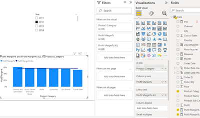
Can you try a Line & Clustered chart, using the overall measure as seconday Y? I'll paste image for more clarity. My example is on profit margin %, but can be done for your overall SAT measure. I hope this helps..
Measure for flat line:
- Mark as New
- Bookmark
- Subscribe
- Mute
- Subscribe to RSS Feed
- Permalink
- Report Inappropriate Content
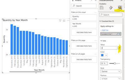
@Anonymous just add your measure as a constant line in the analytics tab of the visual formatting :
- Mark as New
- Bookmark
- Subscribe
- Mute
- Subscribe to RSS Feed
- Permalink
- Report Inappropriate Content
The answer is correct, very cool. But I should use not constant line, but average line, thanks, I didn't know about these feature.
- Mark as New
- Bookmark
- Subscribe
- Mute
- Subscribe to RSS Feed
- Permalink
- Report Inappropriate Content
Hi:
Can you try a Line & Clustered chart, using the overall measure as seconday Y? I'll paste image for more clarity. My example is on profit margin %, but can be done for your overall SAT measure. I hope this helps..
Measure for flat line:
- Mark as New
- Bookmark
- Subscribe
- Mute
- Subscribe to RSS Feed
- Permalink
- Report Inappropriate Content
I won't work because let's say your sales in my case is a measure, not a column
- Mark as New
- Bookmark
- Subscribe
- Mute
- Subscribe to RSS Feed
- Permalink
- Report Inappropriate Content
Hi:
Can you provide example data (and image of key tables in your data model)as it should be possible to create a measure showing the values you want as a straight line?
Thanks
- Mark as New
- Bookmark
- Subscribe
- Mute
- Subscribe to RSS Feed
- Permalink
- Report Inappropriate Content
Table: Both;
Columns: Brand, Person_ID, Question, Answer, answer_code, Type
Measure:
So, it just counts the % of positive answers, and I show it as % per brand in a bar chart(x-axis - brand, y-axis - satisfaction measure. How to show average satisfaction by brand on the same bar chart as line?
Helpful resources

Fabric Data Days
Advance your Data & AI career with 50 days of live learning, contests, hands-on challenges, study groups & certifications and more!

Power BI Monthly Update - October 2025
Check out the October 2025 Power BI update to learn about new features.

| User | Count |
|---|---|
| 8 | |
| 5 | |
| 5 | |
| 4 | |
| 3 |
| User | Count |
|---|---|
| 24 | |
| 11 | |
| 10 | |
| 9 | |
| 8 |


