FabCon is coming to Atlanta
Join us at FabCon Atlanta from March 16 - 20, 2026, for the ultimate Fabric, Power BI, AI and SQL community-led event. Save $200 with code FABCOMM.
Register now!- Power BI forums
- Get Help with Power BI
- Desktop
- Service
- Report Server
- Power Query
- Mobile Apps
- Developer
- DAX Commands and Tips
- Custom Visuals Development Discussion
- Health and Life Sciences
- Power BI Spanish forums
- Translated Spanish Desktop
- Training and Consulting
- Instructor Led Training
- Dashboard in a Day for Women, by Women
- Galleries
- Data Stories Gallery
- Themes Gallery
- Contests Gallery
- Quick Measures Gallery
- Notebook Gallery
- Translytical Task Flow Gallery
- TMDL Gallery
- R Script Showcase
- Webinars and Video Gallery
- Ideas
- Custom Visuals Ideas (read-only)
- Issues
- Issues
- Events
- Upcoming Events
To celebrate FabCon Vienna, we are offering 50% off select exams. Ends October 3rd. Request your discount now.
- Power BI forums
- Forums
- Get Help with Power BI
- DAX Commands and Tips
- Re: Need to visualize percent above and below expe...
- Subscribe to RSS Feed
- Mark Topic as New
- Mark Topic as Read
- Float this Topic for Current User
- Bookmark
- Subscribe
- Printer Friendly Page
- Mark as New
- Bookmark
- Subscribe
- Mute
- Subscribe to RSS Feed
- Permalink
- Report Inappropriate Content
Need to visualize percent above and below expected time for trainings
I would like to be able to visualize (in a bar chart most likely) a count of how many people sit within certain percentages above or below the expected time of a training.
So there is an expected time of a training which doesn't change. If course A has an expected time of 15 mins but learner completed course A in 30 mins then obviously they completed it in twice the expected time.
I tried using percentile calculations but it doesn't make sense when visualized. Maybe it needs to count how many are in that category for me to be able to put it in a bar chart of how many learners were in this bucket?
I tried the quartile formula on this forum too and it's not visualizing either.. but maybe the same problem? I need learners bucketed into these categories and then counted so that I can see how many learners are in each bucket.
HELP! Thank you!!
- Mark as New
- Bookmark
- Subscribe
- Mute
- Subscribe to RSS Feed
- Permalink
- Report Inappropriate Content
Ok in dim table I've put a category to each percentage point
I've got a variance value for each line in the fact table (student records) they range from -1 to 1.25 so I put some cushion in the dim to 1.5
connected dim and fact tables by values
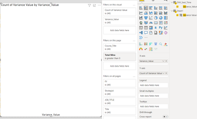
Tried to throw it into a bar chart and nothing?
- Mark as New
- Bookmark
- Subscribe
- Mute
- Subscribe to RSS Feed
- Permalink
- Report Inappropriate Content
Glad to help.
I mocked this up and was able to get results returned. I suggest the following:
- Be sure the data types between the 2 related columns are identical in both back end Transform Data and Front End column Tools.
- I see that you created the variance via calculated column on the front end, this should work but my preference would be to do this in the backend transform data.
- In my mock up, I initially had the column types as % in the backend Transform data and that provided 0 results, telling me my relationship wasnt working. I went back and altered my data types to be fixed decimal and this fixed the relationships instantly. I would have expected % to have worked since they were both set to %, but I suppose some kind of rounding was preventing it from finding a match in the 1:many relationship.
- I see a page level filter in your image, ensure this isnt filtering out all your results.
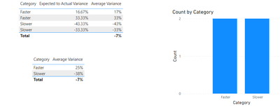
- I would create an explicit measure to do the counts by leveraging countrows(fact table)
- additional explicit measures such as average could be insightful as well
- Mark as New
- Bookmark
- Subscribe
- Mute
- Subscribe to RSS Feed
- Permalink
- Report Inappropriate Content
- Mark as New
- Bookmark
- Subscribe
- Mute
- Subscribe to RSS Feed
- Permalink
- Report Inappropriate Content
I am not familiar with those statistical functions, but I would solve this problem with basic math and star schema modeling.
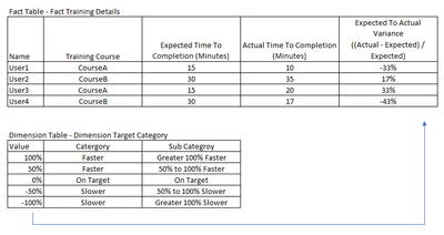
The below digram outlines my approach. Create a Fact table that contains a column computing the variance between Expected to Actual completion times to obtain a %.
Then create a Dimension table that contains all possible combination and group them in your desired buckets. The example does not contain all possible values, your dimension should be built from 1000% to -1000% in 1% increments (or a larger scale if desired).
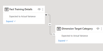
Create a releationship from your dimension to your fact tables by the % value. Once complete you can simply count how many users fit within the buckets you custom defined.
- Mark as New
- Bookmark
- Subscribe
- Mute
- Subscribe to RSS Feed
- Permalink
- Report Inappropriate Content
Sorry, getting to it now.
So I would relate to my fact table with value?
- Mark as New
- Bookmark
- Subscribe
- Mute
- Subscribe to RSS Feed
- Permalink
- Report Inappropriate Content
Yes, once you build out your dimension that includes a row for every possible value within your range. Just relate your dimension to your fact on the % (most likely still in decimal form) and youll be able to customize your groupings like above.


