Party with Power BI’s own Guy in a Cube
Power BI is turning 10! Tune in for a special live episode on July 24 with behind-the-scenes stories, product evolution highlights, and a sneak peek at what’s in store for the future.
Save the date- Power BI forums
- Get Help with Power BI
- Desktop
- Service
- Report Server
- Power Query
- Mobile Apps
- Developer
- DAX Commands and Tips
- Custom Visuals Development Discussion
- Health and Life Sciences
- Power BI Spanish forums
- Translated Spanish Desktop
- Training and Consulting
- Instructor Led Training
- Dashboard in a Day for Women, by Women
- Galleries
- Data Stories Gallery
- Themes Gallery
- Contests Gallery
- Quick Measures Gallery
- Notebook Gallery
- Translytical Task Flow Gallery
- TMDL Gallery
- R Script Showcase
- Webinars and Video Gallery
- Ideas
- Custom Visuals Ideas (read-only)
- Issues
- Issues
- Events
- Upcoming Events
Enhance your career with this limited time 50% discount on Fabric and Power BI exams. Ends August 31st. Request your voucher.
- Power BI forums
- Forums
- Get Help with Power BI
- DAX Commands and Tips
- Re: Need Some DAX Help Turning Donut Chart Data in...
- Subscribe to RSS Feed
- Mark Topic as New
- Mark Topic as Read
- Float this Topic for Current User
- Bookmark
- Subscribe
- Printer Friendly Page
- Mark as New
- Bookmark
- Subscribe
- Mute
- Subscribe to RSS Feed
- Permalink
- Report Inappropriate Content
Need Some DAX Help Turning Donut Chart Data into Stacked Area Chart Over Dates Data. HELP?
Hello Power BI Team,
I need to develop a visualization for which I am having trouble getting my mind around the best way to do the math.
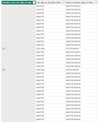
I host a Vimeo OTT site, and I have a table of all our customer_id’s which includes three columns showing how many days ago (from today) they last signed in, and a second column that shows 0-30 days, 30-60 days, etc.. Up into INACTIVE which means we have no sign-in data for that customer. Then there is a third column where I categorize the customer_id as either “ACTIVE” or “INACTIVE”. Note the data for these are pulled from a merged table with platform login information (ie—what date they last signed-in).
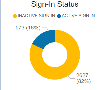
I use this for a donut chart showing what % of total registrants are INACTIVE vs ACTIVE. NOTE: don’t ask why we have so many INACTIVE—it is a long story.
What I want to do is make this into a stacked area chart over dates (I have a date table) showing each day’s % of ACTIVE vs %INACTIVE users so that we can show over time how the % is changing. The area chart should add up to 100% and continue to adapt as we add more registrants and track their sign-in information.
I can’t figure out how to do this. I am guessing I need yet another table showing each date, with calculated columns for %ACTIVE and %INACTIVE but no idea the DAX or M involved.
Any suggestions?
Thanks,
- Mark as New
- Bookmark
- Subscribe
- Mute
- Subscribe to RSS Feed
- Permalink
- Report Inappropriate Content
I 'sort of' figured it out using my running total and an inactive/active legend but I still don't know how to turn it into %. I'd prefer to use % of total rather than just raw numbers. Any ideas?
- Mark as New
- Bookmark
- Subscribe
- Mute
- Subscribe to RSS Feed
- Permalink
- Report Inappropriate Content
Hello @rsderby68,
Maybe if you try the following measure:
Helpful resources
| User | Count |
|---|---|
| 25 | |
| 12 | |
| 8 | |
| 6 | |
| 6 |
| User | Count |
|---|---|
| 26 | |
| 12 | |
| 11 | |
| 10 | |
| 6 |


