Huge last-minute discounts for FabCon Vienna from September 15-18, 2025
Supplies are limited. Contact info@espc.tech right away to save your spot before the conference sells out.
Get your discount- Power BI forums
- Get Help with Power BI
- Desktop
- Service
- Report Server
- Power Query
- Mobile Apps
- Developer
- DAX Commands and Tips
- Custom Visuals Development Discussion
- Health and Life Sciences
- Power BI Spanish forums
- Translated Spanish Desktop
- Training and Consulting
- Instructor Led Training
- Dashboard in a Day for Women, by Women
- Galleries
- Data Stories Gallery
- Themes Gallery
- Contests Gallery
- Quick Measures Gallery
- Notebook Gallery
- Translytical Task Flow Gallery
- TMDL Gallery
- R Script Showcase
- Webinars and Video Gallery
- Ideas
- Custom Visuals Ideas (read-only)
- Issues
- Issues
- Events
- Upcoming Events
Score big with last-minute savings on the final tickets to FabCon Vienna. Secure your discount
- Power BI forums
- Forums
- Get Help with Power BI
- DAX Commands and Tips
- Re: Line graph interaction with page filter
- Subscribe to RSS Feed
- Mark Topic as New
- Mark Topic as Read
- Float this Topic for Current User
- Bookmark
- Subscribe
- Printer Friendly Page
- Mark as New
- Bookmark
- Subscribe
- Mute
- Subscribe to RSS Feed
- Permalink
- Report Inappropriate Content
Line graph interaction with page filter
Still learning here...
I have a line graph that shows for the current year and my page will have a month/year filter. Currently, when I choose a month, my graph shows that one dot for the month.
I know I can turn off interactions, but is it possible to make the graph show the line up to the date selected? So if Aug 2022 was chosen, I would see the line up until Aug?
Thx
Solved! Go to Solution.
- Mark as New
- Bookmark
- Subscribe
- Mute
- Subscribe to RSS Feed
- Permalink
- Report Inappropriate Content
Hi , @atowriss1
Here are the steps you can refer to :
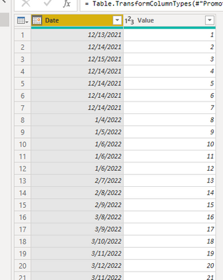
(1)This is my test data :
(2)We can create a calendar table, we don't need to create relationships between two tables:
Calendar = ADDCOLUMNS(
CALENDAR(FIRSTDATE('Table'[Date]),LASTDATE('Table'[Date])),
"year_month", year([Date]) * 100 + MONTH([Date])
)
(3)We can create a measure :
Value = var _slice = MAX('Calendar'[Date])
var _current= MAX('Table'[Date])
return
IF(_current<= _slice , SUM('Table'[Value]) , BLANK() )
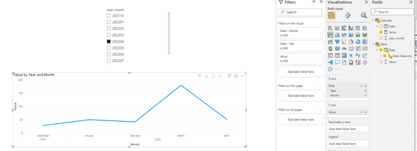
(4)Then we can put the filed we need in the visual and then we can meet your need:
Best Regards,
Aniya Zhang
If this post helps, then please consider Accept it as the solution to help the other members find it more quickly
- Mark as New
- Bookmark
- Subscribe
- Mute
- Subscribe to RSS Feed
- Permalink
- Report Inappropriate Content
You could create a disconnected table to use in your slicer, you can copy the appropriate columns from your Date table using SELECTCOLUMNS. You will need the month number column as well as the month name.
You can then either amend your existing measure or write a new one just for this purpose, something like
Filtered measure = CALCULATE( [Existing Measure], 'Date'[Year] = SELECTEDVALUE('Slicer table'[Year]), 'Date'[Month number] <= SELECTEDVALUE( 'Slicer table'[Month number]) )Helpful resources
| User | Count |
|---|---|
| 12 | |
| 11 | |
| 8 | |
| 6 | |
| 6 |
| User | Count |
|---|---|
| 24 | |
| 19 | |
| 14 | |
| 10 | |
| 7 |


