FabCon is coming to Atlanta
Join us at FabCon Atlanta from March 16 - 20, 2026, for the ultimate Fabric, Power BI, AI and SQL community-led event. Save $200 with code FABCOMM.
Register now!- Power BI forums
- Get Help with Power BI
- Desktop
- Service
- Report Server
- Power Query
- Mobile Apps
- Developer
- DAX Commands and Tips
- Custom Visuals Development Discussion
- Health and Life Sciences
- Power BI Spanish forums
- Translated Spanish Desktop
- Training and Consulting
- Instructor Led Training
- Dashboard in a Day for Women, by Women
- Galleries
- Data Stories Gallery
- Themes Gallery
- Contests Gallery
- QuickViz Gallery
- Quick Measures Gallery
- Visual Calculations Gallery
- Notebook Gallery
- Translytical Task Flow Gallery
- TMDL Gallery
- R Script Showcase
- Webinars and Video Gallery
- Ideas
- Custom Visuals Ideas (read-only)
- Issues
- Issues
- Events
- Upcoming Events
The Power BI Data Visualization World Championships is back! Get ahead of the game and start preparing now! Learn more
- Power BI forums
- Forums
- Get Help with Power BI
- DAX Commands and Tips
- Re: How to sort months by name on rolling 12 month...
- Subscribe to RSS Feed
- Mark Topic as New
- Mark Topic as Read
- Float this Topic for Current User
- Bookmark
- Subscribe
- Printer Friendly Page
- Mark as New
- Bookmark
- Subscribe
- Mute
- Subscribe to RSS Feed
- Permalink
- Report Inappropriate Content
How to sort months by name on rolling 12 months using DAX measures
Hello Power BI Community,
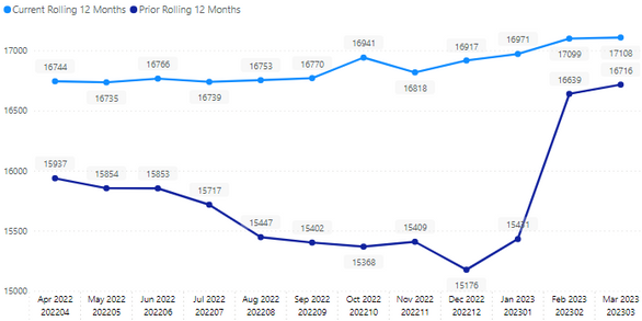
I am facing an issue with the x-axis on my line chart in Power BI. Specifically, when I apply the "PeriodCal" dax measure, the months for 2023 are shown on the left side of the line chart, while the months of the year 2022 are shown on the right side of the line chart in no specific order. I want to reverse the order so that the months for 2022 are shown on the left side and the months for 2023 are shown on the right side. I also attempted to sort the x-axis by "Current 12 months rolling" and "Prior 12 months rolling" (and by PeriodCal also) but to no avail. My objective is to sort the months from left (oldest month) to right (newest month) in a rolling 12 months format (March 2022, April ... December 2022, .... Jan 2023... March 2023)
Here is the code I attempted so far for the "PeriodCal" measure I am using:
PeriodCal = VAR __maxDate = MAX(Calendrier[Date]) VAR __minDate = MIN(Calendrier[Date]) RETURN SWITCH( TRUE(),
            Calendrier[Date] = __maxDate, "Current Month", Calendrier[Date] = __minDate, "Oldest Month",
            FORMAT(Calendrier[Date], "mmm yyyy") )
The following are my two measures applied to the graph to calculate the prior and current 12 months rolling :
Prior rolling 12 months = CALCULATE([DAX_Measure_Sales], DATESINPERIOD('Calendrier'[Date],ENDOFMONTH(dateadd(Data[MyDate],-12,month)),-12,MONTH))
Current rolling 12 months = CALCULATE([DAX_Measure_Sales], DATESINPERIOD('Calendrier'[Date], ENDOFMONTH(Data[MyDate]), -12, MONTH))
I would greatly appreciate any help or suggestions on how to fix this issue.
Thank you!
Solved! Go to Solution.
- Mark as New
- Bookmark
- Subscribe
- Mute
- Subscribe to RSS Feed
- Permalink
- Report Inappropriate Content
@Anonymous OK, so all you need is to create a numeric sorting column corresponding to calculated colunn and set the Sort By column for your calculated column to this sorting column.
Follow on LinkedIn
@ me in replies or I'll lose your thread!!!
Instead of a Kudo, please vote for this idea
Become an expert!: Enterprise DNA
External Tools: MSHGQM
YouTube Channel!: Microsoft Hates Greg
Latest book!: DAX For Humans
DAX is easy, CALCULATE makes DAX hard...
- Mark as New
- Bookmark
- Subscribe
- Mute
- Subscribe to RSS Feed
- Permalink
- Report Inappropriate Content
@Anonymous First, there should be ellipses ( ... ) in the upper right or lower right corner of your visual when you have it selected where you can change the sort order for the x-axis ( ascending/descending) or change the sorting to be based on the y-axis.
Second, I don't understand where you are using the PeriodCal measure because you traditionally cannot use a measure in an x-axis exactly what you are doing or trying to do.
Follow on LinkedIn
@ me in replies or I'll lose your thread!!!
Instead of a Kudo, please vote for this idea
Become an expert!: Enterprise DNA
External Tools: MSHGQM
YouTube Channel!: Microsoft Hates Greg
Latest book!: DAX For Humans
DAX is easy, CALCULATE makes DAX hard...
- Mark as New
- Bookmark
- Subscribe
- Mute
- Subscribe to RSS Feed
- Permalink
- Report Inappropriate Content
It's rather a new column not a new measure, which is applied to the x-axis.
- Mark as New
- Bookmark
- Subscribe
- Mute
- Subscribe to RSS Feed
- Permalink
- Report Inappropriate Content
@Anonymous OK, so all you need is to create a numeric sorting column corresponding to calculated colunn and set the Sort By column for your calculated column to this sorting column.
Follow on LinkedIn
@ me in replies or I'll lose your thread!!!
Instead of a Kudo, please vote for this idea
Become an expert!: Enterprise DNA
External Tools: MSHGQM
YouTube Channel!: Microsoft Hates Greg
Latest book!: DAX For Humans
DAX is easy, CALCULATE makes DAX hard...
- Mark as New
- Bookmark
- Subscribe
- Mute
- Subscribe to RSS Feed
- Permalink
- Report Inappropriate Content
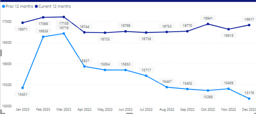
you're right @Greg_Deckler , that's what I did, I created a numeric second calculated column and included it above the PeriodCal column in the x-axis as follows:
I got the following graph, but the label values seem to be redundant, is there a way for me to keep the names of the months, while maintaining the same order (I tried hiding the new column) :

- Mark as New
- Bookmark
- Subscribe
- Mute
- Subscribe to RSS Feed
- Permalink
- Report Inappropriate Content
@Anonymous You don't need to include the 2nd column in the axis. You only need to set the Sort By column for PeriodCal to be the numeric column. Click on the PeriodCal column in your Data view. In the Column Tools section of the ribbon, look for Sort By and use the drop down.
Follow on LinkedIn
@ me in replies or I'll lose your thread!!!
Instead of a Kudo, please vote for this idea
Become an expert!: Enterprise DNA
External Tools: MSHGQM
YouTube Channel!: Microsoft Hates Greg
Latest book!: DAX For Humans
DAX is easy, CALCULATE makes DAX hard...
- Mark as New
- Bookmark
- Subscribe
- Mute
- Subscribe to RSS Feed
- Permalink
- Report Inappropriate Content
Thank you Greg for your assistance, you rock!
Helpful resources

Power BI Dataviz World Championships
The Power BI Data Visualization World Championships is back! Get ahead of the game and start preparing now!

Power BI Monthly Update - November 2025
Check out the November 2025 Power BI update to learn about new features.

| User | Count |
|---|---|
| 20 | |
| 10 | |
| 9 | |
| 4 | |
| 4 |
| User | Count |
|---|---|
| 33 | |
| 31 | |
| 19 | |
| 12 | |
| 11 |

