FabCon is coming to Atlanta
Join us at FabCon Atlanta from March 16 - 20, 2026, for the ultimate Fabric, Power BI, AI and SQL community-led event. Save $200 with code FABCOMM.
Register now!- Power BI forums
- Get Help with Power BI
- Desktop
- Service
- Report Server
- Power Query
- Mobile Apps
- Developer
- DAX Commands and Tips
- Custom Visuals Development Discussion
- Health and Life Sciences
- Power BI Spanish forums
- Translated Spanish Desktop
- Training and Consulting
- Instructor Led Training
- Dashboard in a Day for Women, by Women
- Galleries
- Data Stories Gallery
- Themes Gallery
- Contests Gallery
- Quick Measures Gallery
- Visual Calculations Gallery
- Notebook Gallery
- Translytical Task Flow Gallery
- TMDL Gallery
- R Script Showcase
- Webinars and Video Gallery
- Ideas
- Custom Visuals Ideas (read-only)
- Issues
- Issues
- Events
- Upcoming Events
Calling all Data Engineers! Fabric Data Engineer (Exam DP-700) live sessions are back! Starting October 16th. Sign up.
- Power BI forums
- Forums
- Get Help with Power BI
- DAX Commands and Tips
- How to make graph that show from first month until...
- Subscribe to RSS Feed
- Mark Topic as New
- Mark Topic as Read
- Float this Topic for Current User
- Bookmark
- Subscribe
- Printer Friendly Page
- Mark as New
- Bookmark
- Subscribe
- Mute
- Subscribe to RSS Feed
- Permalink
- Report Inappropriate Content
How to make graph that show from first month until selected month filter.
Hello,
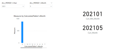
I try to make a graph that show from the first month of the selected year until selected month filter.
(example: when we select year 2021 and month 5, it will show from january to may)
But as you can see from the pic, when the filters at 2021 05, the graph just show may, not from january until may.
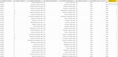
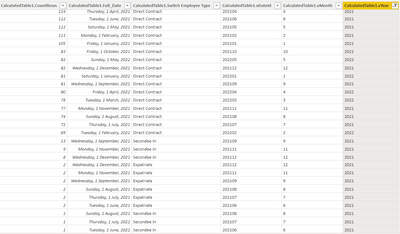
Here's the look of my data:
This is period table
and this is model table
I've already make 2 measure that contain Start and End Period
This measure to always show First Month:
This measure to always show Selected Month:
This Measure that I put on the Graph:
Please help where that i did wrong.
Here's I attached my pbix (Page2)
PBIX Testing
Solved! Go to Solution.
- Mark as New
- Bookmark
- Subscribe
- Mute
- Subscribe to RSS Feed
- Permalink
- Report Inappropriate Content
hi @agustira97
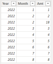
tried to simulate your scenario with simplified dataset like:
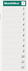
1) plot a slicer with a column from an isolated table like:
2) plot a visual with month column of your record table and a measure like this:
Measure =
IF(
    MAX(TableName[Month])<=SELECTEDVALUE(Slicer[MonthSlicer]),
    SUM(TableName[Amt]),
    BLANK()
)
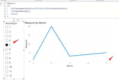
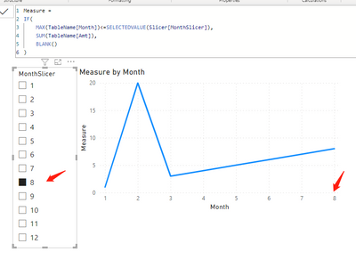
You see, when you choose a different month in the slicer, the chart axis changes accordingly:
The piont is:
the column to feed the slicer needs to be isolated from your record table, otherwise you selecting a data point instead of a range.
- Mark as New
- Bookmark
- Subscribe
- Mute
- Subscribe to RSS Feed
- Permalink
- Report Inappropriate Content
Hi, thank you for the answer @FreemanZ
I've already tried it on my case and It works.
Next Question is, this slicer not just on 1 graph, but also the other graph. It means another graph measure also need to adjust with this isolated slicer right?
Cause I have another chart like gauge chart, but I dont need to sum from the first month of the year, it just need to sum from selected year.
Just to make sure, Thank you.
- Mark as New
- Bookmark
- Subscribe
- Mute
- Subscribe to RSS Feed
- Permalink
- Report Inappropriate Content
hi @agustira97
tried to simulate your scenario with simplified dataset like:
1) plot a slicer with a column from an isolated table like:
2) plot a visual with month column of your record table and a measure like this:
Measure =
IF(
    MAX(TableName[Month])<=SELECTEDVALUE(Slicer[MonthSlicer]),
    SUM(TableName[Amt]),
    BLANK()
)
You see, when you choose a different month in the slicer, the chart axis changes accordingly:
The piont is:
the column to feed the slicer needs to be isolated from your record table, otherwise you selecting a data point instead of a range.
- Mark as New
- Bookmark
- Subscribe
- Mute
- Subscribe to RSS Feed
- Permalink
- Report Inappropriate Content
Hi @FreemanZ
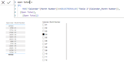
This is my question also, i used your measure in my scenerio .but from my side this measure is not working ,attached screenshot for reference. please give breif answer as soon as possible.
Regards,
Vidya
- Mark as New
- Bookmark
- Subscribe
- Mute
- Subscribe to RSS Feed
- Permalink
- Report Inappropriate Content
Helpful resources

FabCon Global Hackathon
Join the Fabric FabCon Global Hackathon—running virtually through Nov 3. Open to all skill levels. $10,000 in prizes!

Power BI Monthly Update - October 2025
Check out the October 2025 Power BI update to learn about new features.

