Fabric Data Days starts November 4th!
Advance your Data & AI career with 50 days of live learning, dataviz contests, hands-on challenges, study groups & certifications and more!
Get registered- Power BI forums
- Get Help with Power BI
- Desktop
- Service
- Report Server
- Power Query
- Mobile Apps
- Developer
- DAX Commands and Tips
- Custom Visuals Development Discussion
- Health and Life Sciences
- Power BI Spanish forums
- Translated Spanish Desktop
- Training and Consulting
- Instructor Led Training
- Dashboard in a Day for Women, by Women
- Galleries
- Data Stories Gallery
- Themes Gallery
- Contests Gallery
- QuickViz Gallery
- Quick Measures Gallery
- Visual Calculations Gallery
- Notebook Gallery
- Translytical Task Flow Gallery
- TMDL Gallery
- R Script Showcase
- Webinars and Video Gallery
- Ideas
- Custom Visuals Ideas (read-only)
- Issues
- Issues
- Events
- Upcoming Events
Get Fabric Certified for FREE during Fabric Data Days. Don't miss your chance! Request now
- Power BI forums
- Forums
- Get Help with Power BI
- DAX Commands and Tips
- Re: How to make a graph understand that the week n...
- Subscribe to RSS Feed
- Mark Topic as New
- Mark Topic as Read
- Float this Topic for Current User
- Bookmark
- Subscribe
- Printer Friendly Page
- Mark as New
- Bookmark
- Subscribe
- Mute
- Subscribe to RSS Feed
- Permalink
- Report Inappropriate Content
How to make a graph understand that the week number is next year (to make the date sort right)?
Hi,
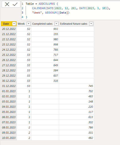
I have this data:
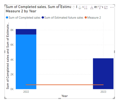
And I have made this graph - which shows completed sales and expected future sales.
This works great for when I use the "Date" field, but I want it on week level, and when I do that it looks strange (see picture below), because Power BI doesn't understand that week 1 is next year, and hence is after week 52.
Is there a way to make it understand that week 1 is next year? And hence that the graph looks more similar to the one with "Date"?
Thanks in advance, highly appreciate it 🙂
Solved! Go to Solution.
- Mark as New
- Bookmark
- Subscribe
- Mute
- Subscribe to RSS Feed
- Permalink
- Report Inappropriate Content
Hi @Anonymous ,
Understood.
I think it's best not to use date hierarchy in concatenate labels, and to use custom dates for the best time.
So you can add a column names Year.
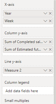
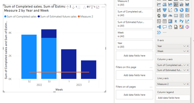
Year = YEAR('Table'[Date]) Then you can set the visual like this :
When you set the column in the visualizations, you may achieve this:
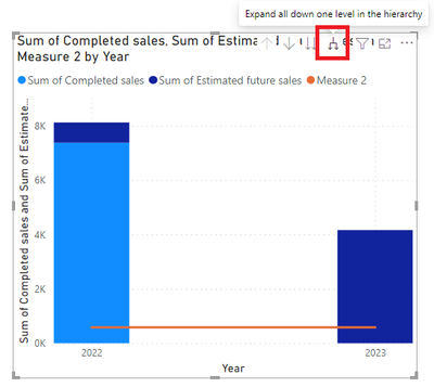
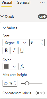
Please click this button:
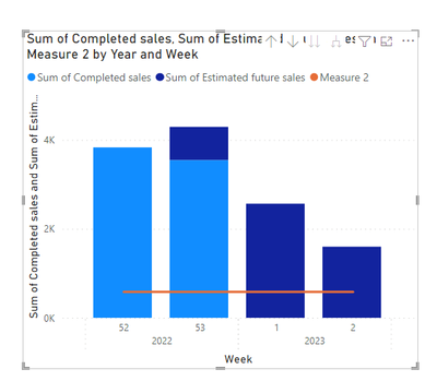
Then you will achieve this:
Hope this helps you. For more information, you can refer my PBIX file.
Best Regards,
Community Support Team _Yinliw
If this post helps, then please consider Accept it as the solution to help the other members find it more quickly.
- Mark as New
- Bookmark
- Subscribe
- Mute
- Subscribe to RSS Feed
- Permalink
- Report Inappropriate Content
Hi @Anonymous ,
Understood.
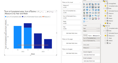
I can reproduce your question:
Looks like this, right?
So this is because the year column, you can reset this column and refresh the visual.
Of course this solution is dynamic, it will change with your data changed.
Hope you success!
Best Regards,
Community Support Team _Yinliw
If this post helps, then please consider Accept it as the solution to help the other members find it more quickly.
- Mark as New
- Bookmark
- Subscribe
- Mute
- Subscribe to RSS Feed
- Permalink
- Report Inappropriate Content
Hi @Anonymous ,
Understood.
Could you please tell me that how do you create your X-Axis?
Did you create the X-Axis by this method below?
Or you use the concatenate labels?
And could you please show a screenshot to me the visualizations about your visual? Here.
By the way, it looks like that your two tables have no relationships because the Average Sales is a straight line.
Like this:
Hope this helps you.
Best Regards,
Community Support Team _Yinliw
If this post helps, then please consider Accept it as the solution to help the other members find it more quickly.
- Mark as New
- Bookmark
- Subscribe
- Mute
- Subscribe to RSS Feed
- Permalink
- Report Inappropriate Content
Hi @v-yinliw-msft,
Thanks! Here are the answer to the questions:
I use the concatenate labels for the x-axis.
Here:
The tables have a relation, but no connection, so they basically act as two independent tables yes. But I didn't think that matter, because I want the Average Sales measure to be a straight line. I calculate the Average Sales measure by summing up all sales the last year and dividing it by 52 weeks, I don't want the average sales per week to change for each week.
Thanks for the help!
- Mark as New
- Bookmark
- Subscribe
- Mute
- Subscribe to RSS Feed
- Permalink
- Report Inappropriate Content
Hi @Anonymous ,
Understood.
I think it's best not to use date hierarchy in concatenate labels, and to use custom dates for the best time.
So you can add a column names Year.
Year = YEAR('Table'[Date]) Then you can set the visual like this :
When you set the column in the visualizations, you may achieve this:
Please click this button:
Then you will achieve this:
Hope this helps you. For more information, you can refer my PBIX file.
Best Regards,
Community Support Team _Yinliw
If this post helps, then please consider Accept it as the solution to help the other members find it more quickly.
- Mark as New
- Bookmark
- Subscribe
- Mute
- Subscribe to RSS Feed
- Permalink
- Report Inappropriate Content
Hi again @v-yinliw-msft,
Thank you so much for taking the time! I don't know what I am doing wrong, but I tried using Year as you wrote, but it doesn't work... Note! The solution need to be dynamic.
It just looks like this:
Thanks!
- Mark as New
- Bookmark
- Subscribe
- Mute
- Subscribe to RSS Feed
- Permalink
- Report Inappropriate Content
Hi @Anonymous ,
Understood.
I can reproduce your question:
Looks like this, right?
So this is because the year column, you can reset this column and refresh the visual.
Of course this solution is dynamic, it will change with your data changed.
Hope you success!
Best Regards,
Community Support Team _Yinliw
If this post helps, then please consider Accept it as the solution to help the other members find it more quickly.
- Mark as New
- Bookmark
- Subscribe
- Mute
- Subscribe to RSS Feed
- Permalink
- Report Inappropriate Content
Ah, I understand! Thank you so much, it works now 🙂
- Mark as New
- Bookmark
- Subscribe
- Mute
- Subscribe to RSS Feed
- Permalink
- Report Inappropriate Content
Hi @Anonymous ,
You can try this method:
Add a column:
Weeks = YEAR('Table'[Date]) & 'Table'[Week]
Then you can use this column to be the x-axis.
Hope this helps you.
Here is my pbix file.
Best Regards,
Community Support Team _Yinliw
If this post helps, then please consider Accept it as the solution to help the other members find it more quickly.
- Mark as New
- Bookmark
- Subscribe
- Mute
- Subscribe to RSS Feed
- Permalink
- Report Inappropriate Content
@Anonymous , Add Year and week both in visual and expand , Or use Year week column
Year week = Year([Date]) *100 + Weeknum([Date])
Both Year and week column
Concatenate Label off : https://youtu.be/QgI0vIGIOOk
- Mark as New
- Bookmark
- Subscribe
- Mute
- Subscribe to RSS Feed
- Permalink
- Report Inappropriate Content
Hi @amitchandak ,
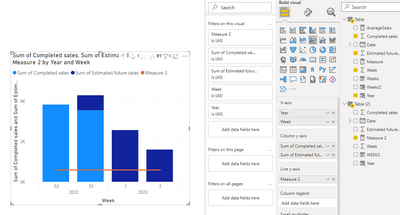
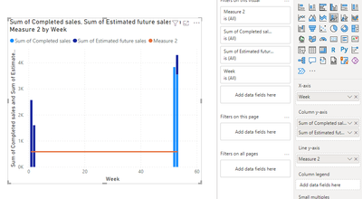
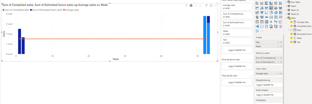
Thank you for the help! The Year and week column (concatenate label) works as desired. But, I also need an average line, and then it stops working. Because I then get a lot of extra weeks I don't want in the visual, se picture.
How can I solve this? It is very important that the solution is dynamic, when the dates change everyday.
- Mark as New
- Bookmark
- Subscribe
- Mute
- Subscribe to RSS Feed
- Permalink
- Report Inappropriate Content
Hi @Anonymous ,
After my testing, there are two known cases in which this result occurs.
The first one: Your average sales is a sample data like:
Average = 1500In this case, it will occur this:
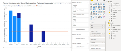
Or ,the second situation, it's because your data in the visual doesn't come from the same table, like this:
So i suggest you to calculate the Average Sales that use the data in the same table.
Because I don't know how you calculate the Average Sales, so I make an example:
AverageSales = DIVIDE(SUM('Table'[Completed sales]) + SUM('Table'[Estimated future sales]), COUNT('Table'[Date]))
For more information to understand, you can refer my PBIX file below.
Hope this helps you.
Best Regards,
Community Support Team _Yinliw
If this post helps, then please consider Accept it as the solution to help the other members find it more quickly.
- Mark as New
- Bookmark
- Subscribe
- Mute
- Subscribe to RSS Feed
- Permalink
- Report Inappropriate Content
Hi @v-yinliw-msft ,
Thanks for helping! The average is calculated based on another table, and this is done due to the fact that I want it to be a yearly average sales last year divided down to week level (and the table making the graph only goes a couple of days back and forward). Is there anyway to do it with data from another table? Highly appreciate the help 🙂
Helpful resources

Fabric Data Days
Advance your Data & AI career with 50 days of live learning, contests, hands-on challenges, study groups & certifications and more!

Power BI Monthly Update - October 2025
Check out the October 2025 Power BI update to learn about new features.

| User | Count |
|---|---|
| 8 | |
| 6 | |
| 4 | |
| 4 | |
| 4 |
| User | Count |
|---|---|
| 25 | |
| 17 | |
| 8 | |
| 8 | |
| 7 |
