FabCon is coming to Atlanta
Join us at FabCon Atlanta from March 16 - 20, 2026, for the ultimate Fabric, Power BI, AI and SQL community-led event. Save $200 with code FABCOMM.
Register now!- Power BI forums
- Get Help with Power BI
- Desktop
- Service
- Report Server
- Power Query
- Mobile Apps
- Developer
- DAX Commands and Tips
- Custom Visuals Development Discussion
- Health and Life Sciences
- Power BI Spanish forums
- Translated Spanish Desktop
- Training and Consulting
- Instructor Led Training
- Dashboard in a Day for Women, by Women
- Galleries
- Data Stories Gallery
- Themes Gallery
- Contests Gallery
- QuickViz Gallery
- Quick Measures Gallery
- Visual Calculations Gallery
- Notebook Gallery
- Translytical Task Flow Gallery
- TMDL Gallery
- R Script Showcase
- Webinars and Video Gallery
- Ideas
- Custom Visuals Ideas (read-only)
- Issues
- Issues
- Events
- Upcoming Events
The Power BI Data Visualization World Championships is back! Get ahead of the game and start preparing now! Learn more
- Power BI forums
- Forums
- Get Help with Power BI
- DAX Commands and Tips
- Re: How to display total a Stacked Column Chart
- Subscribe to RSS Feed
- Mark Topic as New
- Mark Topic as Read
- Float this Topic for Current User
- Bookmark
- Subscribe
- Printer Friendly Page
- Mark as New
- Bookmark
- Subscribe
- Mute
- Subscribe to RSS Feed
- Permalink
- Report Inappropriate Content
How to display total a Stacked Column Chart
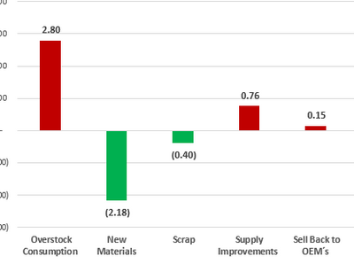
I have database table like master . In the database i have two column Reduction buckets and value . table value looks like below
Reduction buckets Value
Overstock consumption 2.80
New Materials (2.18)
Scrap 0.40
supply Improvement 0.76
Sell back To OEM 0.15
i making this table in to graph
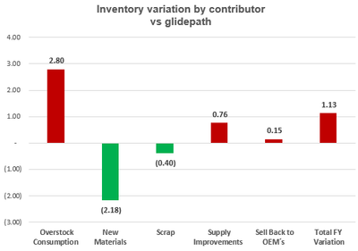
but how i will add total varaition of all total grpah like below images
Solved! Go to Solution.
- Mark as New
- Bookmark
- Subscribe
- Mute
- Subscribe to RSS Feed
- Permalink
- Report Inappropriate Content
Hi, @Anonymous
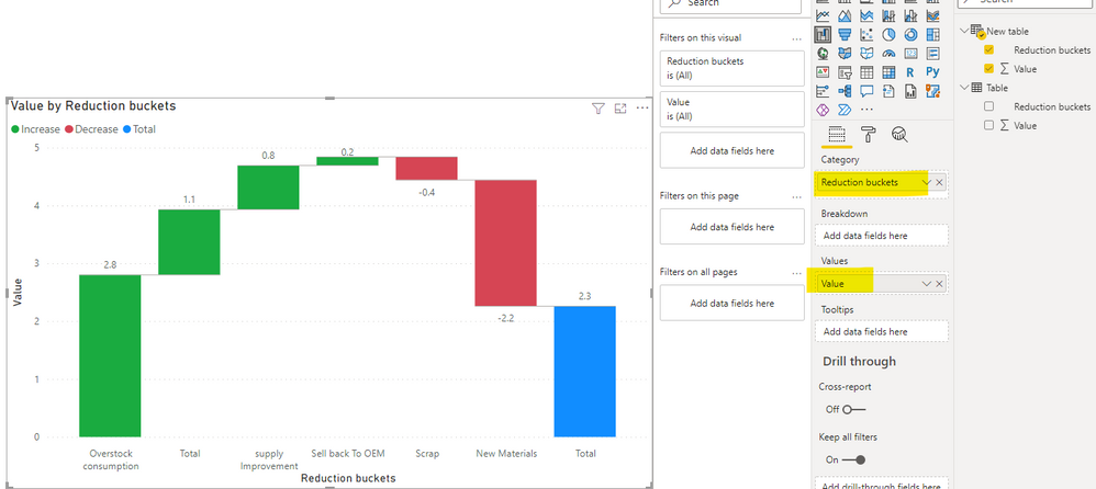
According to your description, I can roughly understand your requirement, I think you can try to create a calculated table like this and place it into the waterfall chart to achieve your requirement
New table =

var _total=ROW("Reduction buckets","Total","Value",SUMX(ALL('Table'),[Value]))

return

UNION('Table',_total)
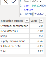
Then you can get thet able like this:
Then you can get the chart like this:
You can download my test pbix file below
Thank you very much!
Best Regards,
Community Support Team _Robert Qin
If this post helps, then please consider Accept it as the solution to help the other members find it more quickly.
- Mark as New
- Bookmark
- Subscribe
- Mute
- Subscribe to RSS Feed
- Permalink
- Report Inappropriate Content
- Mark as New
- Bookmark
- Subscribe
- Mute
- Subscribe to RSS Feed
- Permalink
- Report Inappropriate Content
Hi @Anonymous
Your tables in UNION must have same columns, and it seams your Master Data Base has more that 2 columns.
Please try this measure:
Table 2 =
UNION(
    SUMMARIZE( Table, 'Table'[Reduction buckets], 'Table'[Value] ),
    ROW(
        "Reduction buckets", "total varaition",
        "Value", CALCULATE( SUM( 'Table'[Value] ), ALL( 'Table' ) )
    )
)
If this post helps, please consider accepting it as the solution to help the other members find it more quickly.
Appreciate your Kudos!!
LinkedIn: www.linkedin.com/in/vahid-dm/
- Mark as New
- Bookmark
- Subscribe
- Mute
- Subscribe to RSS Feed
- Permalink
- Report Inappropriate Content
- Mark as New
- Bookmark
- Subscribe
- Mute
- Subscribe to RSS Feed
- Permalink
- Report Inappropriate Content
Hi,
Have you followed the DAX formula posted by VahidDM to find the solution to your problem?
If so, would you like to mark his reply as a solution so that others can learn from it too?
Thanks in advance!
How to Get Your Question Answered Quickly
Best Regards,
Community Support Team _Robert Qin
If this post helps, then please consider Accept it as the solution to help the other members find it more quickly.
- Mark as New
- Bookmark
- Subscribe
- Mute
- Subscribe to RSS Feed
- Permalink
- Report Inappropriate Content
Hi @Anonymous
Create a new table with this code:
Table 2 = union('Table',row("Reduction buckets","total varaition","Value",CALCULATE(sum('Table'[Value]),all('Table'))))
then use that to create a chart:
If this post helps, please consider accepting it as the solution to help the other members find it more quickly.
Appreciate your Kudos!!
LinkedIn: www.linkedin.com/in/vahid-dm/
Helpful resources

Power BI Dataviz World Championships
The Power BI Data Visualization World Championships is back! Get ahead of the game and start preparing now!

| User | Count |
|---|---|
| 19 | |
| 13 | |
| 9 | |
| 4 | |
| 4 |
| User | Count |
|---|---|
| 30 | |
| 26 | |
| 17 | |
| 11 | |
| 10 |


