Join us at FabCon Vienna from September 15-18, 2025
The ultimate Fabric, Power BI, SQL, and AI community-led learning event. Save €200 with code FABCOMM.
Get registered- Power BI forums
- Get Help with Power BI
- Desktop
- Service
- Report Server
- Power Query
- Mobile Apps
- Developer
- DAX Commands and Tips
- Custom Visuals Development Discussion
- Health and Life Sciences
- Power BI Spanish forums
- Translated Spanish Desktop
- Training and Consulting
- Instructor Led Training
- Dashboard in a Day for Women, by Women
- Galleries
- Data Stories Gallery
- Themes Gallery
- Contests Gallery
- Quick Measures Gallery
- Notebook Gallery
- Translytical Task Flow Gallery
- TMDL Gallery
- R Script Showcase
- Webinars and Video Gallery
- Ideas
- Custom Visuals Ideas (read-only)
- Issues
- Issues
- Events
- Upcoming Events
Compete to become Power BI Data Viz World Champion! First round ends August 18th. Get started.
- Power BI forums
- Forums
- Get Help with Power BI
- DAX Commands and Tips
- Re: How to create a measure that changes cell colo...
- Subscribe to RSS Feed
- Mark Topic as New
- Mark Topic as Read
- Float this Topic for Current User
- Bookmark
- Subscribe
- Printer Friendly Page
- Mark as New
- Bookmark
- Subscribe
- Mute
- Subscribe to RSS Feed
- Permalink
- Report Inappropriate Content
How to create a measure that changes cell colour/font colour in a table filtered by a slicer?
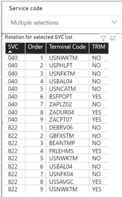
HI, I would like to have my filtered table (from a slicer) display the different services with different font colour/cell background colour. Any idea how i can create a measure to detect that the service code is different from my table that is filtered from a slicer?
So i have filtered the service code to display services 040 and 822 in my table below. How can i create a measure so that columns for 040 are in red, or in another cell colour? This is so that i can easily see the 2 services.
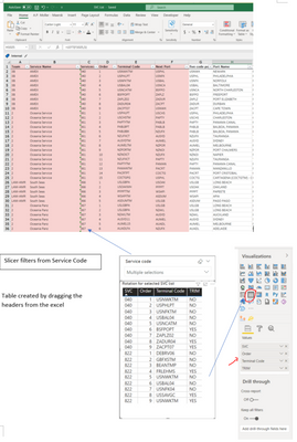
This is how i created my slicer and table from my sources which is an excel file
Thank you in advance for any help rendered!
Regards
Felibhai
- Mark as New
- Bookmark
- Subscribe
- Mute
- Subscribe to RSS Feed
- Permalink
- Report Inappropriate Content
Hello,
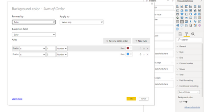
first you need to write a measure. Then in the formatting section under condition formatting select background color and go to the advanced controls. Then insert the measure and select the values.
If this works, please mark it as the solution, thanks 🙂
- Mark as New
- Bookmark
- Subscribe
- Mute
- Subscribe to RSS Feed
- Permalink
- Report Inappropriate Content
HI, thanks for your reply!
However, i dont want to assign a fixed svc code, rather i would like the measure to run down the selected column, and return a 1 if the value of the first column is different. so when measure is 1, i can use it to assign another colour.
My list has a thousand and more services, so it would be too tedious to assign every option, as the user is able to select many services based on the slicer
THanks a lot!
Helpful resources
| User | Count |
|---|---|
| 28 | |
| 12 | |
| 8 | |
| 7 | |
| 5 |
| User | Count |
|---|---|
| 35 | |
| 14 | |
| 12 | |
| 9 | |
| 7 |


