Fabric Data Days starts November 4th!
Advance your Data & AI career with 50 days of live learning, dataviz contests, hands-on challenges, study groups & certifications and more!
Get registered- Power BI forums
- Get Help with Power BI
- Desktop
- Service
- Report Server
- Power Query
- Mobile Apps
- Developer
- DAX Commands and Tips
- Custom Visuals Development Discussion
- Health and Life Sciences
- Power BI Spanish forums
- Translated Spanish Desktop
- Training and Consulting
- Instructor Led Training
- Dashboard in a Day for Women, by Women
- Galleries
- Data Stories Gallery
- Themes Gallery
- Contests Gallery
- Quick Measures Gallery
- Visual Calculations Gallery
- Notebook Gallery
- Translytical Task Flow Gallery
- TMDL Gallery
- R Script Showcase
- Webinars and Video Gallery
- Ideas
- Custom Visuals Ideas (read-only)
- Issues
- Issues
- Events
- Upcoming Events
Get Fabric Certified for FREE during Fabric Data Days. Don't miss your chance! Learn more
- Power BI forums
- Forums
- Get Help with Power BI
- DAX Commands and Tips
- Re: How to automatically change the data values co...
- Subscribe to RSS Feed
- Mark Topic as New
- Mark Topic as Read
- Float this Topic for Current User
- Bookmark
- Subscribe
- Printer Friendly Page
- Mark as New
- Bookmark
- Subscribe
- Mute
- Subscribe to RSS Feed
- Permalink
- Report Inappropriate Content
How to automatically change the data values color?
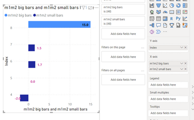
How can we change the data values color in a clustered bar chart when it was overlapped with the graph itself? Please see below example:
Solved! Go to Solution.
- Mark as New
- Bookmark
- Subscribe
- Mute
- Subscribe to RSS Feed
- Permalink
- Report Inappropriate Content
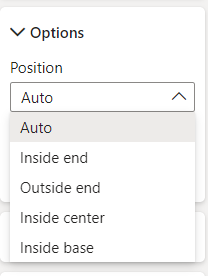
There's currently no option to do that, but it is possible to set the values to only inside / outside if you need.
The other alternative I found is a work-around. It's possible to format the colour of the data labels conditionally... but this point in time, I can't apply the condition of whether the point is inside or outside the bar.
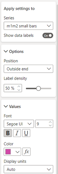
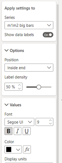
Instead, I was able to split my measure into two - "small" values and "big" value
s and create a chart with them both.
I can then format the position of the data labels on each separately.
Measures used in the chart:
Data Label Settings:
 | 
|
Resulting chart:
HTH
Pi
- Mark as New
- Bookmark
- Subscribe
- Mute
- Subscribe to RSS Feed
- Permalink
- Report Inappropriate Content
- Mark as New
- Bookmark
- Subscribe
- Mute
- Subscribe to RSS Feed
- Permalink
- Report Inappropriate Content
You're welcome! Please remember to mark whichever answer helped as a solution 🙂
- Mark as New
- Bookmark
- Subscribe
- Mute
- Subscribe to RSS Feed
- Permalink
- Report Inappropriate Content
- Mark as New
- Bookmark
- Subscribe
- Mute
- Subscribe to RSS Feed
- Permalink
- Report Inappropriate Content
Thank you @PiEye Is it possible to set it to be dynamic? To change to white if the graph overlaps with the datavalues?
- Mark as New
- Bookmark
- Subscribe
- Mute
- Subscribe to RSS Feed
- Permalink
- Report Inappropriate Content
There's currently no option to do that, but it is possible to set the values to only inside / outside if you need.
The other alternative I found is a work-around. It's possible to format the colour of the data labels conditionally... but this point in time, I can't apply the condition of whether the point is inside or outside the bar.
Instead, I was able to split my measure into two - "small" values and "big" value
s and create a chart with them both.
I can then format the position of the data labels on each separately.
Measures used in the chart:
Data Label Settings:
 | 
|
Resulting chart:
HTH
Pi
Helpful resources

Fabric Data Days
Advance your Data & AI career with 50 days of live learning, contests, hands-on challenges, study groups & certifications and more!

Power BI Monthly Update - October 2025
Check out the October 2025 Power BI update to learn about new features.

| User | Count |
|---|---|
| 9 | |
| 5 | |
| 4 | |
| 3 | |
| 3 |
| User | Count |
|---|---|
| 23 | |
| 12 | |
| 11 | |
| 10 | |
| 9 |

