Fabric Data Days starts November 4th!
Advance your Data & AI career with 50 days of live learning, dataviz contests, hands-on challenges, study groups & certifications and more!
Get registered- Power BI forums
- Get Help with Power BI
- Desktop
- Service
- Report Server
- Power Query
- Mobile Apps
- Developer
- DAX Commands and Tips
- Custom Visuals Development Discussion
- Health and Life Sciences
- Power BI Spanish forums
- Translated Spanish Desktop
- Training and Consulting
- Instructor Led Training
- Dashboard in a Day for Women, by Women
- Galleries
- Data Stories Gallery
- Themes Gallery
- Contests Gallery
- QuickViz Gallery
- Quick Measures Gallery
- Visual Calculations Gallery
- Notebook Gallery
- Translytical Task Flow Gallery
- TMDL Gallery
- R Script Showcase
- Webinars and Video Gallery
- Ideas
- Custom Visuals Ideas (read-only)
- Issues
- Issues
- Events
- Upcoming Events
Get Fabric Certified for FREE during Fabric Data Days. Don't miss your chance! Request now
- Power BI forums
- Forums
- Get Help with Power BI
- DAX Commands and Tips
- How do I count rows that consist of dates into a l...
- Subscribe to RSS Feed
- Mark Topic as New
- Mark Topic as Read
- Float this Topic for Current User
- Bookmark
- Subscribe
- Printer Friendly Page
- Mark as New
- Bookmark
- Subscribe
- Mute
- Subscribe to RSS Feed
- Permalink
- Report Inappropriate Content
How do I count rows that consist of dates into a line graph? And possible even make a forecast?
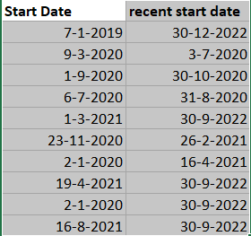
I would like to have the start date (the amount of the same dates, counting) in a line graph as well as the recent start date (the amcount of the same dates, counting)
For example, in the line graph I would like to have all the dates that relate tot september 2020 in one point of the graph, as well as the other months. Do I make an index column to give the rows a number in order to make the graph? How do I make this graph?
Note: I am new to Power BI and English is not my first language. Thank you in advance.
Solved! Go to Solution.
- Mark as New
- Bookmark
- Subscribe
- Mute
- Subscribe to RSS Feed
- Permalink
- Report Inappropriate Content
Create a proper Date table and then create 2 relationships from the Date table to your current table, one linking to the start date and one linking to the recent start date. You can make both relationships inactive.
Create 2 measures like
Num rows using start date = CALCULATE( COUNTROWS( 'Table' ), USERELATIONSHIP( 'Date'[Date], 'Table'[Start date]) )

Num rows using recent start date = CALCULATE( COUNTROWS( 'Table' ), USERELATIONSHIP( 'Date'[Date], 'Table'[Recent start date]) )
Now you can put columns from your Date table into a line chart and add the new measures.
- Mark as New
- Bookmark
- Subscribe
- Mute
- Subscribe to RSS Feed
- Permalink
- Report Inappropriate Content
Hi @Anonymous ,
In addition to johnt75's reply, you can try CALENDAR() OR CALENDARAUTO() function to create a DimDate table.
DimDate =
ADDCOLUMNS( CALENDARAUTO() ,"Year",YEAR([Date]),"Month",MONTH([Date]),"MonthName",FORMAT([Date],"MMMM"))
Then create relationships and measures as he mentioned above.
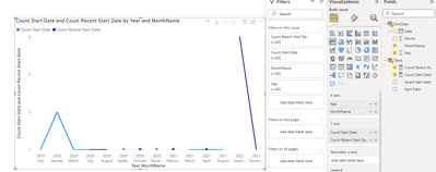
Result is as below.
Best Regards.
- Mark as New
- Bookmark
- Subscribe
- Mute
- Subscribe to RSS Feed
- Permalink
- Report Inappropriate Content
Create a proper Date table and then create 2 relationships from the Date table to your current table, one linking to the start date and one linking to the recent start date. You can make both relationships inactive.
Create 2 measures like
Num rows using start date = CALCULATE( COUNTROWS( 'Table' ), USERELATIONSHIP( 'Date'[Date], 'Table'[Start date]) )

Num rows using recent start date = CALCULATE( COUNTROWS( 'Table' ), USERELATIONSHIP( 'Date'[Date], 'Table'[Recent start date]) )
Now you can put columns from your Date table into a line chart and add the new measures.
Helpful resources

Fabric Data Days
Advance your Data & AI career with 50 days of live learning, contests, hands-on challenges, study groups & certifications and more!

Power BI Monthly Update - October 2025
Check out the October 2025 Power BI update to learn about new features.

| User | Count |
|---|---|
| 8 | |
| 6 | |
| 6 | |
| 5 | |
| 4 |
| User | Count |
|---|---|
| 25 | |
| 15 | |
| 8 | |
| 8 | |
| 8 |


