Huge last-minute discounts for FabCon Vienna from September 15-18, 2025
Supplies are limited. Contact info@espc.tech right away to save your spot before the conference sells out.
Get your discount- Power BI forums
- Get Help with Power BI
- Desktop
- Service
- Report Server
- Power Query
- Mobile Apps
- Developer
- DAX Commands and Tips
- Custom Visuals Development Discussion
- Health and Life Sciences
- Power BI Spanish forums
- Translated Spanish Desktop
- Training and Consulting
- Instructor Led Training
- Dashboard in a Day for Women, by Women
- Galleries
- Data Stories Gallery
- Themes Gallery
- Contests Gallery
- Quick Measures Gallery
- Notebook Gallery
- Translytical Task Flow Gallery
- TMDL Gallery
- R Script Showcase
- Webinars and Video Gallery
- Ideas
- Custom Visuals Ideas (read-only)
- Issues
- Issues
- Events
- Upcoming Events
Score big with last-minute savings on the final tickets to FabCon Vienna. Secure your discount
- Power BI forums
- Forums
- Get Help with Power BI
- DAX Commands and Tips
- Histogram counting number of days within binned va...
- Subscribe to RSS Feed
- Mark Topic as New
- Mark Topic as Read
- Float this Topic for Current User
- Bookmark
- Subscribe
- Printer Friendly Page
- Mark as New
- Bookmark
- Subscribe
- Mute
- Subscribe to RSS Feed
- Permalink
- Report Inappropriate Content
Histogram counting number of days within binned values
Hello PBI experts,
I am stuck on a problem and can't seem to find the answer here or anywhere else.
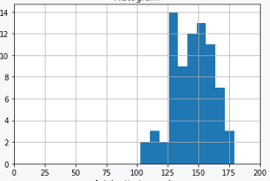
I need to create a histogram, where the height of each bar shows the number of (distinct) days that there have been various number of visits to a facility. The number of visits are to be divided into bins with fixed intervals. E.g., if the interval size would be 10, the first bar would show how many days there have been 0-9 visits, the 2nd bar would show how many days there have been 10-19 visits, and so on. Similar to the chart below.
I can't simply solve this by making a calculated bin column, as the chart needs to be sliced by other columns in the table, such as department.
For the this sample data:
| VisitID | Date | Department |
| 1 | 2022-01-01 | A |
| 2 | 2022-01-01 | B |
| 3 | 2022-01-02 | B |
| 4 | 2022-01-02 | A |
| 5 | 2022-01-02 | B |
| 6 | 2022-01-02 | C |
| 7 | 2022-01-02 | C |
| 8 | 2022-01-02 | C |
| 9 | 2022-01-03 | B |
| 10 | 2022-01-03 | C |
| 11 | 2022-01-03 | A |
| 12 | 2022-01-03 | A |
| 13 | 2022-01-03 | A |
| 14 | 2022-01-04 | B |
| 15 | 2022-01-04 | B |
| 16 | 2022-01-04 | B |
| 17 | 2022-01-04 | B |
| 18 | 2022-01-04 | C |
| 19 | 2022-01-04 | C |
| 20 | 2022-01-04 | C |
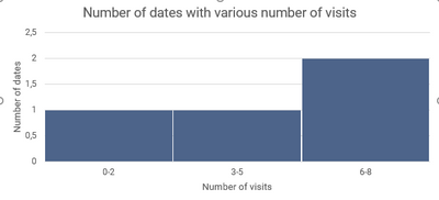
with an interval size of 3, the unfiltered histogram would show 3 bars like this:
The summary tables below might make this a bit more clear:
| Date | Number of visits |
| 2022-01-01 | 2 |
| 2022-01-02 | 6 |
| 2022-01-03 | 5 |
| 2022-01-04 | 7 |
| Number of visits | Number of dates (with number of visits within this range) |
| 0-2 | 1 |
| 3-5 | 1 |
| 6-8 | 2 |
As mentioned, I also need to be able to slice by department. So, for the the sample data, I want the user to be able to select only department A and see what the chart would look like for that department, and so on.
My actual data has 750k visits over a period of 3 years and the requested interval for the bins is 10 (0-9, 10-19, 20-29, etc).
Any help or pointers in how to solve this issue would be very much appreciated!
- Mark as New
- Bookmark
- Subscribe
- Mute
- Subscribe to RSS Feed
- Permalink
- Report Inappropriate Content
Hello @PatrikSwe ,
please check if this match to your need based on your sample data above. Other Power BI expert might have better and elegant solution.
1. in your first summarize table, you need to add department column since you want to be able to slice department value. Just add another column for department from what you did.
2. follow up in your second summarize table, add department and calculate 'Number of Dates' using conditional if for each 'Number of Visit' for exact same department.
3. create bar visual with slicer. This slicer has to be department column from your second summarize table since no table-relationship made.
Hope this will help you.
Thank you.
Helpful resources
| User | Count |
|---|---|
| 12 | |
| 11 | |
| 8 | |
| 6 | |
| 6 |
| User | Count |
|---|---|
| 24 | |
| 19 | |
| 14 | |
| 10 | |
| 7 |


