Join the #PBI10 DataViz contest
Power BI is turning 10, and we’re marking the occasion with a special community challenge. Use your creativity to tell a story, uncover trends, or highlight something unexpected.
Get started- Power BI forums
- Get Help with Power BI
- Desktop
- Service
- Report Server
- Power Query
- Mobile Apps
- Developer
- DAX Commands and Tips
- Custom Visuals Development Discussion
- Health and Life Sciences
- Power BI Spanish forums
- Translated Spanish Desktop
- Training and Consulting
- Instructor Led Training
- Dashboard in a Day for Women, by Women
- Galleries
- Webinars and Video Gallery
- Data Stories Gallery
- Themes Gallery
- Contests Gallery
- Quick Measures Gallery
- Notebook Gallery
- Translytical Task Flow Gallery
- R Script Showcase
- Ideas
- Custom Visuals Ideas (read-only)
- Issues
- Issues
- Events
- Upcoming Events
Join us for an expert-led overview of the tools and concepts you'll need to become a Certified Power BI Data Analyst and pass exam PL-300. Register now.
- Power BI forums
- Forums
- Get Help with Power BI
- DAX Commands and Tips
- Help needed for DAX formula to calculate percentag...
- Subscribe to RSS Feed
- Mark Topic as New
- Mark Topic as Read
- Float this Topic for Current User
- Bookmark
- Subscribe
- Printer Friendly Page
- Mark as New
- Bookmark
- Subscribe
- Mute
- Subscribe to RSS Feed
- Permalink
- Report Inappropriate Content
Help needed for DAX formula to calculate percentage by certain group
Hello,
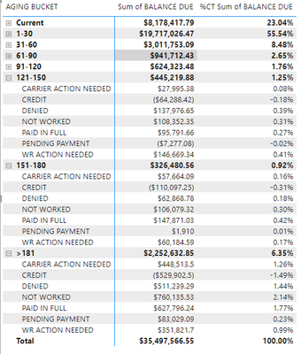
Total newbie here. I'm looking to add a card visual that displays the percentage of certain aging bucket groups and status subcategories. While i have it listed out in the matrix table below, i was hoping to visualize it in a simple card at the top of the report.
I'm specifically looking to just calculate 121-150, 151-180, and >180 aging buckets and only the "Carrier Action Needed, WR Action Needed, and Not Worked" subcategories within those buckets to get a percentage from the grand total of balance due ($35,497,566.55) to show how much impact it overall.
I am so grateful for any assistance!
Here is a matrix table to show more details:
Solved! Go to Solution.
- Mark as New
- Bookmark
- Subscribe
- Mute
- Subscribe to RSS Feed
- Permalink
- Report Inappropriate Content
Hi, @vviera
You can try the following methods.
Measure =
VAR _N1 = CALCULATE ( SUM ( 'Table'[BALANCE DUE] ), ALL ( 'Table' ) )
VAR _N2 =
    CALCULATE ( SUM ( 'Table'[BALANCE DUE] ),
        FILTER ( ALLEXCEPT ( 'Table', 'Table'[AGING BUCKET] ),
            [Type] IN { "Carrier Action Needed", "WR Action Needed", "Not Worked" } ) )
RETURN
    DIVIDE ( _N2, _N1 )
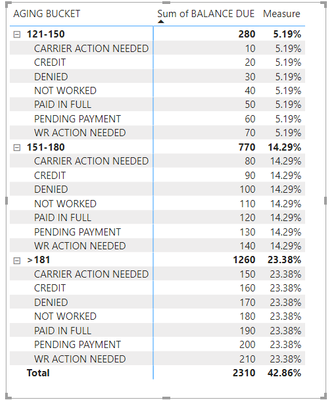
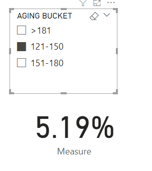
Is this the result you expect?
Best Regards,
Community Support Team _Charlotte
If this post helps, then please consider Accept it as the solution to help the other members find it more quickly.
Helpful resources

Join our Fabric User Panel
This is your chance to engage directly with the engineering team behind Fabric and Power BI. Share your experiences and shape the future.

Power BI Monthly Update - June 2025
Check out the June 2025 Power BI update to learn about new features.

| User | Count |
|---|---|
| 10 | |
| 9 | |
| 8 | |
| 8 | |
| 8 |
| User | Count |
|---|---|
| 13 | |
| 12 | |
| 11 | |
| 10 | |
| 8 |


