FabCon is coming to Atlanta
Join us at FabCon Atlanta from March 16 - 20, 2026, for the ultimate Fabric, Power BI, AI and SQL community-led event. Save $200 with code FABCOMM.
Register now!- Power BI forums
- Get Help with Power BI
- Desktop
- Service
- Report Server
- Power Query
- Mobile Apps
- Developer
- DAX Commands and Tips
- Custom Visuals Development Discussion
- Health and Life Sciences
- Power BI Spanish forums
- Translated Spanish Desktop
- Training and Consulting
- Instructor Led Training
- Dashboard in a Day for Women, by Women
- Galleries
- Data Stories Gallery
- Themes Gallery
- Contests Gallery
- Quick Measures Gallery
- Visual Calculations Gallery
- Notebook Gallery
- Translytical Task Flow Gallery
- TMDL Gallery
- R Script Showcase
- Webinars and Video Gallery
- Ideas
- Custom Visuals Ideas (read-only)
- Issues
- Issues
- Events
- Upcoming Events
Calling all Data Engineers! Fabric Data Engineer (Exam DP-700) live sessions are back! Starting October 16th. Sign up.
- Power BI forums
- Forums
- Get Help with Power BI
- DAX Commands and Tips
- Re: Help: Traffic Light Staff Capacity formula
- Subscribe to RSS Feed
- Mark Topic as New
- Mark Topic as Read
- Float this Topic for Current User
- Bookmark
- Subscribe
- Printer Friendly Page
- Mark as New
- Bookmark
- Subscribe
- Mute
- Subscribe to RSS Feed
- Permalink
- Report Inappropriate Content
Help: Traffic Light Staff Capacity formula
Hi,
I am trying to re-create a formula from one Power Bi report (built with Excel spreadsheets) into a new Power Bi (bulit with API's into the data) to show conditonal formatting in colour on a column chart and its not working.
Orignially, when recreating the formula it had an error that one of my cells was text but, now my data is all numbers and its still not showing the way I want.
The data I want to show is a traffic light on the amount of hours a staff member has done in the month vs their individual capacity. ie Bob is expected to do 37.5 hours per week, the month of July 2021 has 4.29 weeks in the month, Bobs expected hours for July is 160.87 hours, Bob has actually worked 180 hours, which is 19.13 over his expected and needs to be shown as red.
The formulas used are
the orignal graph appears as:
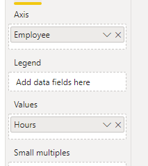
I have the same formulas in my new model, but the graph appears as:
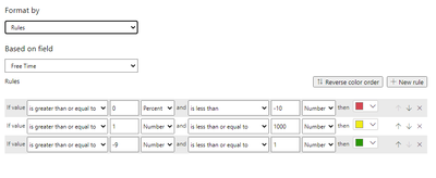
My data colour formmatting is:
My new model has the formulas:
- Mark as New
- Bookmark
- Subscribe
- Mute
- Subscribe to RSS Feed
- Permalink
- Report Inappropriate Content
Hi,
According to your description, I think you can make some changes on the measure [Free time] to get the requirement you wanted:
Free Time =

var _date=EOMONTH(TODAY(),-1)

var _weeks=divide(DATEDIFF(DATE(YEAR(_date),MONTH(_date),1),EOMONTH(_date,0),day),7)

var _sum=CALCULATE(SUM('Timesheet data'[hours]),FILTER(ALL('Timesheet data'),[Employee]=MAX('Timesheet data'[Employee])))

return

MAX('staff table'[Capacity])*_weeks-_sum
You can define the first variable _date according to your needs, in this case, is the last date in October
Then you can do the same thing as my above replies to achieve your needs:
Color =

SWITCH(

    TRUE(),

    [Free Time]<-10,"Red",

    [Free Time]>=-9&&[Free Time]<1,"Yellow",

    [Free Time]>1&&[Free Time]<=1000,"Green")
Thank you very much!
Best Regards,
Community Support Team _Robert Qin
If this post helps, then please consider Accept it as the solution to help the other members find it more quickly.
- Mark as New
- Bookmark
- Subscribe
- Mute
- Subscribe to RSS Feed
- Permalink
- Report Inappropriate Content
Hi Robert,
sorry it didnt work. I dont want to show the "Free Time". I want to show the amount of hours that the staff member has done, and I want the color to be based on whether they have done their hours or not. I
also have a splicer on the dates, so I want it to change based on whatever month is choosen
Cheers
Kelz
- Mark as New
- Bookmark
- Subscribe
- Mute
- Subscribe to RSS Feed
- Permalink
- Report Inappropriate Content
Hi @Kelz - Did you mark this as solved? I see it is marked as solved but your latest question came in after the "solution".
| Have I solved your problem? Please click Accept as Solution so I don't keep coming back to this post, oh yeah, others may find it useful also ;). |
- Mark as New
- Bookmark
- Subscribe
- Mute
- Subscribe to RSS Feed
- Permalink
- Report Inappropriate Content
Hi, no I didn't, I think the system may have? or somebody might have if they can do that? and Im unsure how to revert it.
The instructions Robert had were great and work well if I wanted to show the free time, but I wanted to show the hours the staff had worked for the month with the colour for each staff member based on whether they were under, over or at their contracted hours for month/s selected (I have a slicer on months and muiltple can be selected).
the original formula worked really well for the model I created using excel reports, but I've had to recreate the report using an API, so the names / tables are slightly different but still has the same information.
Thanks
Kelly
- Mark as New
- Bookmark
- Subscribe
- Mute
- Subscribe to RSS Feed
- Permalink
- Report Inappropriate Content
@Kelz , @KNP , I have unmarked the "Accepted Solution" as it looks as @Kelz has not found the correct answer to their question. If I am wrong, please advise.
Thank you for being part of the community!
cc: @v-robertq-msft, @Anonymous, @chass
- Mark as New
- Bookmark
- Subscribe
- Mute
- Subscribe to RSS Feed
- Permalink
- Report Inappropriate Content
Hi,
According to your description and sample picture, I think you can try to use these measures to create a column chart to achieve your requirement:
Free Time =

var _sum=CALCULATE(SUM('Timesheet data'[hours]),FILTER(ALL('Timesheet data'),[Employee]=MAX('staff table'[Employee])))

return

SUM([Capacity])-_sum
Color =
SWITCH(
TRUE(),
[Free Time]<-10,"Red",
[Free Time]>=-9&&[Free Time]<1,"Yellow",
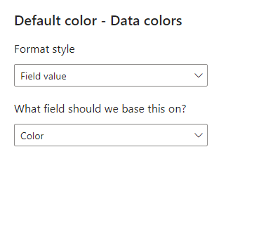
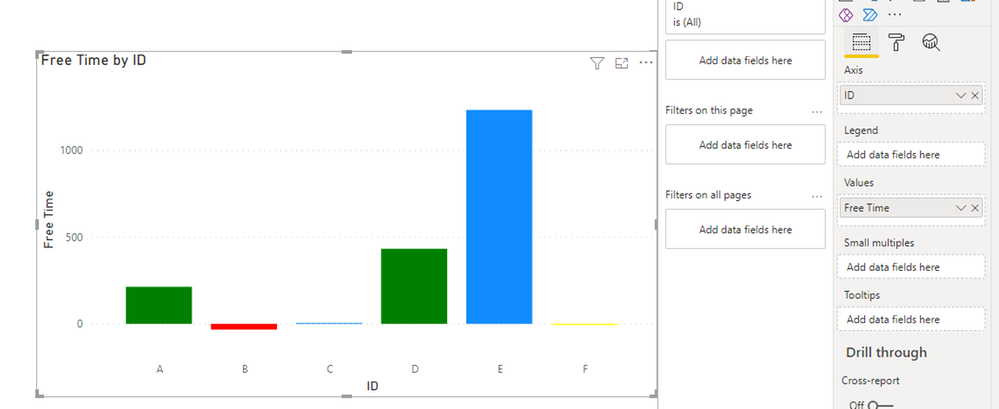
[Free Time]>1&&[Free Time]<=1000,"Green")And you can create a column chart to set the data color like this to get what you want:
You can download my test pbix file below
Thank you very much!
Best Regards,
Community Support Team _Robert Qin
If this post helps, then please consider Accept it as the solution to help the other members find it more quickly.
- Mark as New
- Bookmark
- Subscribe
- Mute
- Subscribe to RSS Feed
- Permalink
- Report Inappropriate Content
Hi Robert,
Sorry to be a pain, that didnt quite work.
I need to show the hours the employees completed each month, but coloured coded depending on whether they met or exceeded their hours in the coloumn graph:
ie
Bob worked 185 hours in October (Sum of timesheet hours - timesheet table)
Bob's capacity per week is 40 hours (capactity - employee table)
in the month of October there are 4.29 weeks (weeks in the month - Dates table)
Bob's expected hours is 4.29 x 40 = 171.60 for the month of October. (capacity x weeks in month)
Free time = Expected hours - actual hours
in bob's case - 171.60 - 185 = -13.4
If free time is greater than -10 = red (ie they did too much)
If free time is between 2 & -9 = Green (they worked their hours/ slight over)
If the free time is less than 2 = Yellow (they havent done all thier hours)
in the coloumn graph, bob's hours would show red.
Thanks
Kelz
- Mark as New
- Bookmark
- Subscribe
- Mute
- Subscribe to RSS Feed
- Permalink
- Report Inappropriate Content
Hi, @Kelz
According to your description and sample pictures, I can roughly understand your requirement, I think you can try to create a measure to define the data color manually instead set it in the color formatting, you can try this measure:
Color =

SWITCH(

    TRUE(),

    [Free Time]<-10,"Red",

    [Free Time]>=-9&&[Free Time]<1,"Yellow",

[Free Time]>1&&[Free Time]<=1000,"Green")Then go to the data color setting of this column chart, set like this:
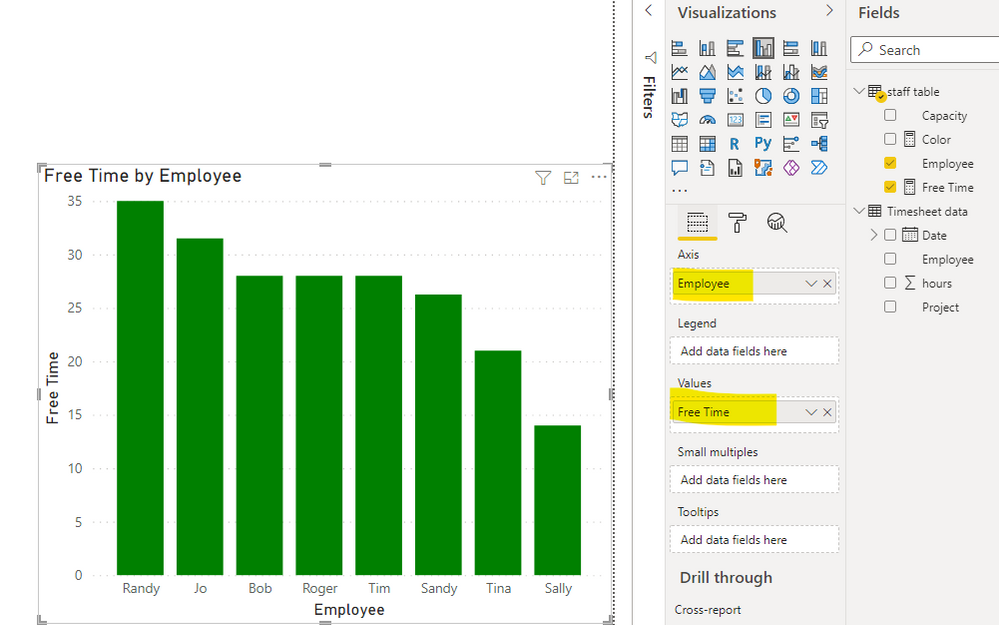
And you can get what you want, like this:
You can download my test pbix file below
Thank you very much!
Best Regards,
Community Support Team _Robert Qin
If this post helps, then please consider Accept it as the solution to help the other members find it more quickly.
- Mark as New
- Bookmark
- Subscribe
- Mute
- Subscribe to RSS Feed
- Permalink
- Report Inappropriate Content
Hi,
Thanks for that, it didnt work, but i think it might be because I need to link it to the indivdual/unique staff members.
ie bob is 37.5, sally is 20 hours, jane is 30 hours which is under the employee tab.
do you know how I can get the free time formula to filter on each of the staff members capacity and not the whole group?
thanks
kelz
- Mark as New
- Bookmark
- Subscribe
- Mute
- Subscribe to RSS Feed
- Permalink
- Report Inappropriate Content
Hi,
According to your description, I can roughly understand what you want to get. But I find it hard to create the test data based on your requirement details. Would you like to post some sample data in table form or pbix file(without sensitive data) and your expected result(like the chart you want to get and the correct measure value based on your sample data)?
Thanks very much!
How to Get Your Question Answered Quickly
Best Regards,
Community Support Team _Robert Qin
If this post helps, then please consider Accept it as the solution to help the other members find it more quickly.
- Mark as New
- Bookmark
- Subscribe
- Mute
- Subscribe to RSS Feed
- Permalink
- Report Inappropriate Content
Hi,
Here is the table examples
Timesheet data
| Date | hours | Employee | Project |
| 1/10/2021 | 4 | Bob | Project 1 |
| 1/10/2021 | 2 | Sally | Project 3 |
| 1/10/2021 | 4.5 | Jo | Project 5 |
| 1/10/2021 | 5 | Randy | Project 1 |
| 1/10/2021 | 3.75 | Sandy | Project 3 |
| 1/10/2021 | 3 | Tina | Project 5 |
| 1/10/2021 | 4 | Tim | Project 1 |
| 1/10/2021 | 4 | Roger | Project 3 |
| 4/10/2021 | 4 | Bob | Project 1 |
| 4/10/2021 | 2 | Sally | Project 3 |
| 4/10/2021 | 4.5 | Jo | Project 5 |
| 4/10/2021 | 5 | Randy | Project 1 |
| 4/10/2021 | 3.75 | Sandy | Project 3 |
| 4/10/2021 | 3 | Tina | Project 5 |
| 4/10/2021 | 4 | Tim | Project 1 |
| 4/10/2021 | 4 | Roger | Project 3 |
staff table:
| Employee | Capacity |
| Bob | 40 |
| Sally | 20 |
| Jo | 45 |
| Randy | 50 |
| Sandy | 37.5 |
| Tina | 30 |
| Tim | 40 |
| Roger | 40 |
Thanks 🙂
- Mark as New
- Bookmark
- Subscribe
- Mute
- Subscribe to RSS Feed
- Permalink
- Report Inappropriate Content
@Kelz , I think 1st and 3rd condition has a problem. Reconsider and correct. Alos you should number at all place, you are using percent in first one
- Mark as New
- Bookmark
- Subscribe
- Mute
- Subscribe to RSS Feed
- Permalink
- Report Inappropriate Content
Hi @amitchandak
Thanks for the suggestion, I tried it, but when changing it to a number it comes up as a red box
and that color formatting works in my old model
Cheers,
Kelz
Helpful resources

FabCon Global Hackathon
Join the Fabric FabCon Global Hackathon—running virtually through Nov 3. Open to all skill levels. $10,000 in prizes!

Power BI Monthly Update - October 2025
Check out the October 2025 Power BI update to learn about new features.

| User | Count |
|---|---|
| 12 | |
| 12 | |
| 11 | |
| 10 | |
| 9 |


