FabCon is coming to Atlanta
Join us at FabCon Atlanta from March 16 - 20, 2026, for the ultimate Fabric, Power BI, AI and SQL community-led event. Save $200 with code FABCOMM.
Register now!- Power BI forums
- Get Help with Power BI
- Desktop
- Service
- Report Server
- Power Query
- Mobile Apps
- Developer
- DAX Commands and Tips
- Custom Visuals Development Discussion
- Health and Life Sciences
- Power BI Spanish forums
- Translated Spanish Desktop
- Training and Consulting
- Instructor Led Training
- Dashboard in a Day for Women, by Women
- Galleries
- Data Stories Gallery
- Themes Gallery
- Contests Gallery
- Quick Measures Gallery
- Visual Calculations Gallery
- Notebook Gallery
- Translytical Task Flow Gallery
- TMDL Gallery
- R Script Showcase
- Webinars and Video Gallery
- Ideas
- Custom Visuals Ideas (read-only)
- Issues
- Issues
- Events
- Upcoming Events
Calling all Data Engineers! Fabric Data Engineer (Exam DP-700) live sessions are back! Starting October 16th. Sign up.
- Power BI forums
- Forums
- Get Help with Power BI
- DAX Commands and Tips
- Re: Have calculate distinguish column values
- Subscribe to RSS Feed
- Mark Topic as New
- Mark Topic as Read
- Float this Topic for Current User
- Bookmark
- Subscribe
- Printer Friendly Page
- Mark as New
- Bookmark
- Subscribe
- Mute
- Subscribe to RSS Feed
- Permalink
- Report Inappropriate Content
Have calculate distinguish column values
Hi everyone
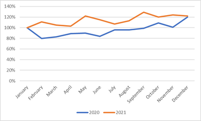
In one of my dashboards, I am attempting to create a graph that looks as follows:
The idea is to compare the performance over the course of a year of multiple years.
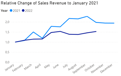
To do that, I have set up the following visual:
My current measure looks as follows:
Test Measure =
var curr =
CALCULATE(
    sum('Table'[SalesTotalEUR]),
    KEEPFILTERS(
        'Table'[Date]
    )
)

var refer =
CALCULATE(
    sum('Table'[SalesTotalEUR]),
    FILTER(
        ALL('Date'[Date]),
        Month('Date'[Date])=1
    )
)

var div=
DIVIDE(
    curr,
    refer,
    ""
)

return div
My problem is that I am unable to keep my measure restricted to the year column. Therefore, all my January values (be they from 2021 or from 2022) are being used in my calculations. Can anyone therefore please tell me how to set up my measure so that it distinguished between the column values?
Solved! Go to Solution.
- Mark as New
- Bookmark
- Subscribe
- Mute
- Subscribe to RSS Feed
- Permalink
- Report Inappropriate Content
So, after some more researching and plenty of trials and errors, I was finally able to find the correct dax command for the problem It is as follows:
Test Measure =

var yearselected=
SELECTEDVALUE('Date'[Date].[Year])

var curr =
sumx('Table', 'Table'[SalesTotalEUR])

var refer =
CALCULATE(
    sum('Table'[SalesTotalEUR]),
    FILTER(
        ALL('Date'[Date]),
        Month('Date'[Date])=1 && year('Date'[Date])=yearselected
    )
)

var div=
DIVIDE(
    curr,
    refer,
    ""
)

return div
As you can see, as SELECTEDVALUES that has to be brought in as a variable is needed.
The resulting visual looks as desired:
- Mark as New
- Bookmark
- Subscribe
- Mute
- Subscribe to RSS Feed
- Permalink
- Report Inappropriate Content
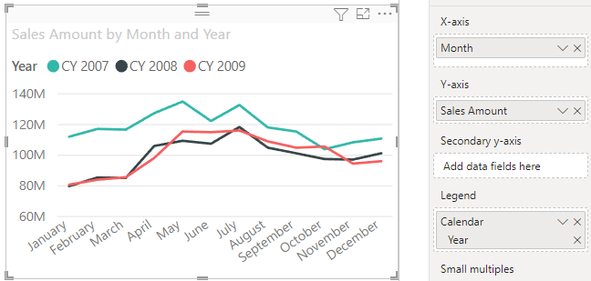
You shouldn't need a new measure to generate a chart like this. Put Month on the x-axis and Year in the Legend box like this:
- Mark as New
- Bookmark
- Subscribe
- Mute
- Subscribe to RSS Feed
- Permalink
- Report Inappropriate Content
Hi @AlexisOlson ,
thanks for your reply. How would you set up your example to have your Sales Amount values normalized to 100 in January of every year? My goal is to show the relative change of my sales figures over the course of a year (e.g. sales grew by 10% in February 2021 (i.e. line goes to 110) while sales in February 2022 decreased by 6% (i.e. line goes to 94)). You can see what I mean in the graph above.
How would you approach this?
- Mark as New
- Bookmark
- Subscribe
- Mute
- Subscribe to RSS Feed
- Permalink
- Report Inappropriate Content
Ah, I missed that detail. Try this:
Normalized Sales =
DIVIDE (
    [Sales Amount],
    CALCULATE (
        [Sales Amount],
        REMOVEFILTERS ( 'Date'[Month Number] ),
        'Date'[Month] = "January"
    )
)
The removes the month name and month number filter context without removing the year filter context.
- Mark as New
- Bookmark
- Subscribe
- Mute
- Subscribe to RSS Feed
- Permalink
- Report Inappropriate Content
Hi @AlexisOlson ,
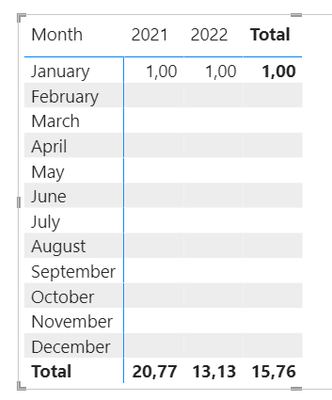
unfortunately, this only fills out the January cells in my table
I have slightly modified your command in order to fit my tables
Test 3 =
DIVIDE (
    sum('Table'[SalesTotalEUR]),
    CALCULATE (
        sum('Table'[SalesTotalEUR]),
        REMOVEFILTERS ( 'Date'[Month Number] ),
        'Date'[Date].[Month] = "January"
    ),
    ""
)
Any idea how to have the CALCULATE section of your solution expanded to all cells?
- Mark as New
- Bookmark
- Subscribe
- Mute
- Subscribe to RSS Feed
- Permalink
- Report Inappropriate Content
I'm guessing your model doesn't have exactly the same columns with the same names as the file I was testing with. Do you have columns for month name, month number, and year in your date table? If so, what are they? If not, then my solution clearly won't work since it's referencing non-existing things.
Helpful resources

FabCon Global Hackathon
Join the Fabric FabCon Global Hackathon—running virtually through Nov 3. Open to all skill levels. $10,000 in prizes!

Power BI Monthly Update - October 2025
Check out the October 2025 Power BI update to learn about new features.

| User | Count |
|---|---|
| 12 | |
| 11 | |
| 10 | |
| 9 | |
| 8 |


