FabCon is coming to Atlanta
Join us at FabCon Atlanta from March 16 - 20, 2026, for the ultimate Fabric, Power BI, AI and SQL community-led event. Save $200 with code FABCOMM.
Register now!- Power BI forums
- Get Help with Power BI
- Desktop
- Service
- Report Server
- Power Query
- Mobile Apps
- Developer
- DAX Commands and Tips
- Custom Visuals Development Discussion
- Health and Life Sciences
- Power BI Spanish forums
- Translated Spanish Desktop
- Training and Consulting
- Instructor Led Training
- Dashboard in a Day for Women, by Women
- Galleries
- Data Stories Gallery
- Themes Gallery
- Contests Gallery
- Quick Measures Gallery
- Notebook Gallery
- Translytical Task Flow Gallery
- TMDL Gallery
- R Script Showcase
- Webinars and Video Gallery
- Ideas
- Custom Visuals Ideas (read-only)
- Issues
- Issues
- Events
- Upcoming Events
To celebrate FabCon Vienna, we are offering 50% off select exams. Ends October 3rd. Request your discount now.
- Power BI forums
- Forums
- Get Help with Power BI
- DAX Commands and Tips
- Grouped line chart that shows count per month
- Subscribe to RSS Feed
- Mark Topic as New
- Mark Topic as Read
- Float this Topic for Current User
- Bookmark
- Subscribe
- Printer Friendly Page
- Mark as New
- Bookmark
- Subscribe
- Mute
- Subscribe to RSS Feed
- Permalink
- Report Inappropriate Content
Grouped line chart that shows count per month
Hi, I have a problem getting the output that I need.
I have a dataset ('data') with two columns ('name' and 'date'). What I want is very simple (at least I thought so):
I want the following grouped line chart:
- It is grouped by name
- The x-axis is date
- The y-axis should give the percentage of rows of a specific name in a specific date relative to all rows that date.
So if there are 10 rows on the first of march, and there are two rows with the name 'Peter' on the 1st of march, I want the percentage of 'Peter' on the first of march to be 20%.
As simple as that. From what i've read, it must be done using DAX, however, I cannot find the right query. Right now I have
DIVIDE(
COUNTROWS(FILTER('data', 'data'[Name] = EARLIER('data'[Name]))),
CALCULATE(COUNTROWS('data'), ALLEXCEPT('data', 'data'[Date]))
) * 100
But this does not seem to give the right answer.
Can anybody please help me out?
Solved! Go to Solution.
- Mark as New
- Bookmark
- Subscribe
- Mute
- Subscribe to RSS Feed
- Permalink
- Report Inappropriate Content
Hi @petervandenberg ,
According to your description, here are my steps you can follow as a solution.
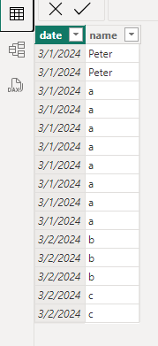
(1) This is my test data.
(2) We can create a measure.
percentage =
var _a=COUNTROWS(FILTER(ALLSELECTED('Table'),[date]=MAX('Table'[date])))
var _b=COUNTROWS(FILTER(ALLSELECTED('Table'),[date]=MAX('Table'[date]) && [name]= MAX('Table'[name])))
RETURN DIVIDE(_b,_a,0)
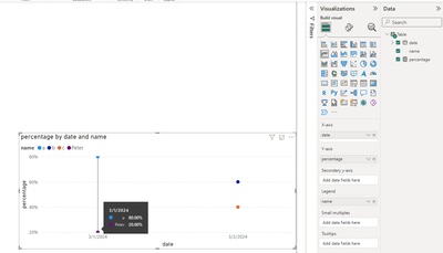
(3) Then the result is as follows.
If I have misunderstood your needs, please clarify in a follow-up reply.
Best Regards,
Neeko Tang
If this post helps, then please consider Accept it as the solution to help the other members find it more quickly.
- Mark as New
- Bookmark
- Subscribe
- Mute
- Subscribe to RSS Feed
- Permalink
- Report Inappropriate Content
Please provide sample data that covers your issue or question completely, in a usable format (not as a screenshot).
Do not include sensitive information or anything not related to the issue or question.
If you are unsure how to upload data please refer to https://community.fabric.microsoft.com/t5/Community-Blog/How-to-provide-sample-data-in-the-Power-BI-...
Please show the expected outcome based on the sample data you provided.
Want faster answers? https://community.fabric.microsoft.com/t5/Desktop/How-to-Get-Your-Question-Answered-Quickly/m-p/1447...


