Join us at FabCon Vienna from September 15-18, 2025
The ultimate Fabric, Power BI, SQL, and AI community-led learning event. Save €200 with code FABCOMM.
Get registered- Power BI forums
- Get Help with Power BI
- Desktop
- Service
- Report Server
- Power Query
- Mobile Apps
- Developer
- DAX Commands and Tips
- Custom Visuals Development Discussion
- Health and Life Sciences
- Power BI Spanish forums
- Translated Spanish Desktop
- Training and Consulting
- Instructor Led Training
- Dashboard in a Day for Women, by Women
- Galleries
- Data Stories Gallery
- Themes Gallery
- Contests Gallery
- Quick Measures Gallery
- Notebook Gallery
- Translytical Task Flow Gallery
- TMDL Gallery
- R Script Showcase
- Webinars and Video Gallery
- Ideas
- Custom Visuals Ideas (read-only)
- Issues
- Issues
- Events
- Upcoming Events
Enhance your career with this limited time 50% discount on Fabric and Power BI exams. Ends August 31st. Request your voucher.
- Power BI forums
- Forums
- Get Help with Power BI
- DAX Commands and Tips
- Filtering rows by selected value of a slicer
- Subscribe to RSS Feed
- Mark Topic as New
- Mark Topic as Read
- Float this Topic for Current User
- Bookmark
- Subscribe
- Printer Friendly Page
- Mark as New
- Bookmark
- Subscribe
- Mute
- Subscribe to RSS Feed
- Permalink
- Report Inappropriate Content
Filtering rows by selected value of a slicer
Let’s say we are running a virtual school. We want to create a dashboard that serves as a Learning Catalog for the students. For our data we have a table that displays in each row a course with its info about which student levels may access that course: The value will be “LX” value if the course is recommended for the level X and the value will be “LXp” if the course is strongly recommended for the students of level X as a prerequisite when the student is in level X-1 and wants to be promoted to level X.
The table looks like this:
Course Name | Student Level 1 | Student Level 2 | Student Level 3 | Student Level 4 | Student Level 5 | Student Level 6 | Student Level 7 | Student Level 8 |
Course 1 | L7 | L8 | ||||||
Course 2 | L5 | L6 | L7 | |||||
Course 3 | L5 | L6 | L7 | |||||
Course 4 | L3 | L4 | L5 | L6 | L7 | L8 |
The catalog should work like this: The student chooses his/her level and the visuals display the courses recommended for the level chosen. The current solution to display this catalog is working now and is working very well but given that the criteria to choose the courses is based on the columns of the table (Student Level X) and it changes according to the student request, we created the visuals using bookmarks, having a bookmark for every Student Level. Now, this is a nightmare, because whenever we want to make a change in the visuals (let’s say we want to add another column for additional info about the course) then we must change each all the bookmarks and all the visuals, which is very slow process and prone to errors.
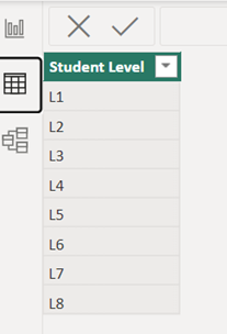
Trying a new approach, I created a table only for the Student Levels to use for a Slicer and I created a table and measures using DAX to be able to have only 1 visual to maintain.
This is the student level table
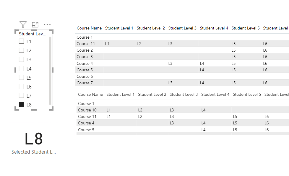
This is how the dashboard should look when no level has been chosen
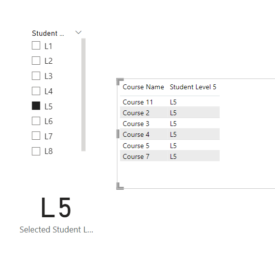
And if the student chooses Level 5 for example, he should be able to see this.
Notice that not only is changing the columns displayed but also FILTERING the rows according to the value of a variable, the selected value of the slicer.
To get the selected Student Level I used this formula:
And to create the table to populate the visual this is the formula I thought would work but it is not working:
Selected Job Level Table =
CALCULATETABLE('LG Training Matrix (2)',
FILTER('LG Training Matrix (2)',
'LG Training Matrix (2)'[Student Level 1]=[Selected Student Text]||
'LG Training Matrix (2)'[Student Level 2]=[Selected Student Text]||
'LG Training Matrix (2)'[Student Level 3]=[Selected Student Text]||
'LG Training Matrix (2)'[Student Level 4]=[Selected Student Text]||
'LG Training Matrix (2)'[Student Level 5]=[Selected Student Text]||
'LG Training Matrix (2)'[Student Level 6]=[Selected Student Text]||
'LG Training Matrix (2)'[Student Level 7]=[Selected Student Text]))
Using the FILTER function with a dynamic parameter (the column of the table [Selected Student Level]) is not working ☹
Here is the PIBX sample.
Please any help on making the last formula work or about how to create the catalog dashboard without the bookmarks would be very useful. Thanks in advance!
Solved! Go to Solution.
- Mark as New
- Bookmark
- Subscribe
- Mute
- Subscribe to RSS Feed
- Permalink
- Report Inappropriate Content
I think to problem is the structure of your table. You have the students level from L1 to L5 in different columns.
Transform the data in a other structure, like this. Than create a relationship between the main table (Fact table) and your "Student level" Table (Dimension table).
| Course | Level | Text |
| Course 1 | Student Level 7 | L7 |
| Course 1 | Student Level 8 | L8 |
| Course 2 | Student Level 5 | L5 |
| Course 2 | Student Level 6 | L6 |
| Course 2 | Student Level 7 | L7 |
Did I answer your question? Mark my post as a solution!
Proud to be a Super User!
- Mark as New
- Bookmark
- Subscribe
- Mute
- Subscribe to RSS Feed
- Permalink
- Report Inappropriate Content
Can you use the Power Query Editor? Than use the unpivot command:
https://support.microsoft.com/en-us/office/unpivot-columns-power-query-0f7bad4b-9ea1-49c1-9d95-f5882...
You can also use DAX:
https://stackoverflow.com/questions/50213905/is-it-possible-to-unpivot-in-power-bi-using-dax
Did I answer your question? Mark my post as a solution!
Proud to be a Super User!
- Mark as New
- Bookmark
- Subscribe
- Mute
- Subscribe to RSS Feed
- Permalink
- Report Inappropriate Content
I think to problem is the structure of your table. You have the students level from L1 to L5 in different columns.
Transform the data in a other structure, like this. Than create a relationship between the main table (Fact table) and your "Student level" Table (Dimension table).
| Course | Level | Text |
| Course 1 | Student Level 7 | L7 |
| Course 1 | Student Level 8 | L8 |
| Course 2 | Student Level 5 | L5 |
| Course 2 | Student Level 6 | L6 |
| Course 2 | Student Level 7 | L7 |
Did I answer your question? Mark my post as a solution!
Proud to be a Super User!
- Mark as New
- Bookmark
- Subscribe
- Mute
- Subscribe to RSS Feed
- Permalink
- Report Inappropriate Content
Thanks for your reply. I think this approach might be helpful. Can I use DAX to create taht table? Would that be a measure or a calculated table?
Thanks in advance!
- Mark as New
- Bookmark
- Subscribe
- Mute
- Subscribe to RSS Feed
- Permalink
- Report Inappropriate Content
Can you please confirm, that the table in your opening post is the data structure of your underlaying data? Can you please send a good data example? Do you have more level of the students?
It will be a calculated table i think or directly via power query editor.
Did I answer your question? Mark my post as a solution!
Proud to be a Super User!
- Mark as New
- Bookmark
- Subscribe
- Mute
- Subscribe to RSS Feed
- Permalink
- Report Inappropriate Content
I cannot share more due to privacy agreement.
But I tried your approach and it was good. Created a table duplicate, unpivot the necessary columns, create de relationship, and the display the visuals using the data from both tables. It is a WIP but so far it is going well. thank you.
- Mark as New
- Bookmark
- Subscribe
- Mute
- Subscribe to RSS Feed
- Permalink
- Report Inappropriate Content
This is great. Mark my post as a solution, this will be nice 🙂
Did I answer your question? Mark my post as a solution!
Proud to be a Super User!
- Mark as New
- Bookmark
- Subscribe
- Mute
- Subscribe to RSS Feed
- Permalink
- Report Inappropriate Content
Your first answer was marked as a solution long before you sent this reply. Check it for yourself 🙂
Helpful resources
| User | Count |
|---|---|
| 11 | |
| 8 | |
| 6 | |
| 6 | |
| 6 |
| User | Count |
|---|---|
| 24 | |
| 14 | |
| 13 | |
| 9 | |
| 8 |


