FabCon is coming to Atlanta
Join us at FabCon Atlanta from March 16 - 20, 2026, for the ultimate Fabric, Power BI, AI and SQL community-led event. Save $200 with code FABCOMM.
Register now!- Power BI forums
- Get Help with Power BI
- Desktop
- Service
- Report Server
- Power Query
- Mobile Apps
- Developer
- DAX Commands and Tips
- Custom Visuals Development Discussion
- Health and Life Sciences
- Power BI Spanish forums
- Translated Spanish Desktop
- Training and Consulting
- Instructor Led Training
- Dashboard in a Day for Women, by Women
- Galleries
- Data Stories Gallery
- Themes Gallery
- Contests Gallery
- QuickViz Gallery
- Quick Measures Gallery
- Visual Calculations Gallery
- Notebook Gallery
- Translytical Task Flow Gallery
- TMDL Gallery
- R Script Showcase
- Webinars and Video Gallery
- Ideas
- Custom Visuals Ideas (read-only)
- Issues
- Issues
- Events
- Upcoming Events
The Power BI Data Visualization World Championships is back! Get ahead of the game and start preparing now! Learn more
- Power BI forums
- Forums
- Get Help with Power BI
- DAX Commands and Tips
- Dynamic Title
- Subscribe to RSS Feed
- Mark Topic as New
- Mark Topic as Read
- Float this Topic for Current User
- Bookmark
- Subscribe
- Printer Friendly Page
- Mark as New
- Bookmark
- Subscribe
- Mute
- Subscribe to RSS Feed
- Permalink
- Report Inappropriate Content
Dynamic Title
Hi,
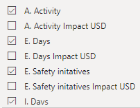
I have a project I am working on and to visualise its effect I want to use Power BI. There are 8 activities in the project, and each of the activities' impact is measured in $ as well. resulting in 16 attributes in total. In one Power BI window I want to visualise only the activities themselves, not its impact measured in $, so only 8 of the 16 attributes.
I have used this code as of now:
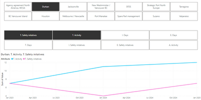
With this code, if I select for example Durban, T. Safety initatives and T. Activity, the title of the graph looks like this, exactly as I want it:
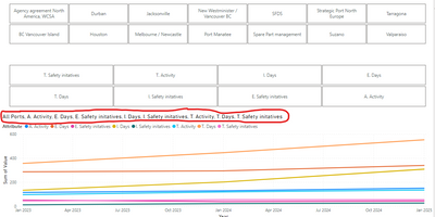
The problem, however, is when i have selected no location and no activity. Then the title looks like below, because I have filtered out the attributes in $:
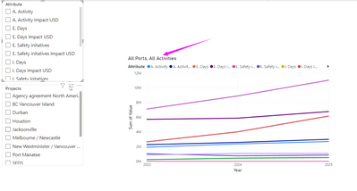
I want the title to say "All Ports, All activities" when no location or activity is selected, but it seems like that does not happen because I have filtered some of the attributes out.
I will add a link to a Google Drive file with a sample of the data as well:
https://drive.google.com/file/d/1gGyFrGVD0ly6PEgHVEtugS7O5cfmke3R/view?usp=sharing
If anyone could provide some guidance for how I could achieve that, it would be greatly appreciated. Thanks!
Solved! Go to Solution.
- Mark as New
- Bookmark
- Subscribe
- Mute
- Subscribe to RSS Feed
- Permalink
- Report Inappropriate Content
- Mark as New
- Bookmark
- Subscribe
- Mute
- Subscribe to RSS Feed
- Permalink
- Report Inappropriate Content
it's fine on my pc
- Mark as New
- Bookmark
- Subscribe
- Mute
- Subscribe to RSS Feed
- Permalink
- Report Inappropriate Content
Thanks, I found a minor setting that made it not work for me 🙂 Works fine for me as well now!
Helpful resources

Power BI Dataviz World Championships
The Power BI Data Visualization World Championships is back! Get ahead of the game and start preparing now!

| User | Count |
|---|---|
| 9 | |
| 5 | |
| 5 | |
| 3 | |
| 3 |
| User | Count |
|---|---|
| 24 | |
| 11 | |
| 9 | |
| 6 | |
| 6 |


