FabCon is coming to Atlanta
Join us at FabCon Atlanta from March 16 - 20, 2026, for the ultimate Fabric, Power BI, AI and SQL community-led event. Save $200 with code FABCOMM.
Register now!- Power BI forums
- Get Help with Power BI
- Desktop
- Service
- Report Server
- Power Query
- Mobile Apps
- Developer
- DAX Commands and Tips
- Custom Visuals Development Discussion
- Health and Life Sciences
- Power BI Spanish forums
- Translated Spanish Desktop
- Training and Consulting
- Instructor Led Training
- Dashboard in a Day for Women, by Women
- Galleries
- Data Stories Gallery
- Themes Gallery
- Contests Gallery
- Quick Measures Gallery
- Notebook Gallery
- Translytical Task Flow Gallery
- TMDL Gallery
- R Script Showcase
- Webinars and Video Gallery
- Ideas
- Custom Visuals Ideas (read-only)
- Issues
- Issues
- Events
- Upcoming Events
Join the Fabric FabCon Global Hackathon—running virtually through Nov 3. Open to all skill levels. $10,000 in prizes! Register now.
- Power BI forums
- Forums
- Get Help with Power BI
- DAX Commands and Tips
- Dynamic Title
- Subscribe to RSS Feed
- Mark Topic as New
- Mark Topic as Read
- Float this Topic for Current User
- Bookmark
- Subscribe
- Printer Friendly Page
- Mark as New
- Bookmark
- Subscribe
- Mute
- Subscribe to RSS Feed
- Permalink
- Report Inappropriate Content
Dynamic Title
Hi,
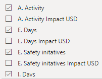
I have a project I am working on and to visualise its effect I want to use Power BI. There are 8 activities in the project, and each of the activities' impact is measured in $ as well. resulting in 16 attributes in total. In one Power BI window I want to visualise only the activities themselves, not its impact measured in $, so only 8 of the 16 attributes.
I have used this code as of now:
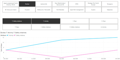
With this code, if I select for example Durban, T. Safety initatives and T. Activity, the title of the graph looks like this, exactly as I want it:
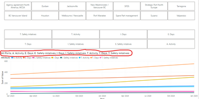
The problem, however, is when i have selected no location and no activity. Then the title looks like below, because I have filtered out the attributes in $:
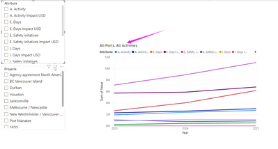
I want the title to say "All Ports, All activities" when no location or activity is selected, but it seems like that does not happen because I have filtered some of the attributes out.
I will add a link to a Google Drive file with a sample of the data as well:
https://drive.google.com/file/d/1gGyFrGVD0ly6PEgHVEtugS7O5cfmke3R/view?usp=sharing
If anyone could provide some guidance for how I could achieve that, it would be greatly appreciated. Thanks!
Solved! Go to Solution.
- Mark as New
- Bookmark
- Subscribe
- Mute
- Subscribe to RSS Feed
- Permalink
- Report Inappropriate Content
- Mark as New
- Bookmark
- Subscribe
- Mute
- Subscribe to RSS Feed
- Permalink
- Report Inappropriate Content
it's fine on my pc
- Mark as New
- Bookmark
- Subscribe
- Mute
- Subscribe to RSS Feed
- Permalink
- Report Inappropriate Content
Thanks, I found a minor setting that made it not work for me 🙂 Works fine for me as well now!
Helpful resources
| User | Count |
|---|---|
| 10 | |
| 8 | |
| 5 | |
| 5 | |
| 4 |


